Why Typography Matters in UI/UX Design
Every digital product relies on communication.
Users read:
Navigation labels
Form instructions
Buttons
Notifications
Error messages
Dashboards
Reports
Settings pages
If users cannot easily read and understand information, even the most visually beautiful interface will fail.
Good typography improves:
Readability
Information hierarchy
User comprehension
Accessibility
Task completion speed
User confidence
Typography is not just a visual design decision.
It is a usability decision.
Typography Is About Communication, Not Decoration
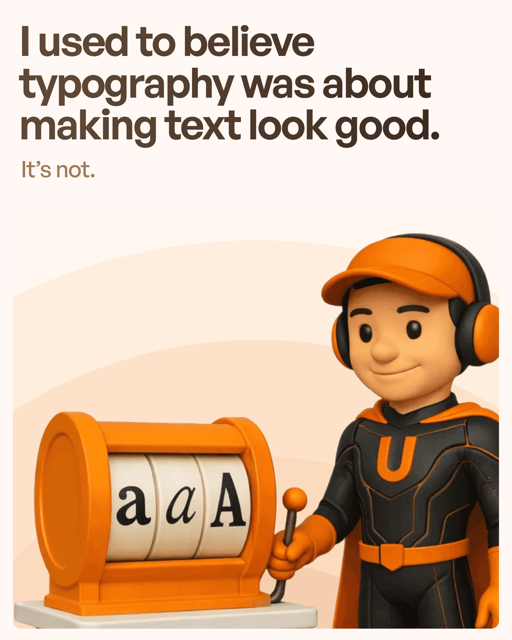
One of the biggest misconceptions among designers is that typography exists primarily to make interfaces look professional.
The truth is:
Typography exists to communicate information.
Users do not visit a software platform to admire fonts.
They visit to complete tasks.
Every typography decision should help users:
Find information faster
Understand content easier
Make decisions quicker
The best typography often goes unnoticed because it feels natural.
Users simply absorb information without struggling to read it.
Tip 1: Create a Clear Typography Hierarchy
One of the most important typography principles is hierarchy.
Users should instantly understand:
What is most important
What is secondary
What supports the content
Without hierarchy, every piece of text competes for attention.
This creates visual noise and increases cognitive load.
A strong typography hierarchy usually includes:
Heading
Used for major page titles and primary content sections.
Subheading
Provides additional context and organizes content.
Body Text
Contains detailed information users need to read.
Supporting Text
Used for descriptions, labels, helper text, or metadata.
When typography hierarchy is properly implemented, users can scan interfaces quickly without reading every word.
This significantly improves usability.
Tip 2: Limit Fonts and Font Weights
Many designers use too many fonts and weights in a single project.
This often creates inconsistency and visual clutter.
A simple rule works well:
Use 1–2 font families
Use 2–3 font weights
For example:
Bold for headings
Medium for subheadings
Regular for body text
This creates consistency throughout the product.
Consistency helps users recognize patterns and understand content structures more easily.
In enterprise software systems, where users process large amounts of information daily, consistency becomes even more important.
Tip 3: Use a Typography Scale
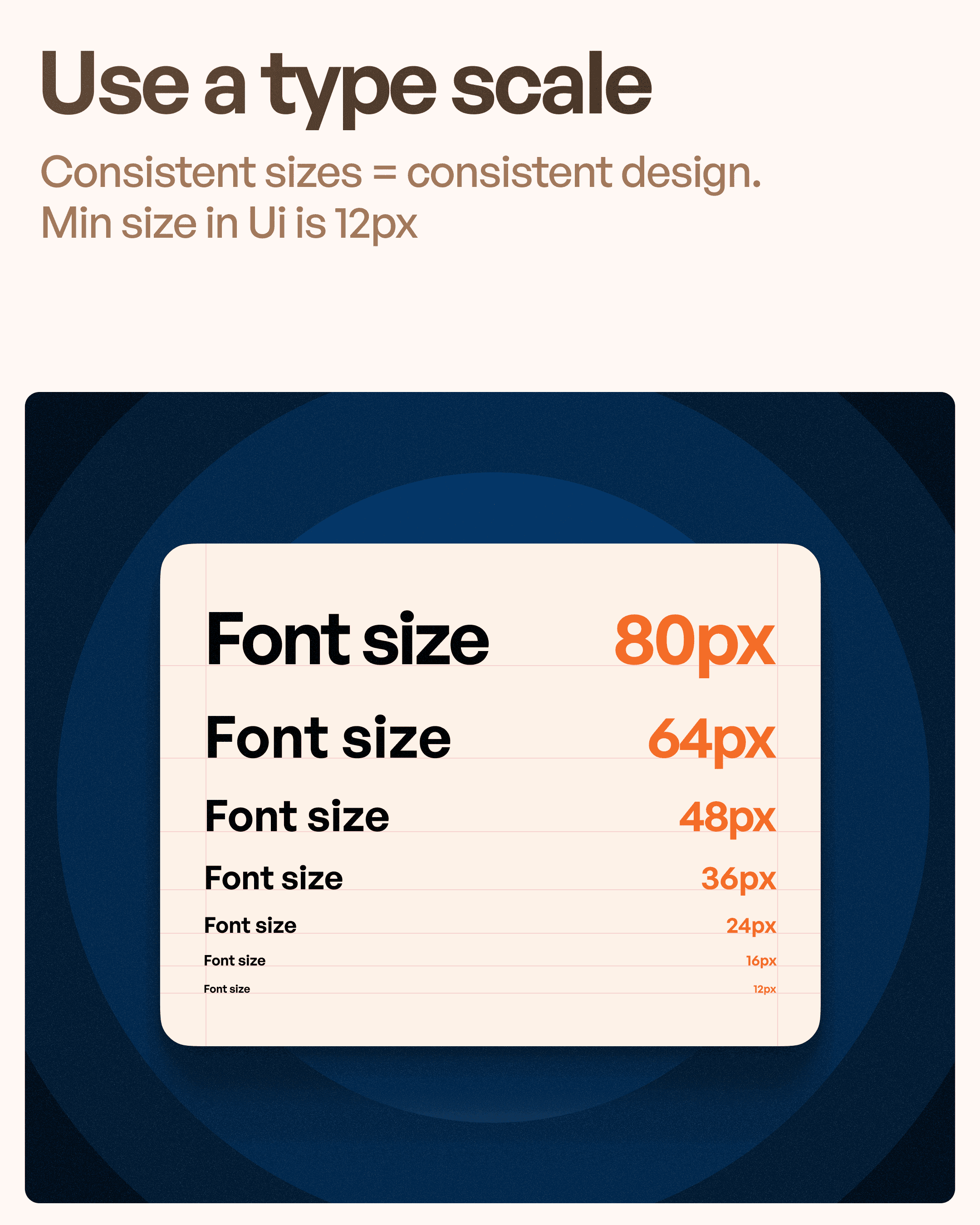
A typography scale provides a structured approach to font sizing.
Instead of choosing sizes randomly, designers use a predictable scale.
Example:
12px – Small labels
14px – Secondary text
16px – Body text
20px – Subheadings
24px – Section titles
32px+ – Main headings
Benefits include:
Consistency
Easier maintenance
Better design systems
Improved responsiveness
Typography scales help create visual rhythm throughout an interface.
This makes products feel more professional and organized.
Tip 4: Use Proper Contrast
Even beautiful typography becomes useless if users cannot read it.
Contrast plays a critical role in readability.
Poor contrast creates:
Eye strain
Accessibility issues
Reduced usability
Slower information processing
The Web Content Accessibility Guidelines (WCAG) recommend sufficient contrast between text and background colors.
Good contrast helps:
Users with visual impairments
Users in bright environments
Mobile users outdoors
Older users
Accessible typography improves experiences for everyone.
Design should never sacrifice readability for aesthetics.
Tip 5: Adjust Tracking and Line Height
Typography is not only about font selection.
Spacing matters equally.
Tracking (Letter Spacing)
Tracking controls the space between characters.
Proper tracking improves:
Readability
Clarity
Visual balance
Large headings often benefit from slightly adjusted tracking.
Line Height
Line height controls the space between lines of text.
Poor line height creates:
Dense content
Reading fatigue
Scanning difficulties
Comfortable line spacing makes long-form content significantly easier to read.
Good typography breathes.
Crowded typography overwhelms.
Tip 6: Test Typography Across Devices
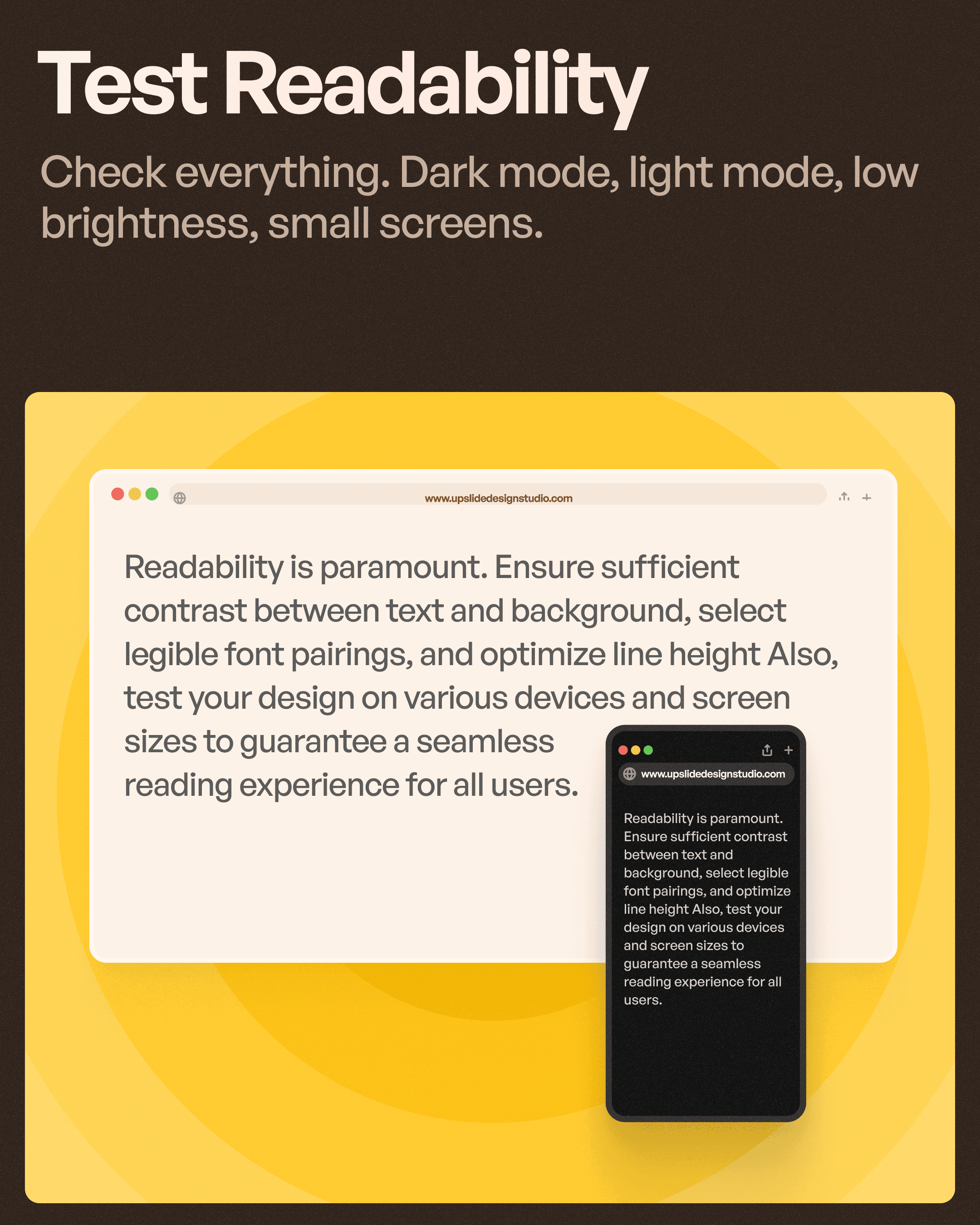
Typography that looks perfect on a desktop monitor may perform poorly on a mobile screen.
Always test typography in:
Mobile devices
Tablets
Desktop screens
Light mode
Dark mode
Different brightness levels
Users interact with products in various environments.
A font size that appears readable in a design file may become difficult to read on an actual device.
At Upslide Design Studio, typography decisions are reviewed across multiple screen sizes to ensure consistency and usability.
This is especially important for responsive UI design.
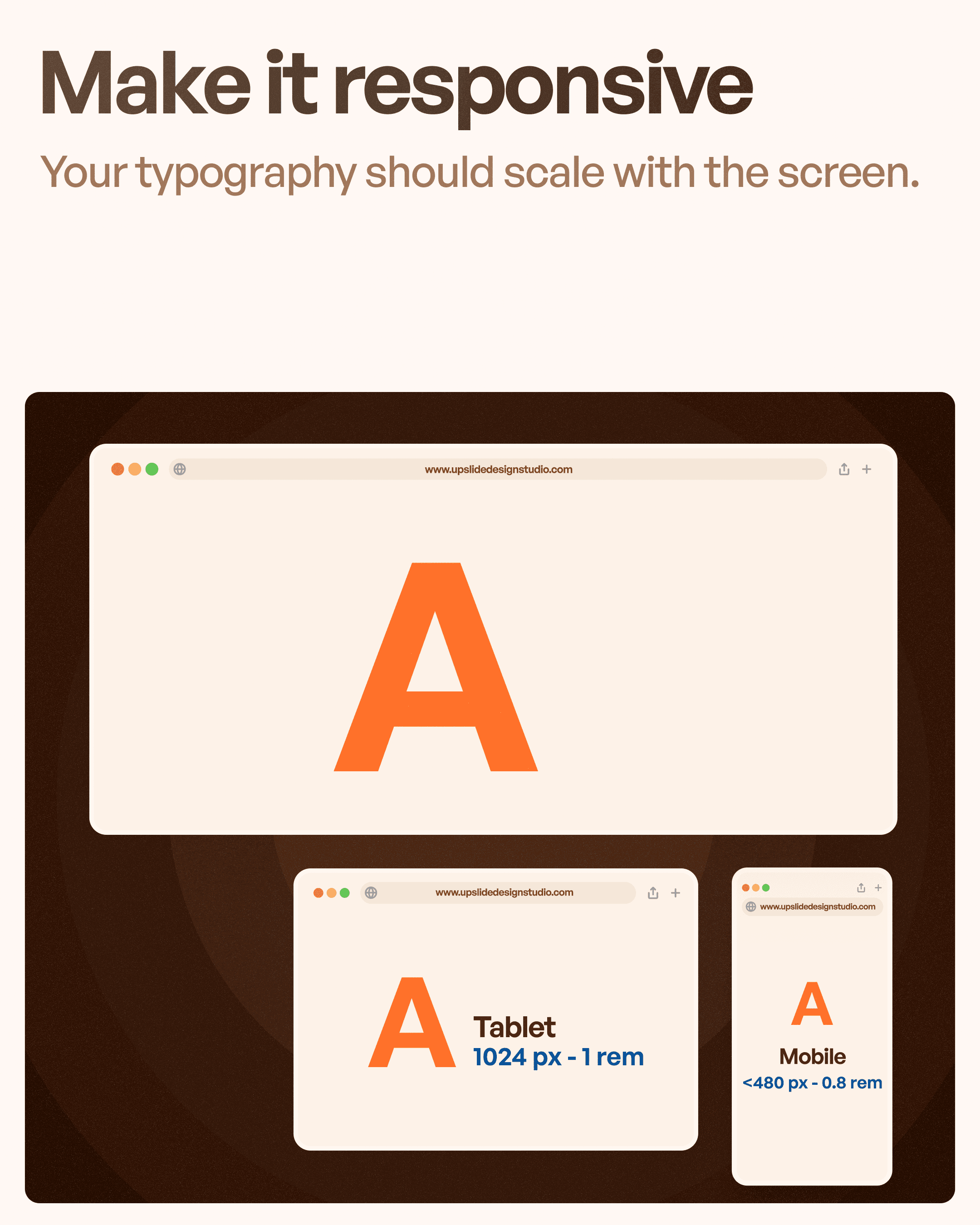
Tip 7: Make Typography Responsive
Modern digital products must work across a wide range of devices.
Typography should scale appropriately based on screen size.
A heading that works on a desktop screen may dominate a mobile layout.
Responsive typography ensures:
Better readability
Consistent hierarchy
Improved user experience
Flexible layouts
Many modern design systems now use fluid typography techniques that automatically adjust text sizes based on screen dimensions.
This creates a more adaptable user experience.
Common Typography Mistakes Designers Make
Even experienced designers occasionally make typography mistakes.
Some of the most common include:
Too Many Font Sizes
Using excessive font variations creates inconsistency.
Poor Contrast
Light gray text on white backgrounds may look modern but often hurts readability.
Weak Hierarchy
When headings and body text look similar, users struggle to scan content.
Inconsistent Line Spacing
Irregular spacing creates visual confusion.
Ignoring Mobile Readability
Typography must be tested on actual devices, not just design files.
Avoiding these mistakes can dramatically improve usability.
How Typography Impacts UX Metrics
Typography affects more than aesthetics.
It directly influences user behavior.
Good typography can improve:
Reading speed
Information retention
Task completion rates
Accessibility compliance
User satisfaction
In enterprise software, where users spend hours working inside interfaces, typography often becomes one of the most important usability factors.
Small improvements in readability can produce significant gains in productivity.
Final Thoughts
Typography is one of the foundations of great UI/UX design.
It helps users understand information, navigate interfaces, and complete tasks with confidence.
The best typography systems focus on:
Clear hierarchy
Consistent scaling
Proper contrast
Comfortable spacing
Accessibility
Responsiveness
At Upslide Design Studio, typography is viewed as a usability tool rather than a visual afterthought. Strong typography reduces cognitive load, improves readability, and creates experiences that feel clear, intuitive, and effortless.
Because in great UX design, readability is not optional—it is essential.