Why UX Laws Matter in Product Design
User experience design is more than creating beautiful screens.
Great products are built around understanding how people think, behave, and make decisions. UX laws are psychological principles that explain user behavior and help designers create interfaces that feel natural.
Companies like Uber, Airbnb, Spotify, Netflix, and Amazon rely on these principles because they improve:
User adoption
Task completion rates
Customer satisfaction
Conversion rates
User retention
Product usability
The better a product aligns with human behavior, the easier it becomes to use.
1. Aesthetic Usability Effect
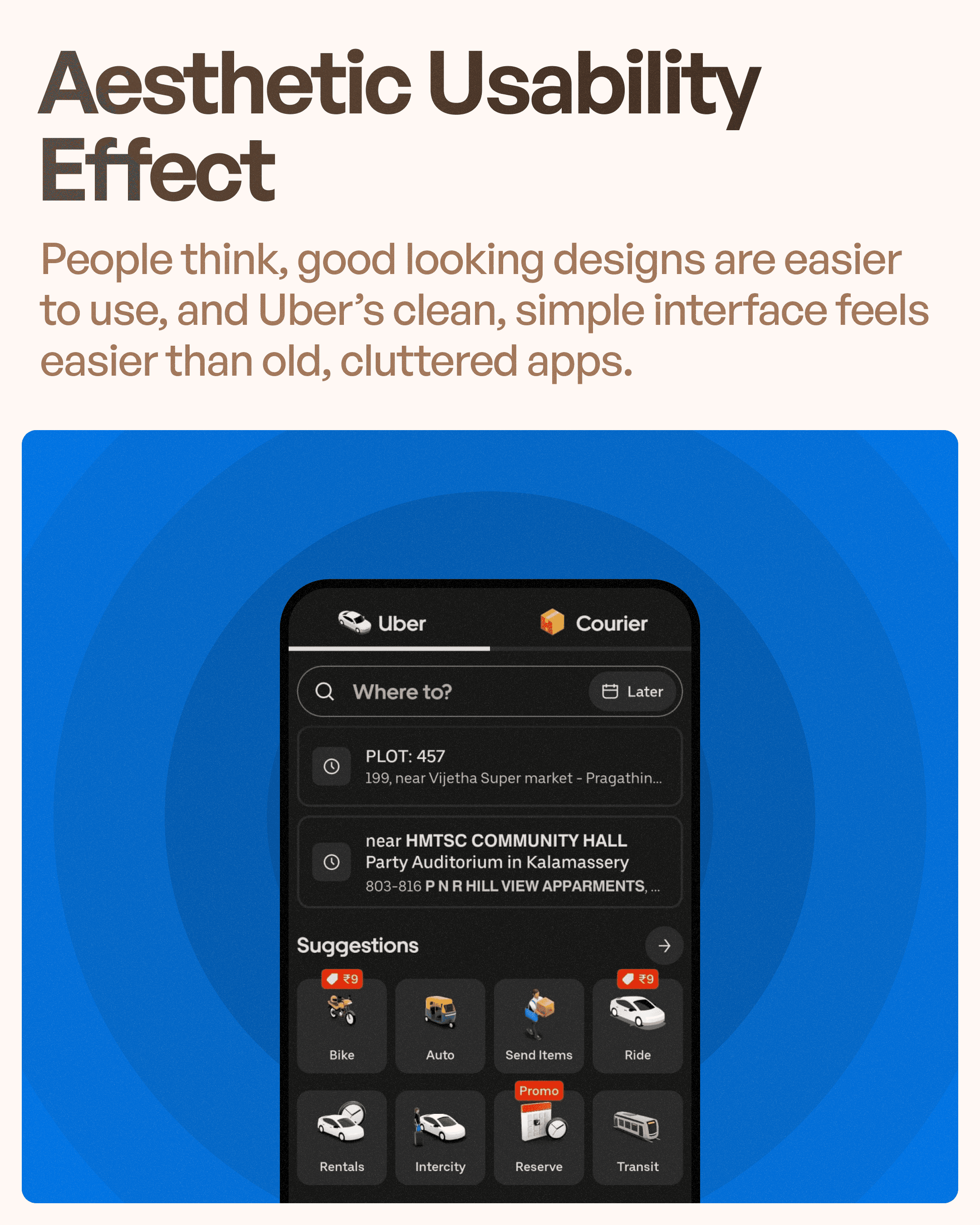
The Aesthetic Usability Effect states that users perceive visually attractive products as easier to use.
People naturally trust interfaces that look clean, modern, and organized.
Uber follows this principle through its minimalist interface design. The app avoids unnecessary clutter, maintains strong visual hierarchy, and uses consistent spacing throughout the experience.
When users open the app, they immediately feel that the system is reliable and professional.
This perception matters because users are often more forgiving of minor usability issues when the interface feels visually polished.
For SaaS applications and enterprise software, visual simplicity often becomes the first step toward building user trust.
2. Doherty Threshold
The Doherty Threshold suggests that systems should provide feedback within approximately 400 milliseconds to keep users engaged.
Users should never wonder whether the system is working.
Uber constantly communicates system status through:
Loading animations
Driver search progress
Ride confirmation updates
Route calculations
Status notifications
These small interactions reassure users that the app is responding.
Without feedback, users become uncertain and may repeat actions or abandon tasks entirely.
One of the reasons Uber feels responsive is because it continuously acknowledges user actions.
3. Fitts's Law
Fitts's Law states that the time required to interact with an element depends on its size and distance.
Important actions should be large enough and positioned within easy reach.
Uber applies this principle by placing key actions such as:
Confirm Ride
Select Vehicle
Book Ride
Payment Actions
in highly accessible locations.
Large touch targets reduce errors and make the experience faster, particularly for mobile users operating the app with one hand.
This principle is one of the most important considerations in modern mobile app UX design.
4. Hick's Law
Hick's Law explains that the more choices users have, the longer it takes them to make a decision.
Too many options create cognitive overload.
Uber solves this by simplifying ride selection.
Instead of overwhelming users with excessive information, Uber highlights:
Recommended ride options
Estimated fares
Wait times
Popular vehicle categories
This allows users to make quick decisions without analyzing unnecessary details.
By reducing decision complexity, Uber speeds up task completion and improves overall usability.
This principle is equally valuable in SaaS dashboards, pricing pages, and onboarding experiences.
5. Law of Proximity
The Law of Proximity comes from Gestalt Psychology and states that elements positioned close together are perceived as related.
Uber uses spacing strategically to organize content into meaningful groups.
For example:
Ride categories are grouped together
Payment methods are separated from trip details
Service options appear in clearly defined sections
This structure helps users understand relationships between different elements without needing additional labels.
Good spacing creates clarity.
Poor spacing creates confusion.
The Law of Proximity remains one of the most powerful principles in interface design.
6. Law of Common Region
The Law of Common Region suggests that elements placed inside the same visual boundary are perceived as belonging together.
Uber frequently uses cards, containers, and grouped sections to organize information.
Examples include:
Promotions
Membership benefits
Payment information
Trip summaries
Service recommendations
These visual boundaries help users quickly understand how content is related.
Instead of relying solely on text, Uber uses visual grouping to improve comprehension.
This makes scanning information significantly easier.
7. Jakob's Law
Jakob's Law states that users spend most of their time using other products.
As a result, they expect your product to work similarly to products they already know.
Uber follows familiar mobile interaction patterns rather than reinventing every component.
Examples include:
Standard navigation patterns
Familiar map interactions
Predictable buttons and gestures
Recognizable icons
Because users already understand these patterns, they can begin using Uber almost immediately.
This reduces learning curves and increases adoption.
Many products fail because they prioritize uniqueness over usability.
Uber succeeds because it respects existing user expectations.
8. Tesler's Law
Tesler's Law states that every system contains a certain amount of complexity that cannot be removed.
The goal is not to eliminate complexity but to manage it intelligently.
Booking a ride involves numerous behind-the-scenes processes:
Driver matching
Route optimization
Fare calculations
Payment processing
Real-time tracking
Uber hides most of this complexity from users.
Instead of forcing users to manage complicated decisions, the system handles them automatically.
The user simply focuses on:
Where they are
Where they want to go
Which ride they prefer
This is a perfect example of complexity being absorbed by the system rather than the user.
What UX Designers Can Learn from Uber
Uber demonstrates that successful UX design is not about adding more features.
It is about reducing effort.
The company applies multiple UX laws simultaneously to create a smooth experience.
The biggest lessons include:
Attractive design builds trust.
Feedback reduces uncertainty.
Accessible controls improve usability.
Fewer choices speed up decisions.
Proper grouping improves clarity.
Familiar patterns reduce learning effort.
Systems should absorb complexity whenever possible.
These principles can be applied to mobile apps, SaaS platforms, enterprise software, healthcare systems, fintech products, and almost any digital experience.
UX Laws Are the Foundation of Great Products
Many companies focus heavily on features while overlooking user psychology.
However, products become successful when they align with how people naturally think and behave.
Uber's design demonstrates how small UX decisions can create massive business impact.
Every interaction is intentionally designed to:
Reduce friction
Increase confidence
Simplify decisions
Improve efficiency
This is why studying products like Uber is valuable for designers and product teams.
The interface itself may look simple, but the thinking behind it is incredibly sophisticated.
Final Thoughts
Uber's user experience is built on far more than technology.
Its success comes from applying proven UX laws that help users navigate the platform effortlessly.
Through principles such as the Aesthetic Usability Effect, Doherty Threshold, Fitts's Law, Hick's Law, Law of Proximity, Law of Common Region, Jakob's Law, and Tesler's Law, Uber creates a product that feels intuitive, predictable, and easy to use.
For UX designers, SaaS founders, and product teams, these principles provide a framework for building products that users not only understand but enjoy using.
At Upslide Design Studio, these same UX principles guide our work when redesigning SaaS platforms, enterprise software, healthcare applications, and complex business systems. Because great user experience isn't about making things look good—it's about making things work naturally for the people who use them.