Why Icons Matter in UI/UX Design
Icons serve as visual shortcuts.
Instead of reading long labels, users can quickly recognize actions, navigation options, statuses, and features through familiar visual symbols.
Good icons help users:
Navigate interfaces faster
Identify actions instantly
Reduce reading effort
Improve visual scanning
Enhance overall usability
In modern SaaS products and enterprise software, users often interact with hundreds of screens daily. Consistent icon design helps create familiarity and speeds up task completion.
However, icons only work when they are designed systematically.
Start with a Base Grid
Every icon should begin with a grid.
A base grid acts as the foundation for maintaining consistency across an icon library. It provides structure and ensures that all icons follow the same proportions.
For example, many design systems use:
16×16 grids
20×20 grids
24×24 grids
32×32 grids
The choice depends on the product and intended usage.
Using a consistent grid ensures that icons align properly and appear visually balanced when placed together.
Without a grid, icons often end up with inconsistent sizing and uneven visual weight.
In large-scale design systems, a grid becomes essential for scalability.
Maintain Safe Space Around Icons
One common mistake in icon design is drawing elements too close to the edges.
Every icon needs breathing room.
Safe space ensures that icons retain their clarity when displayed across different screen sizes and interface components.
When icons lack sufficient spacing:
Shapes appear cramped
Details become harder to recognize
Scaling causes readability issues
Proper safe space improves visibility and ensures icons remain clear even at smaller sizes.
This principle becomes especially important in mobile app design, where icons are often displayed in compact spaces.
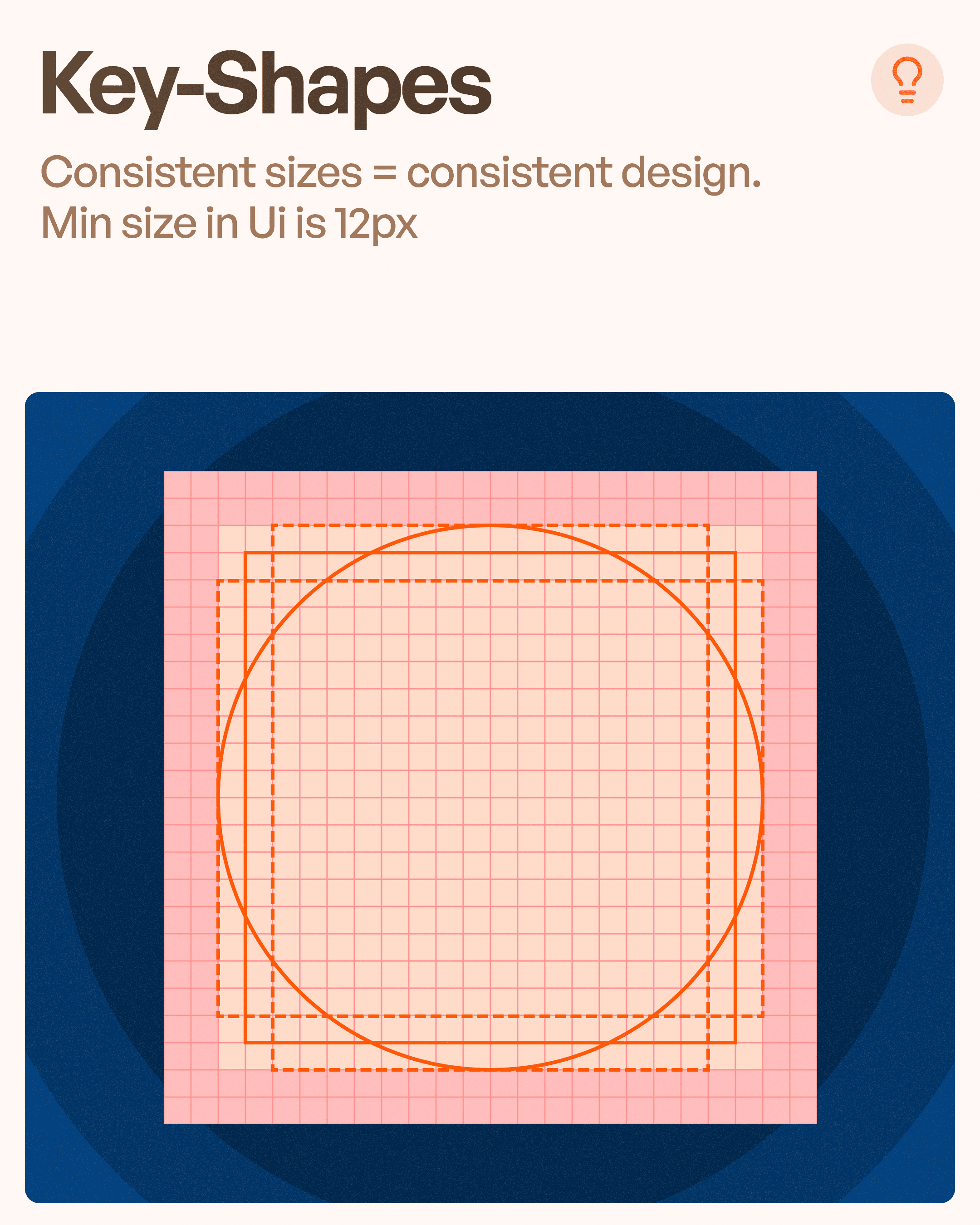
Use Consistent Key Shapes
Strong icon systems are built around a limited set of geometric shapes.
Common foundations include:
Circles
Squares
Rectangles
Triangles
These shapes create visual consistency across the icon library.
For example, if one icon is built inside a circular structure while another uses completely different proportions, they may feel disconnected even if they technically represent different actions.
Consistency in key shapes creates harmony throughout the interface.
This makes the design feel more intentional and easier for users to understand.
Keep Stroke Width Consistent
Stroke width is one of the most overlooked aspects of icon design.
When stroke thickness varies significantly between icons, the entire icon set begins to look inconsistent.
A strong design system defines a standard stroke width.
For example:
1.5px stroke
2px stroke
2.5px stroke
The selected stroke weight should remain consistent across:
Curves
Straight lines
Internal details
External outlines
Consistent strokes create visual balance and improve icon recognition.
Users may not consciously notice stroke inconsistencies, but they will feel the lack of polish.
Standardize Corner Radius
Corner radius plays a significant role in icon personality.
Rounded corners create a softer and more approachable appearance.
Sharp corners often feel technical, professional, or industrial.
The key is consistency.
If one icon uses heavily rounded corners while another uses sharp angles, the icon set begins to lose cohesion.
Most successful design systems define:
Corner radius values
Radius usage rules
Shape consistency standards
This ensures that every icon feels like part of the same visual family.
Follow Consistent Angles
Angles are another subtle yet important aspect of icon design.
Many design systems establish specific angle rules such as:
45°
30°
60°
Using consistent angles helps create harmony across the icon library.
For example, if one icon uses a 45-degree diagonal line while another uses arbitrary angles, the visual rhythm becomes inconsistent.
Angle consistency improves:
Recognition
Scalability
Professional appearance
Design system integrity
Small details like this separate amateur icon sets from professional ones.
Design Icons as a System, Not Individually
One of the biggest mistakes designers make is treating every icon as a separate illustration.
Icons should be designed as a unified system.
When creating an icon library, ask:
Do all icons share the same stroke width?
Are corner radii consistent?
Do they use the same grid?
Are shapes constructed similarly?
Is spacing standardized?
A successful icon library feels connected.
Users should recognize that every icon belongs to the same product ecosystem.
Companies like Apple, Google, Microsoft, and Figma invest heavily in maintaining icon consistency because it directly affects usability and brand perception.
How Icon Consistency Improves User Experience
Users often interact with icons before reading text.
Consistent icons improve UX by:
Increasing recognition speed
Reducing cognitive load
Improving navigation
Supporting accessibility
Creating trust through visual consistency
In enterprise software environments, where users complete repetitive tasks daily, these improvements can significantly impact efficiency.
Good icon design is not simply about aesthetics.
It is about communication.
Common Icon Design Mistakes
Many interfaces suffer from avoidable icon design problems.
These include:
Mixed Stroke Widths
Icons appear unrelated and inconsistent.
Inconsistent Corner Radius
Creates visual imbalance across the system.
No Grid Structure
Results in irregular sizing and poor alignment.
Different Visual Styles
Mixing outline, filled, and detailed icons without purpose confuses users.
Lack of Safe Space
Makes icons difficult to recognize at smaller sizes.
Avoiding these mistakes creates a cleaner and more professional user experience.
Building a Scalable Icon Design System
As products grow, icon libraries often expand from a few icons to hundreds.
Without clear guidelines, maintaining consistency becomes nearly impossible.
A scalable icon design system should document:
Grid size
Stroke width
Corner radius
Spacing rules
Angle standards
Export specifications
This allows designers and developers to create new icons without breaking visual consistency.
For SaaS products, enterprise software, and mobile applications, a strong icon system becomes a critical part of the overall design system.
Final Thoughts
Perfect icons are not created by chance.
They are created through structure, consistency, and design system thinking.
By focusing on principles such as base grids, safe space, key shapes, stroke consistency, corner radius, and angle alignment, designers can create icon libraries that are both visually appealing and highly functional.
At Upslide Design Studio, icon design is treated as a fundamental part of UI/UX design because even the smallest interface elements contribute to the overall user experience.
The best icons are not necessarily the most detailed or artistic.
They are the ones users instantly understand.
And in UX design, clarity always wins.