What Is a Grid System in UI Design?
A grid system is a framework used to align interface elements consistently across screens. It helps designers organize text, images, buttons, cards, and components into predictable structures.
Think of grids as the architectural blueprint behind digital products.
Without grids:
Interfaces feel inconsistent
Alignment becomes messy
Scanning information gets harder
Responsive behavior breaks
With proper grids:
Layouts feel balanced
Navigation improves
Content becomes easier to consume
Products scale more efficiently
Good grid systems improve both visual design and usability.
Understanding Basic Grid Terminology
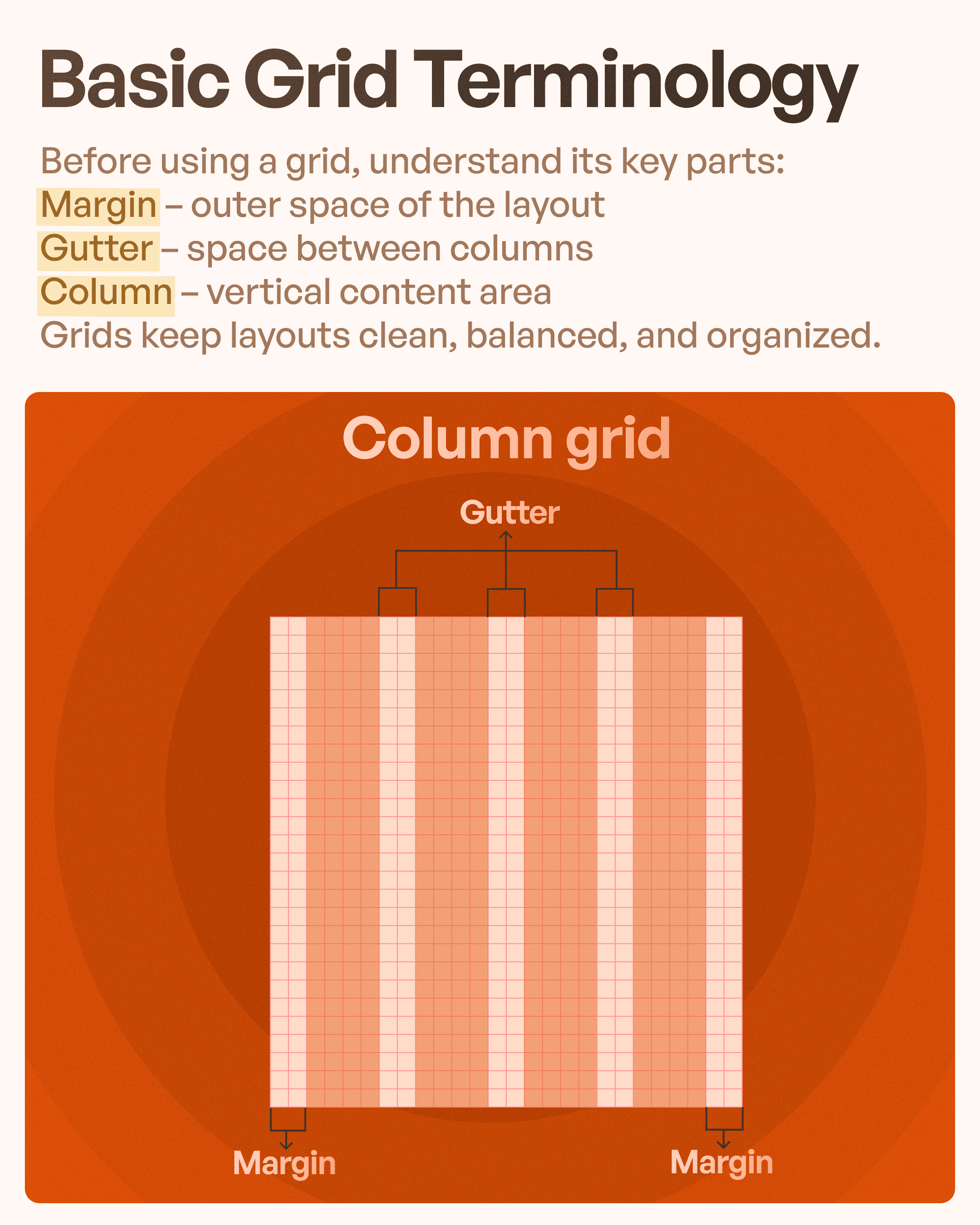
Before implementing grids, designers should understand several foundational concepts:
Margin
Margins are the outer spaces around a layout. They prevent content from touching screen edges and create breathing room.
Proper margins improve readability and visual comfort.
Gutter
Gutters refer to spacing between columns.
Without adequate gutter spacing, interfaces appear crowded and difficult to scan.
Column
Columns divide content into vertical sections.
Designers place components within columns to create alignment and maintain structure.
Together, margins, gutters, and columns build organized layouts.
Understanding these basics is crucial for effective UI layout design.
Why Device Dimensions Matter in UI Design
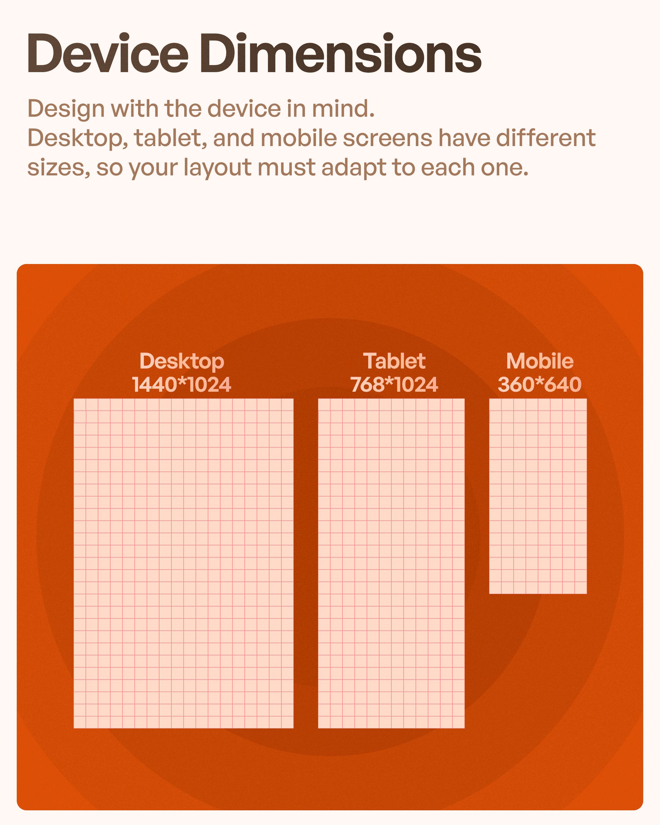
One interface rarely fits all devices.
A design that works perfectly on desktop may become unusable on mobile.
Responsive products require layouts that adapt to varying screen sizes.
Common screen categories include:
Desktop interfaces
Tablet layouts
Mobile applications
Designers must consider:
Screen width.
Touch interaction.
Content density.
Navigation patterns.
This is why responsive UI design depends heavily on flexible grid systems.
Number of Columns: Why Different Devices Need Different Grids
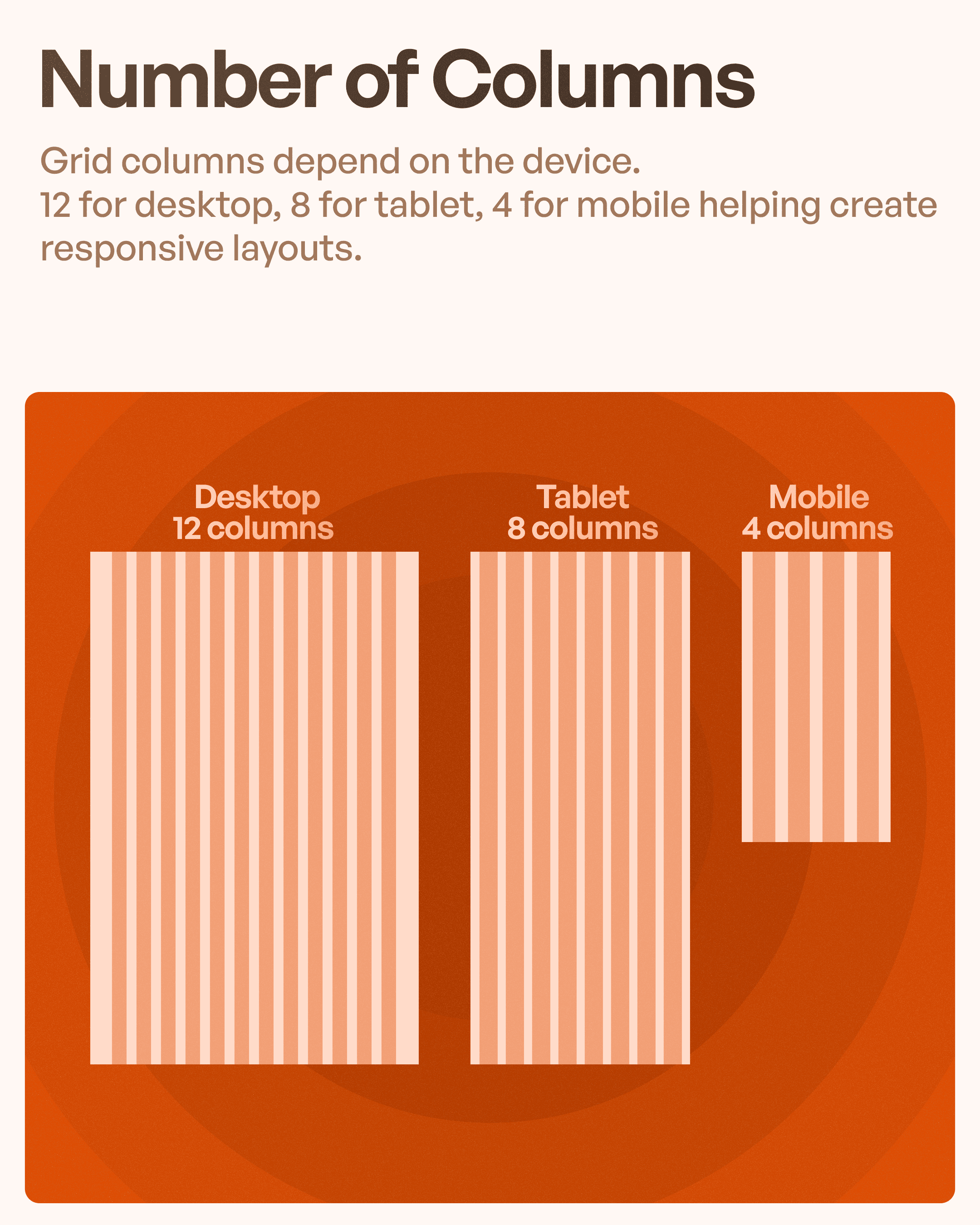
Column count changes depending on device type.
Typically:
Desktop → 12-column grid
Tablet → 8-column grid
Mobile → 4-column grid
A 12-column grid system remains popular because it allows flexible combinations.
For example:
A dashboard may use:
6 + 6 columns
4 + 4 + 4 columns
8 + 4 columns
This adaptability helps teams design scalable products.
Responsive column structures improve consistency across devices.
Which is critical for modern UX design systems.
Understanding the 4pt Grid System
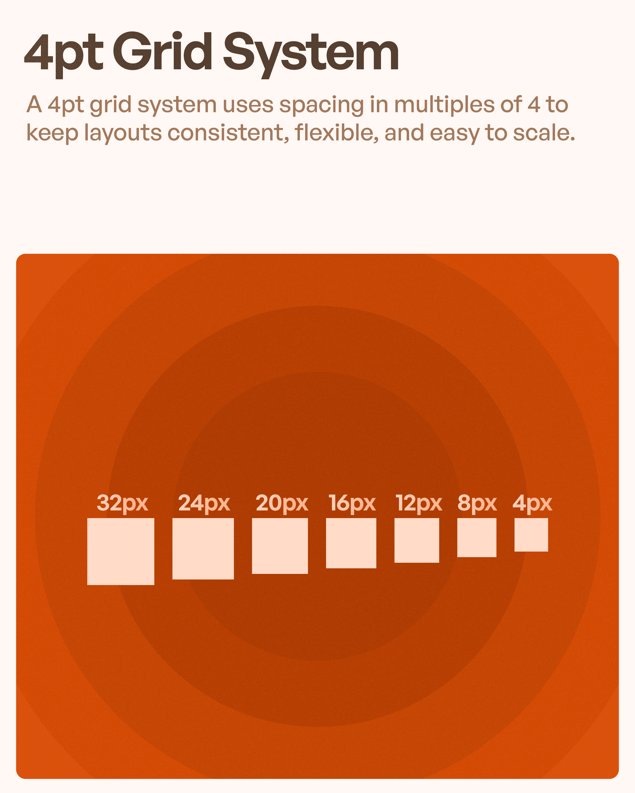
One widely used spacing approach in UI design is the 4-point grid system.
The concept is simple:
Spacing values follow multiples of four.
Examples:
4px → 8px → 12px → 16px → 20px → 24px → 32px
This creates predictable spacing between:
Cards
Buttons
Inputs
Text blocks
Sections
The result is cleaner interfaces and easier scalability.
Design systems built around consistent spacing reduce visual chaos.
Many modern products rely heavily on spacing frameworks for this reason.
Soft Grid vs Hard Grid in UI Design
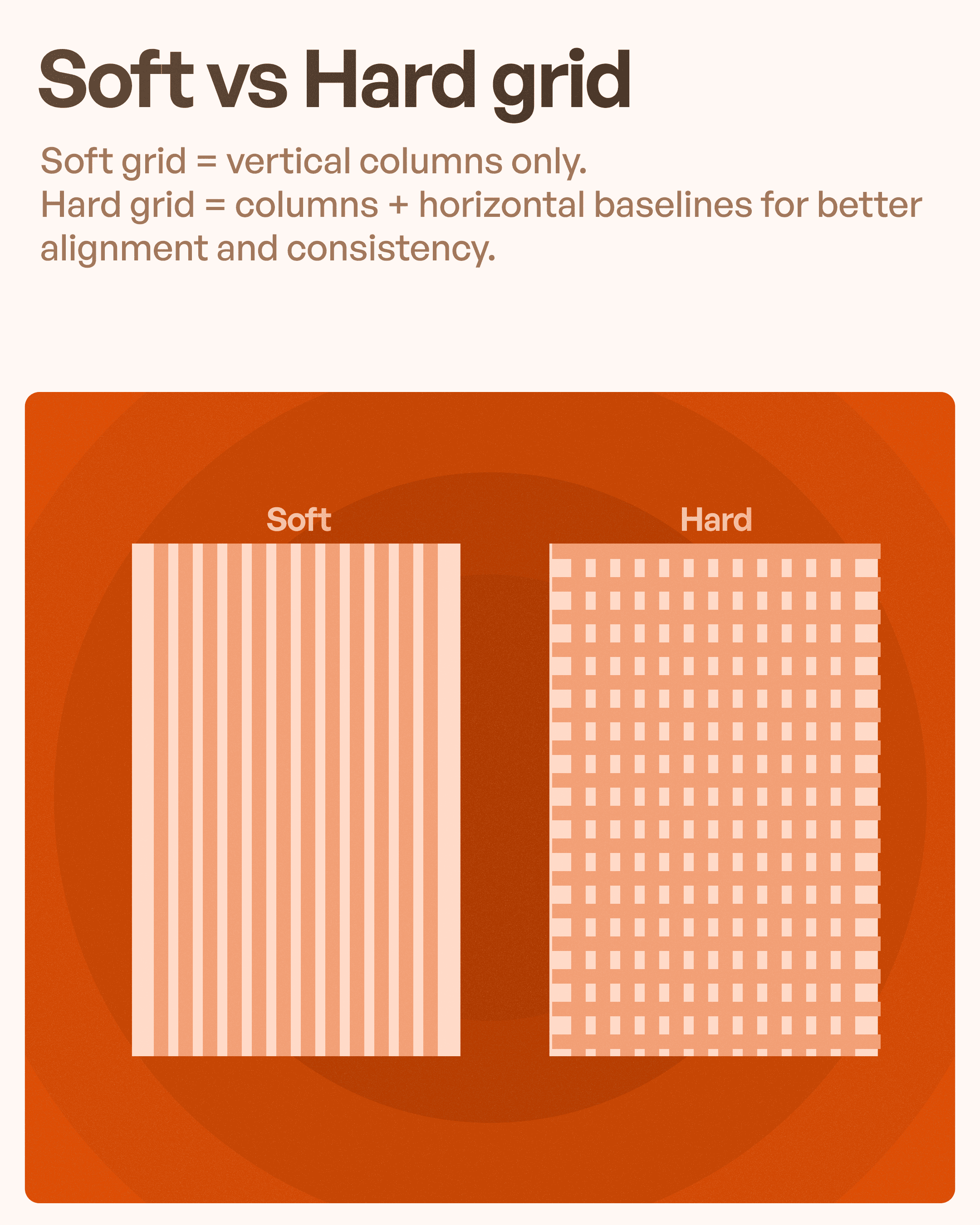
Grid systems can generally be divided into two categories:
Soft Grid
A soft grid primarily uses vertical columns.
This provides flexibility and works well during early exploration phases.
Hard Grid
Hard grids combine:
Vertical columns
Horizontal baselines
This creates stricter alignment systems.
Hard grids are useful for:
Enterprise software
Data-heavy dashboards
Design systems
Large-scale products
Structured environments benefit from stronger consistency.
Grid Systems and Design Systems Work Together
Modern digital products increasingly rely on design systems.
Design systems include:
Typography, Components, Colors, Icons, Spacing & Layout rules.
Grid systems become the foundation supporting all of these elements.
Without layout consistency, maintaining products across multiple teams becomes difficult.
Common Mistakes Designers Make With Grids
Even experienced designers occasionally misuse grids.
Common problems include:
Ignoring margins.
Inconsistent spacing.
Overcrowded columns.
Designing only for desktop.
Breaking alignment patterns.
These issues gradually reduce interface quality.
Good UI rarely happens accidentally—it depends on systematic decisions.
How Better Grid Usage Improves UX
A strong grid system impacts more than aesthetics.
It affects business outcomes through:
Faster task completion
Better readability
Reduced confusion
Improved usability
Easier onboarding
Higher product consistency
Users complete actions faster when interfaces feel predictable.
Predictability builds confidence.
Confidence improves experience.
Final Thoughts: Great UI Starts With Invisible Structure
The best-designed products often share one characteristic:
They feel effortless.
Behind that effortlessness is usually a carefully built structure powered by grids, spacing systems, and consistent alignment.
Learning grid systems may not seem exciting compared to animations or visual trends.
But grids create the foundation that makes every other design decision stronger.
For designers looking to improve UI design skills, responsive layouts, or design systems thinking, understanding grids is one of the highest-leverage skills to develop.
Because before beautiful interfaces come structure.
And before structure comes the grid.