

Featured Snippet Optimized Intro
Batch Manufacturing Record (BMR) systems often fail not because of missing features, but because of poor workflow design. Long processes, disconnected screens, and manual coordination create confusion, increase errors, and slow down operations. This case study explains how a structured UX approach transformed a fragmented BMR system into a guided, efficient workflow.
The Problem: When Workflows Depend on Memory Instead of System Design
In most pharmaceutical and manufacturing environments, BMR systems are expected to ensure accuracy, traceability, and compliance. However, in reality, many systems rely heavily on manual coordination, spread workflows across disconnected screens, and force users to remember steps instead of guiding them.
In this case, production and QA teams were constantly switching contexts, coordinating offline, and clarifying steps outside the system. This increased the chances of human error, delayed review and approval cycles, and created a strong dependency on external communication.
The system existed, but the workflow did not.

Root Cause: Long Workflows Without Structural Guidance
Through a detailed UX audit and workflow analysis, the core issue became clear: the system was not designed around how teams actually work.
Workflows were broken into scattered screens with no clear sequence of actions. There was little visibility into progress and stages, and users had to repeatedly check information due to lack of context. As a result, users were constantly asking what to do next, who needed to act, and where tasks were stuck.
When users ask these questions, the UX has already failed.
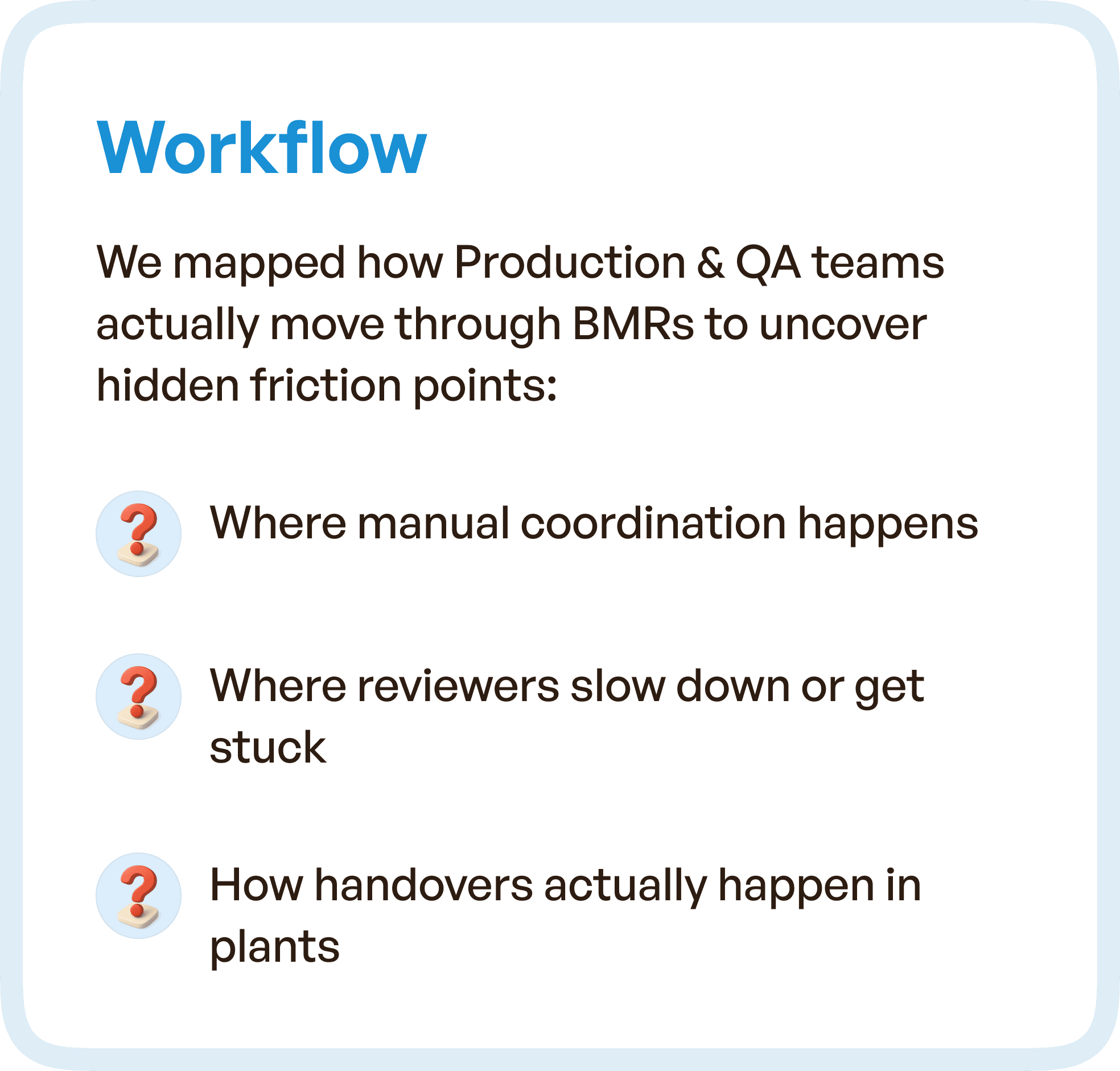
Understanding Real Workflows in BMR Systems
Instead of redesigning screens in isolation, the focus shifted to understanding real-world workflows.
We mapped how Production and QA teams actually move through the BMR lifecycle.
This revealed:
Where manual coordination happens
Where reviewers slow down or get stuck
How handoffs occur between teams
These insights uncovered hidden friction points that were not visible at a UI level.
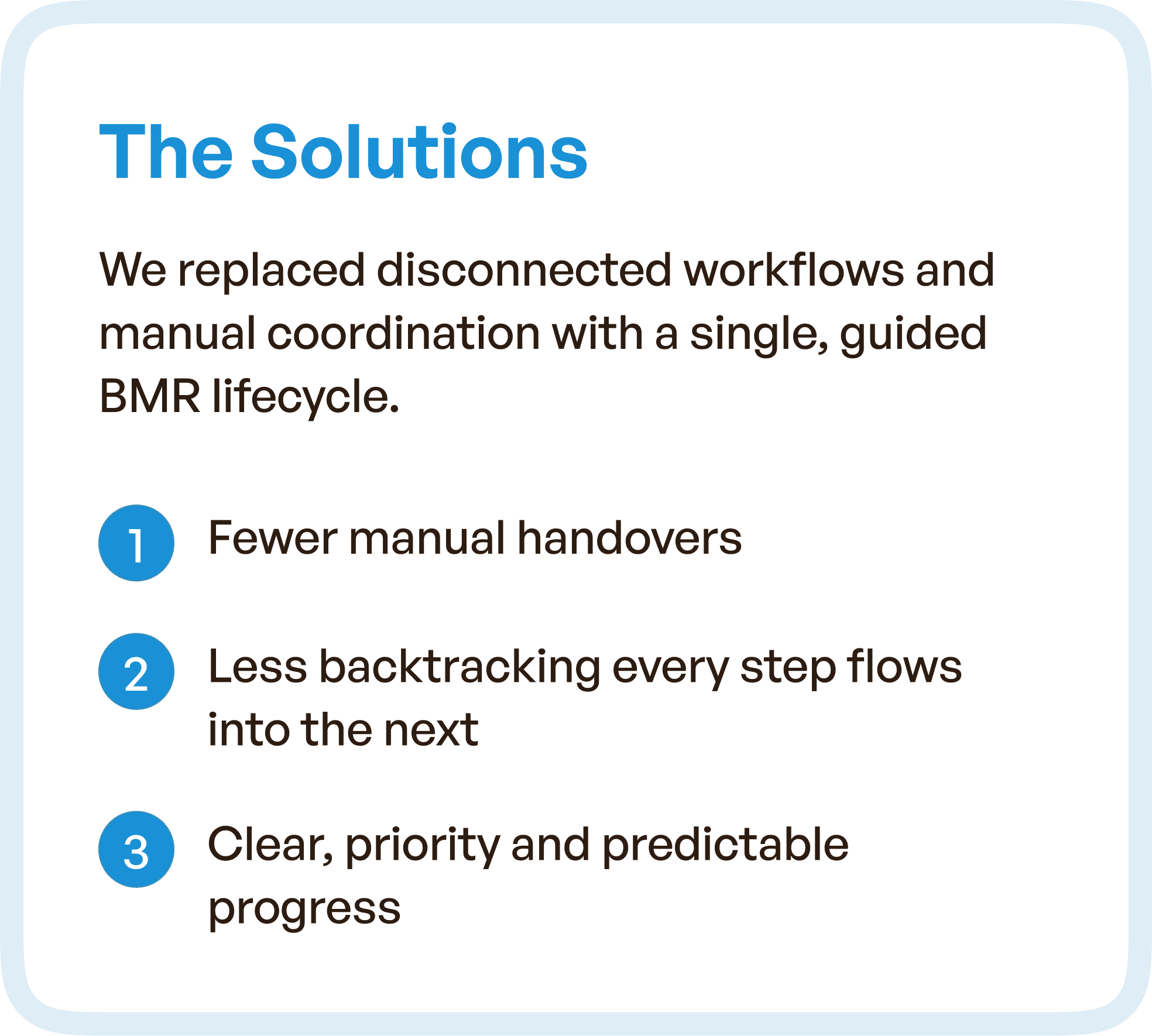
The Solution: From Disconnected Screens to a Guided BMR Lifecycle
The redesign focused on transforming the system into a single, connected workflow.
Instead of forcing users to navigate across multiple screens, the system now:
Follows a structured lifecycle approach
Connects each step logically to the next
Reduces dependency on external coordination
Key Improvements
Fewer manual handovers between teams
Reduced backtracking between steps
Clear, predictable progression across the workflow
The system started guiding users — instead of users figuring it out.
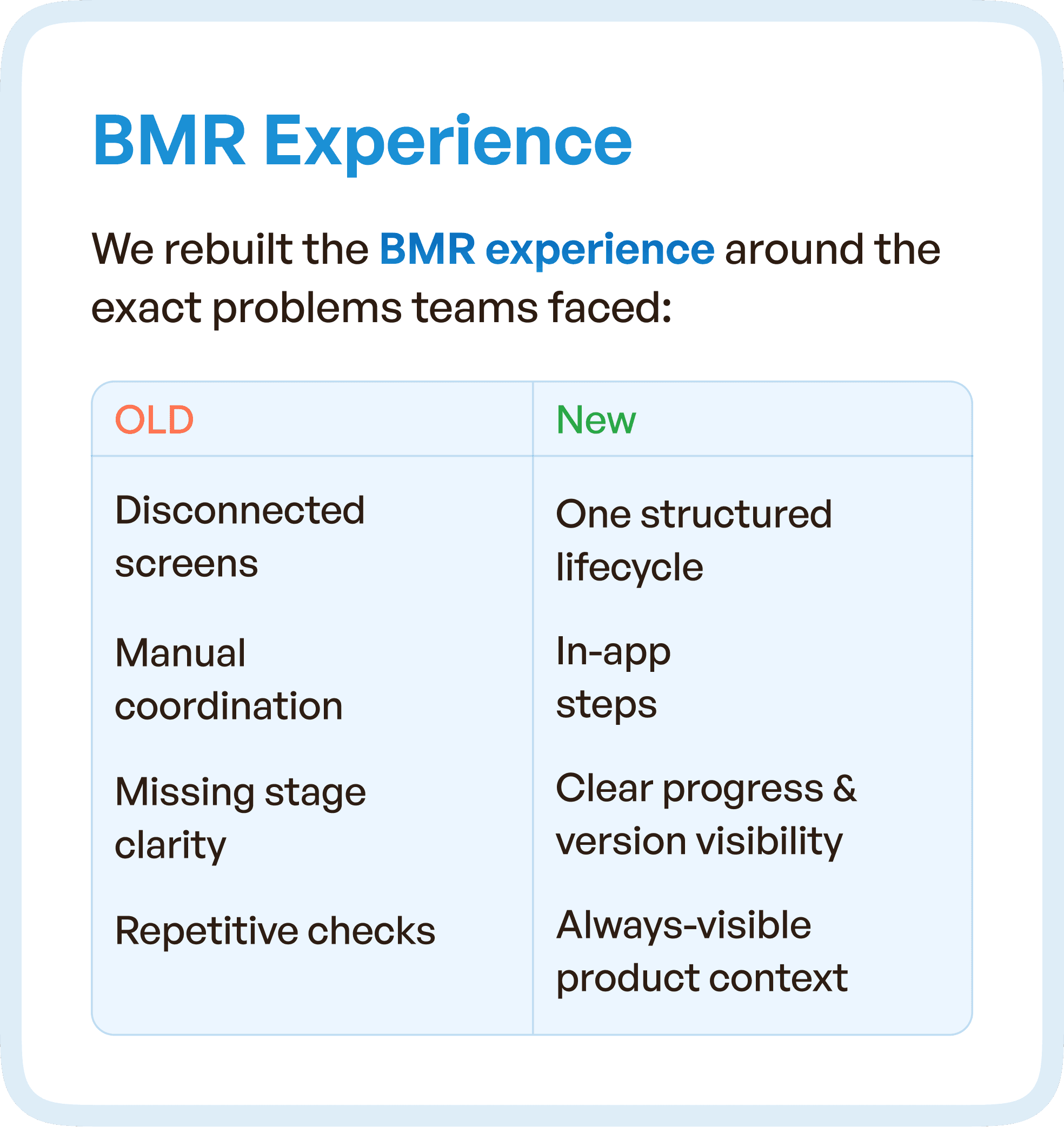
Rebuilding the BMR Experience Around Real Problems
The redesign directly addressed real usage issues by shifting from fragmented interactions to a unified experience.
Previously, users dealt with disconnected screens, manual coordination, missing stage clarity, and repetitive checks. After the redesign, the system offered a structured lifecycle with guided steps, clear progress visibility, and always-visible context.
This shift removed friction at every stage.
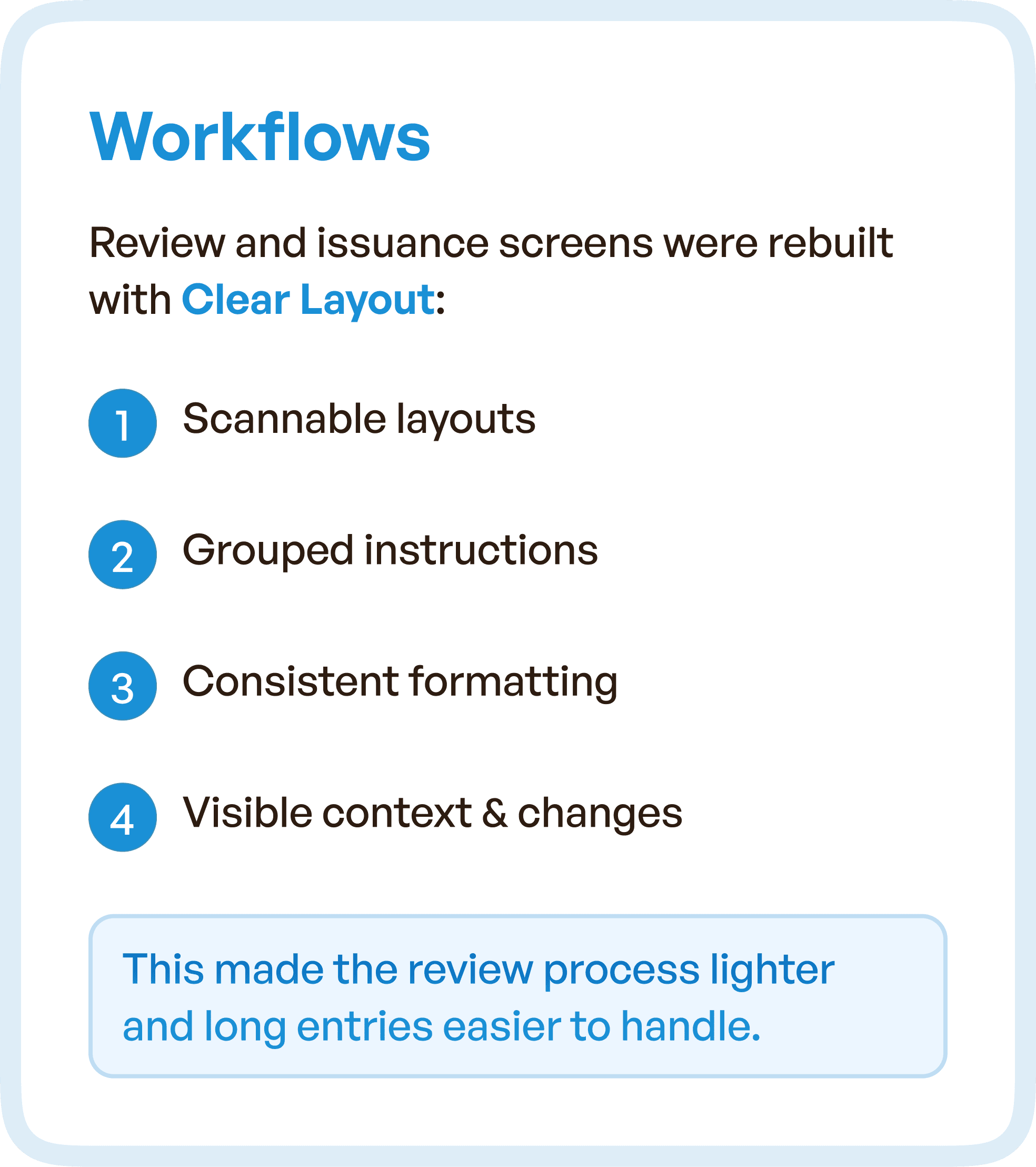
Simplifying Review and Issuance Workflows
One of the most critical improvements was in the review and issuance process. The interface was redesigned to support faster scanning, reduced cognitive load, and predictable interactions.
Information was grouped logically, formatting was standardized, and context was always visible. This made long entries easier to handle and allowed reviewers to act faster with greater confidence.
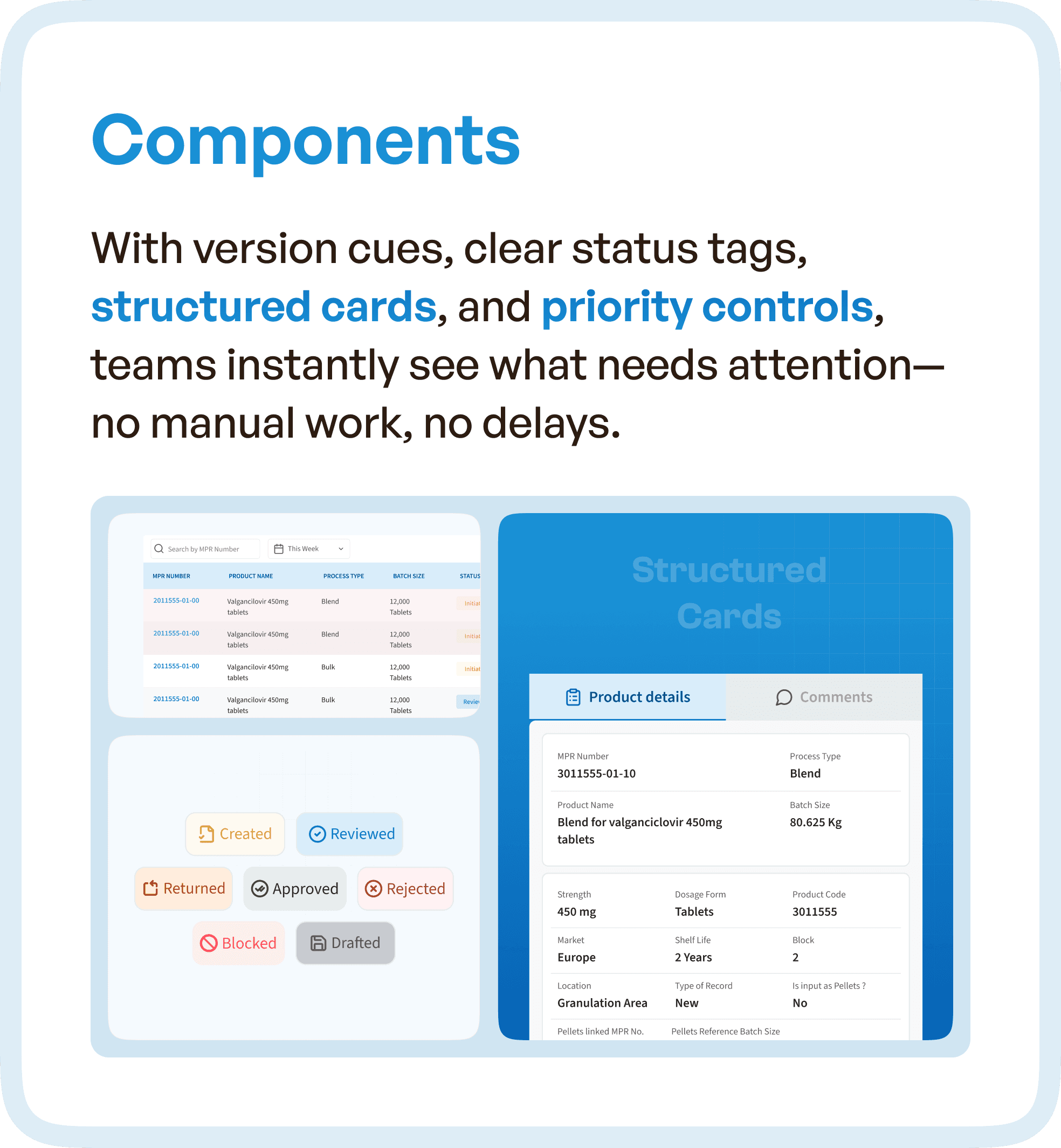
Smarter Components for Faster Decision-Making
To further improve efficiency, structured UI components were introduced. Version tracking, clear status indicators, and organized information cards helped users quickly understand what had changed and what required attention.
Instead of relying on manual checks, users could instantly identify the next action.
The Impact: From Coordination-Heavy to System-Driven Workflow
The redesigned system aligned with real operational behavior. Users no longer depended on manual coordination or memory. Instead, the system provided clear guidance at every step.
This resulted in faster review cycles, reduced cognitive load, improved workflow clarity, and increased user confidence. Most importantly, the system became reliable enough for users to trust.
Why This Matters for Enterprise and Pharma Software
This case highlights a common issue in enterprise systems:
Adding features is easy. Structuring workflows is hard.
Many systems fail because they:
Grow over time without restructuring
Prioritize features over usability
Ignore real user workflows
The solution is not a visual redesign.
It is architectural UX correction.
How Upslide Design Studio Approaches BMR UX Optimization
At Upslide Design Studio, we focus on:
Mapping real-world workflows across roles
Identifying breakdowns in system structure
Redesigning experiences around user behavior
Building scalable design systems for consistency
This ensures that systems are not just usable — but efficient, reliable, and scalable.
Final Thought
If your system requires constant coordination, reminders, and clarifications, the issue is not your team.
The issue is the workflow design.


