
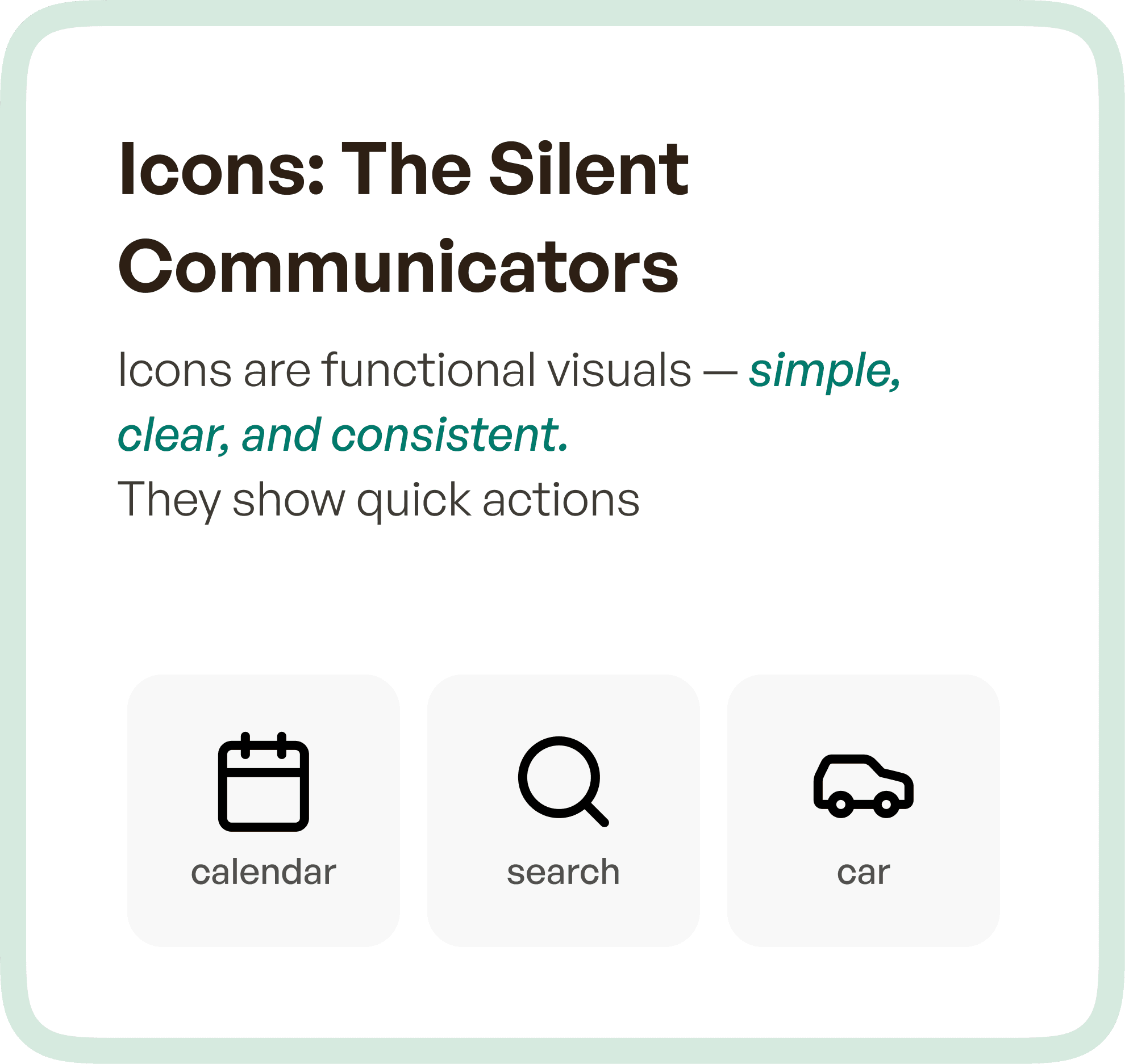
What Icons Represent in UX
Icons are designed for efficiency.
They are compact visual representations of actions, objects, or concepts that users can quickly recognize without needing to read text. Their primary role is to support interaction by reducing cognitive load.
In most digital products, icons appear in:
Navigation menus
Action buttons
Toolbars
Dashboards
A well-designed icon communicates meaning instantly. It does not explain — it signals.
For example, a search icon, a calendar icon, or a settings icon allows users to act immediately because the meaning is already familiar.
The strength of icons lies in three qualities:
Simplicity
Consistency
Recognizability
When these are achieved, icons significantly improve speed and usability across the interface.
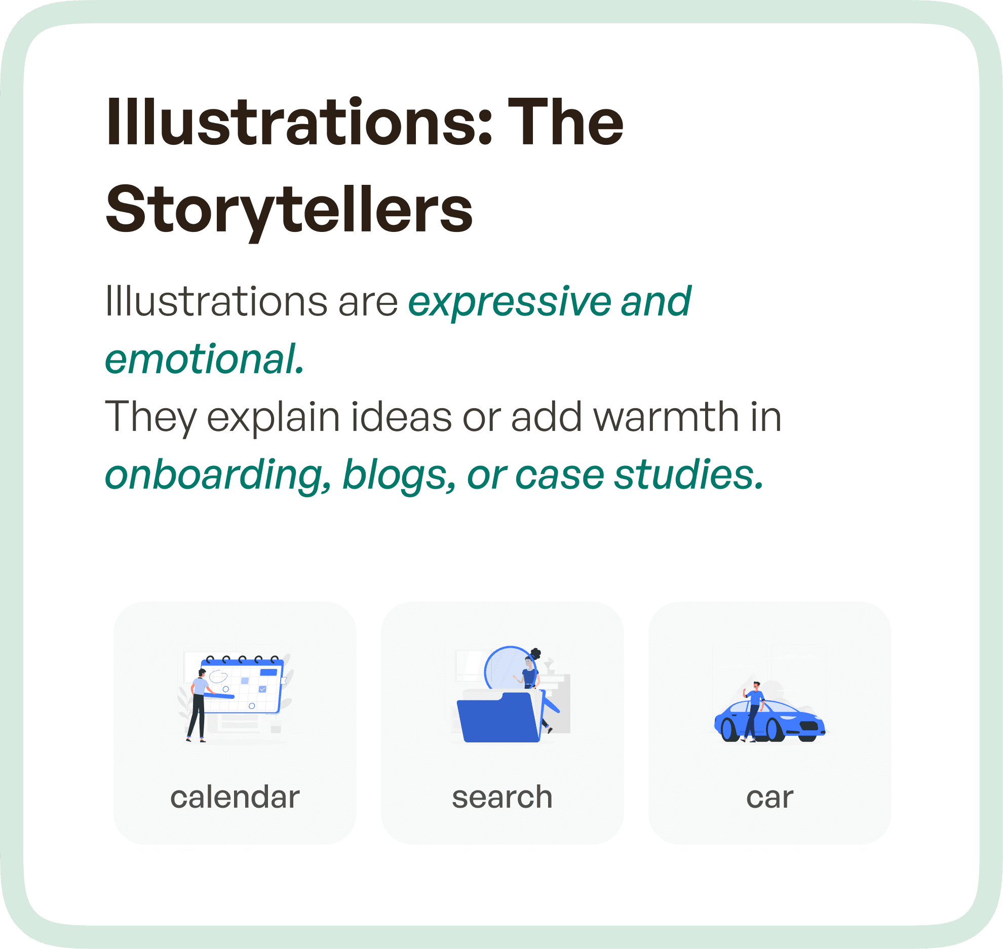
What Illustrations Do in UX
Illustrations serve a fundamentally different role.
They are not designed for speed.
They are designed for communication and expression.
Illustrations help users understand context, reduce ambiguity, and create emotional connection within the product experience. They are commonly used in:
Onboarding flows
Empty states
Marketing pages
Case studies
Feature explanations
Unlike icons, illustrations are not repeated as functional elements. Instead, they are used selectively to enhance understanding or reinforce brand personality.
They add depth to the experience by making complex ideas easier to grasp and interactions more engaging.
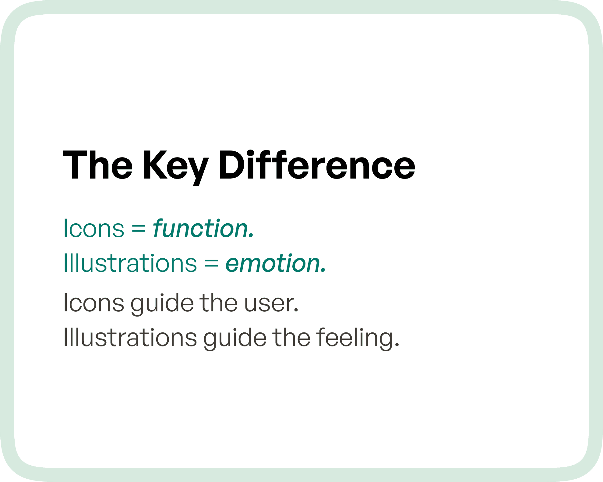
The Core Difference: Function vs Communication
The distinction between icons and illustrations comes down to intent.
Icons are used when the user needs to act quickly.
Illustrations are used when the user needs to understand or feel something.
Icons support interaction.
Illustrations support interpretation.
This difference becomes especially important in SaaS and enterprise products, where users interact with systems frequently and expect clarity at every step.
Why Misusing Icons and Illustrations Creates UX Problems
One of the most common issues in UI design is using visuals without defining their role.
When illustrations are used in functional areas where icons should be used, interfaces become visually heavy and slow to interpret. Users are forced to process more information than necessary, which increases cognitive load.
On the other hand, when icons are used in situations that require explanation, users are left guessing. Without context, icons alone may not provide enough clarity, especially for new or complex features.
This mismatch leads to:
Confusion during navigation
Slower task completion
Increased reliance on training or support
In enterprise environments, these inefficiencies compound over time and directly impact productivity.
How to Decide Between Icons and Illustrations
The decision should not be based on visual preference, but on user intent and context.
If the goal is to enable quick actions and repeated interactions, icons are the right choice. They help users move faster and reduce dependency on text.
If the goal is to explain, guide, or create engagement, illustrations are more effective. They provide context and make the experience more intuitive, especially in unfamiliar flows.
A simple way to think about it:
If the user needs to do something, use an icon
If the user needs to understand something, use an illustration
This clarity ensures that every visual element contributes meaningfully to the overall experience.
The Role of Icons and Illustrations in Design Systems
In scalable products, especially SaaS platforms, both icons and illustrations must be treated as part of a structured design system.
Icons should follow strict rules around:
Size and proportions
Stroke or fill consistency
Alignment and spacing
Usage patterns across screens
This ensures predictability and familiarity.
Illustrations, while more flexible, should still align with:
Brand tone and style
Color system
Visual language
When both are systemized correctly, the product achieves a balance between functional clarity and emotional engagement.
How Upslide Design Studio Approaches Visual Elements
At Upslide Design Studio, icons and illustrations are not treated as decorative layers.
They are considered functional components of the product experience.
Icons are designed to simplify workflows and reduce friction in high-frequency interactions. They ensure that users can navigate complex systems with minimal effort.
Illustrations are used strategically to enhance communication, support onboarding, and strengthen brand identity without interfering with usability.
This structured approach allows products to be both efficient and expressive, without compromising on clarity.
Why This Matters for SaaS and Enterprise Products
In complex applications, users are often performing critical tasks under time constraints. Every additional second spent understanding the interface adds friction.
Icons help reduce this friction by enabling fast recognition and action.
Illustrations, when used correctly, reduce uncertainty and improve comprehension, especially in non-repetitive or exploratory scenarios.
Together, they contribute to:
Improved task efficiency
Better user confidence
Higher product adoption
Reduced support dependency
When used incorrectly, they do the opposite.
Final Thoughts
Icons and illustrations are often grouped together as visual elements.
But in practice, they solve entirely different problems.
Icons bring speed and clarity.
Illustrations bring meaning and connection.
The key is not choosing one over the other, but understanding when and where each should be used.
Because in UX design, every element should serve a purpose.
And when visuals are aligned with intent, the entire product becomes easier to use, easier to understand, and ultimately more successful.


