
Why Software Must Continuously Evolve?
In today’s fast paced digital landscape, software cannot remain static. User expectations, technologies, and behaviors evolve constantly and products must evolve with them to stay relevant and usable.
Continuous updates are not about frequent change for its own sake. They are about improving usability, reducing friction, and aligning workflows with how users actually operate over time.
Design Optimization as a Growth Lever
Well-optimized design directly impacts user experience and business growth.
By refining workflows, improving information architecture, and simplifying interactions, products become easier to use and more efficient. Identifying when an update is necessary requires a careful evaluation of how design decisions affect usability, accessibility, and task completion.
Incremental Updates, Long-Term Impact
Rather than large, disruptive redesigns, many successful products rely on continuous assessment and staged improvements.
This approach:
Ensures smoother transitions
Reduces user disruption
Maximizes the impact of each enhancement
WhatsApp is a strong example of how this strategy works in practice.
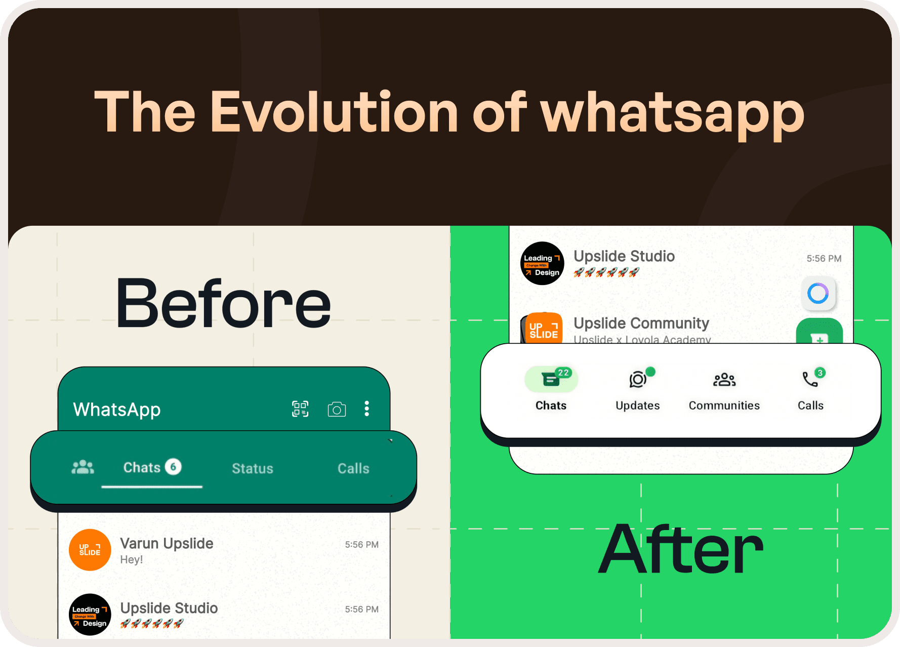
WhatsApp Case Study: Evolution Through Subtle Change
Have you noticed how WhatsApp has changed over time without ever feeling unfamiliar?
With billions of users worldwide, WhatsApp has evolved from a simple chat-and-call application into a multi-functional platform supporting Communities, Status updates, business tools, and more. Despite this expansion, the app has consistently preserved intuitive navigation and familiarity.
One of the most significant shifts came through navigation optimization improving accessibility while maintaining core functionality.
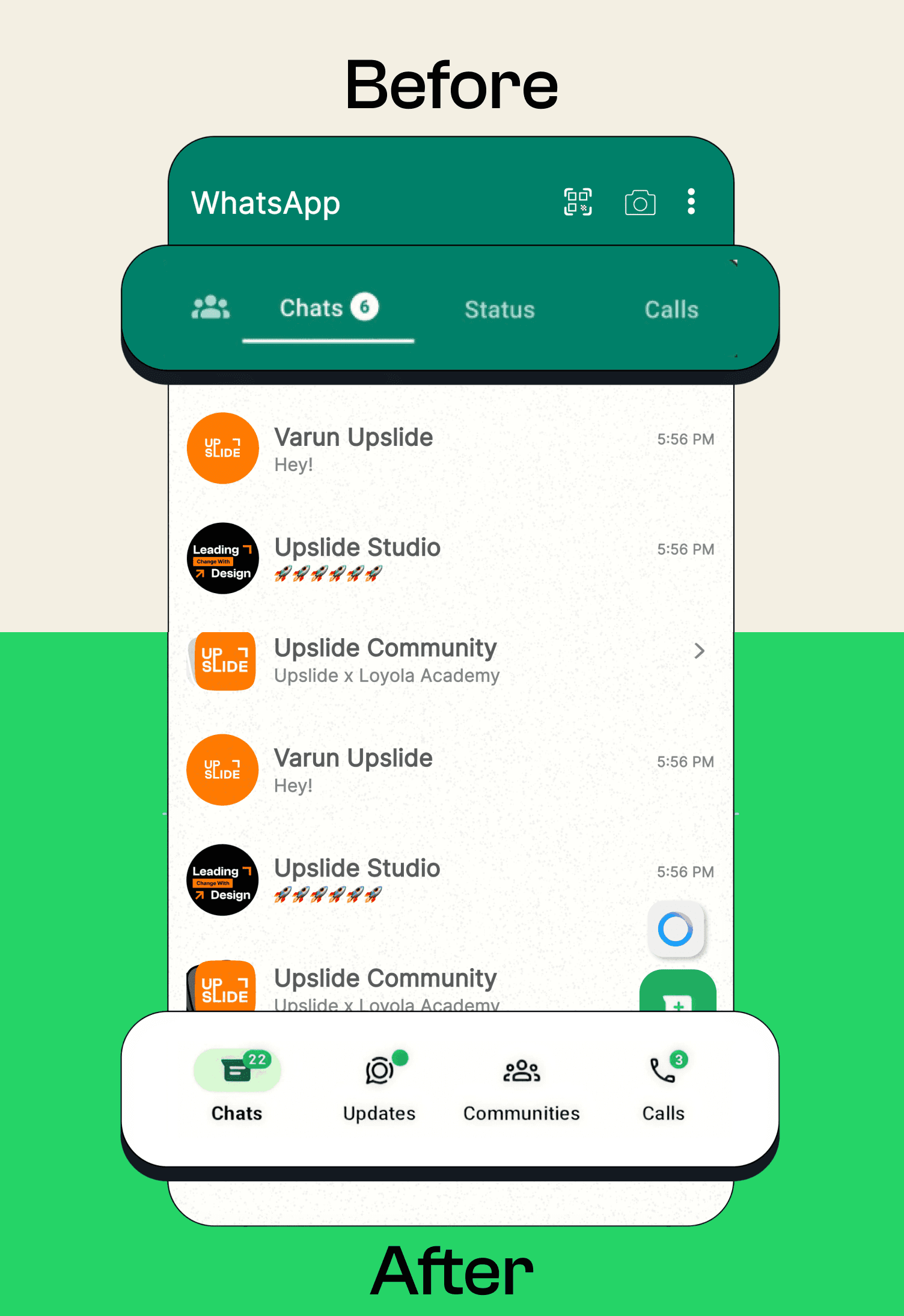
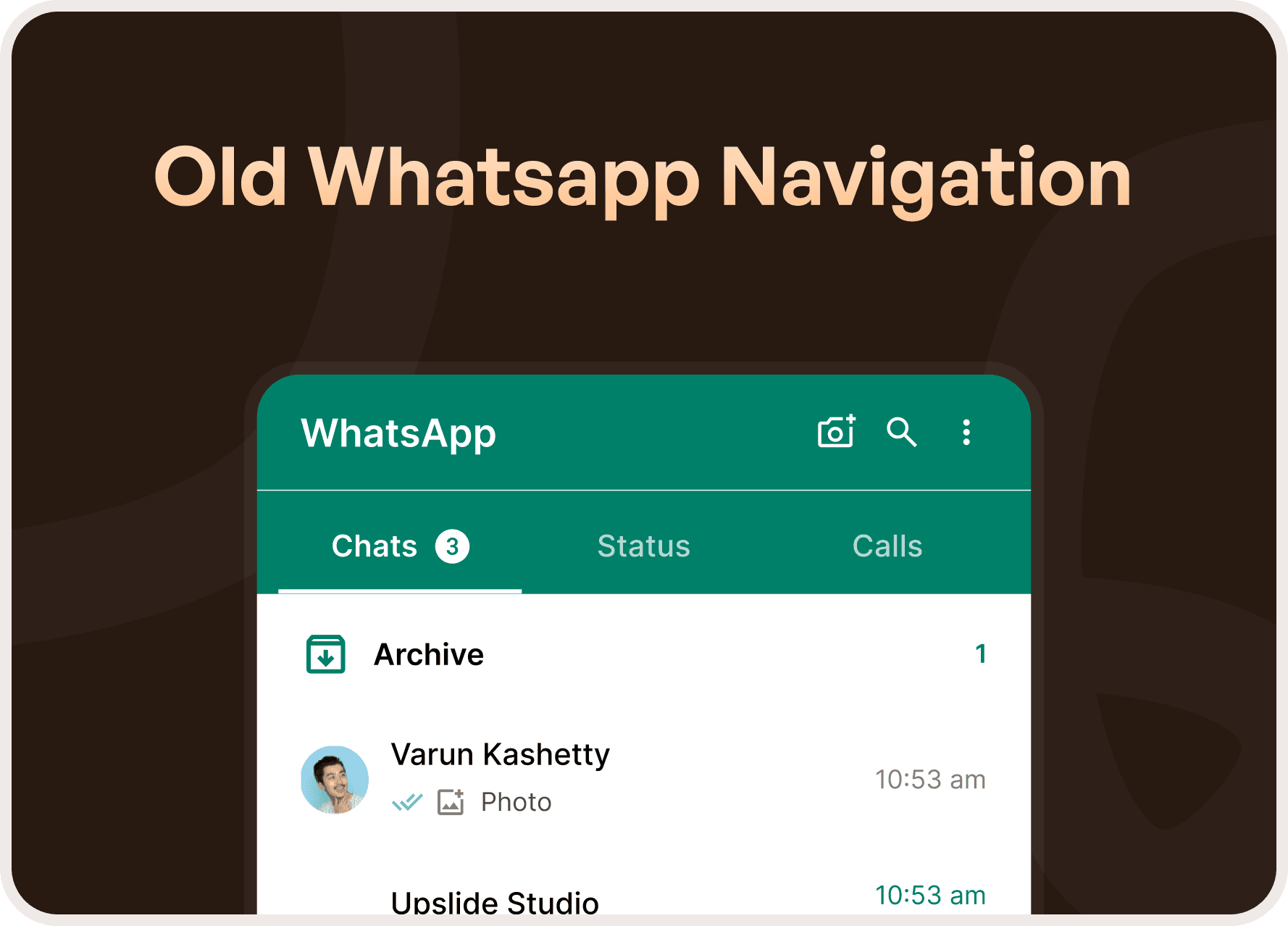
The Original Navigation Design
Initially, WhatsApp had only two primary sections:
Chats
Calls
Both were placed on the top navigation bar, which made sense at the time.
Smartphones were smaller, interactions were simple, and the limited feature set allowed for a clean, uncluttered interface. This approach aligned with standard UI conventions, where apps with fewer sections avoided bottom navigation to maintain simplicity.
Why the Original Design Worked Until It Didn’t
As WhatsApp expanded its feature set, the limitations of top navigation became apparent.
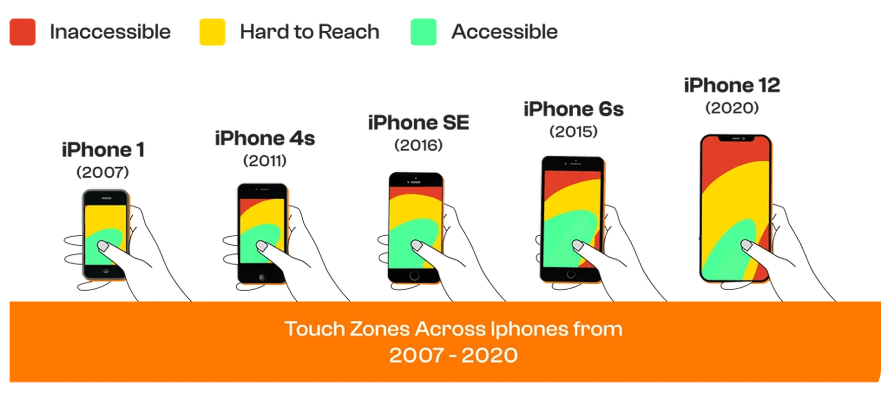
New functionalities like media sharing, business tools, and community features increased interaction complexity. Navigating between sections became less intuitive, especially on larger screens and during one-handed use.
At this point, usability not aesthetics drove the need for redesign.
Navigation Redesign for Accessibility and Scale
The shift in navigation was not about visual change it was about functional clarity.
By rethinking navigation placement and structure, WhatsApp improved:
Reachability
Ease of navigation
Feature discoverability
One-handed usability
This redesign allowed the app to scale without overwhelming users.
Subtle Yet Impactful Optimizations
Beyond major navigation changes, WhatsApp consistently introduces small refinements that collectively improve the experience.
Notable examples include:
Filters for faster search
Improved message retrieval through search filters
Updated colors and icons for clarity
Sticker creation for personalization
Floating group creation buttons
Message undo (Delete for Me)
Enhanced voice message privacy
AI tools and Meta-verified features for businesses
Events and replies in announcement groups
Individually, these changes may seem minor. Together, they significantly refine usability and engagement.
The Real UX Lesson
WhatsApp’s success lies in how invisible its design changes feel.
Users adapt naturally. Muscle memory remains intact. The product improves without forcing relearning an essential principle of intuitive UX.
“Good design supports users quietly. Great design evolves without being noticed.”
Final Takeaway
WhatsApp demonstrates that meaningful UX improvements don’t always come from dramatic redesigns.
They come from:
Understanding evolving user behavior
Respecting familiarity
Optimizing continuously
Designing for scale and accessibility
This is how products grow without breaking trust.


