
Why One-Handed Mobile Usage Matters
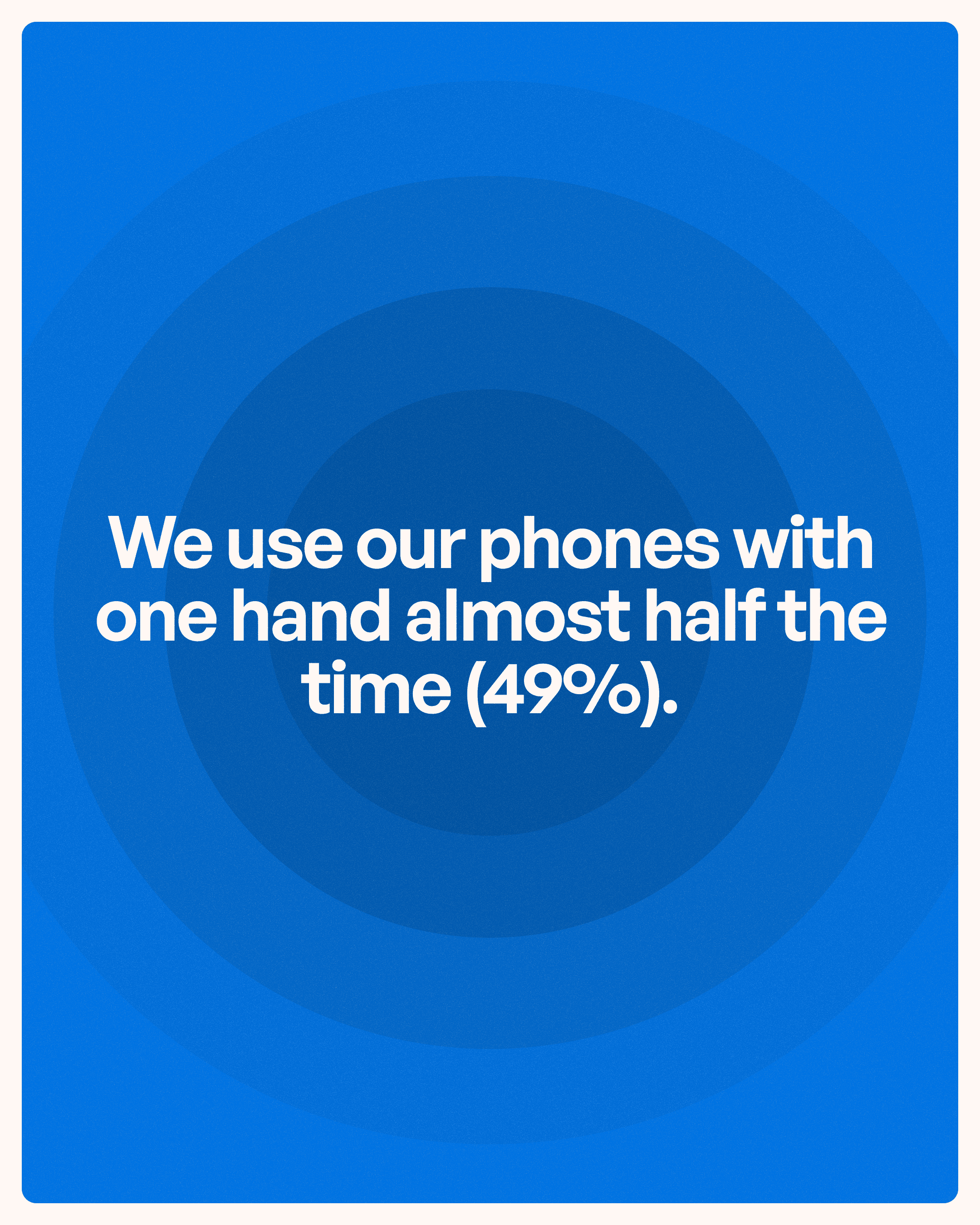
Mobile phones are designed to be portable, which means they are frequently used in situations where users only have one hand available.
Consider common scenarios:
Walking through an airport
Holding a coffee cup
Carrying groceries
Standing in public transport
Holding a child
Using the phone during work tasks
In these situations, users naturally depend on a single thumb to interact with the interface.
When designers ignore this reality, users are forced to stretch their fingers, adjust their grip, or use a second hand just to complete basic tasks.
These interruptions may seem minor, but repeated friction accumulates over time and negatively affects the overall experience.
Good mobile UX design reduces physical effort.
Understanding the Thumb Zone
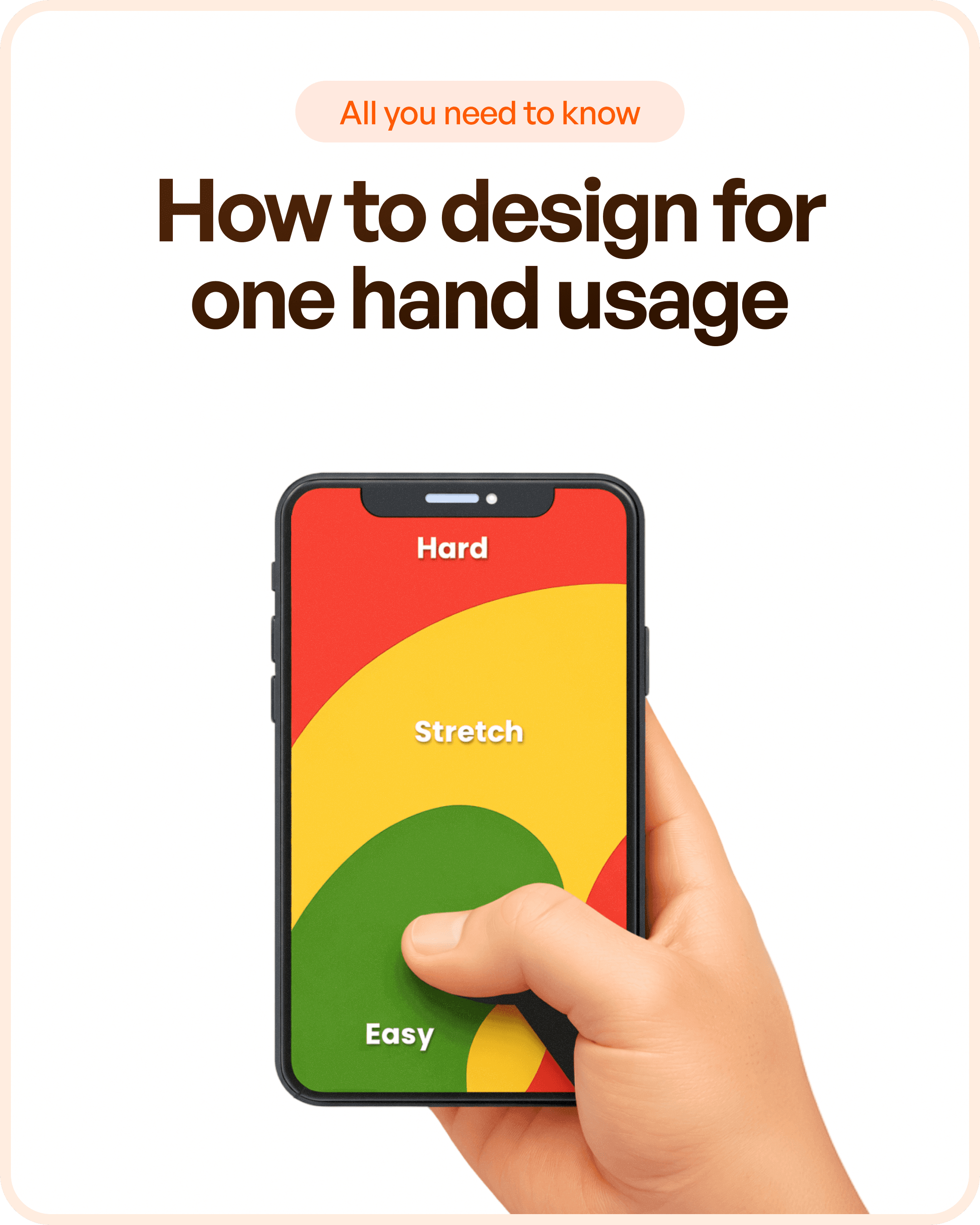
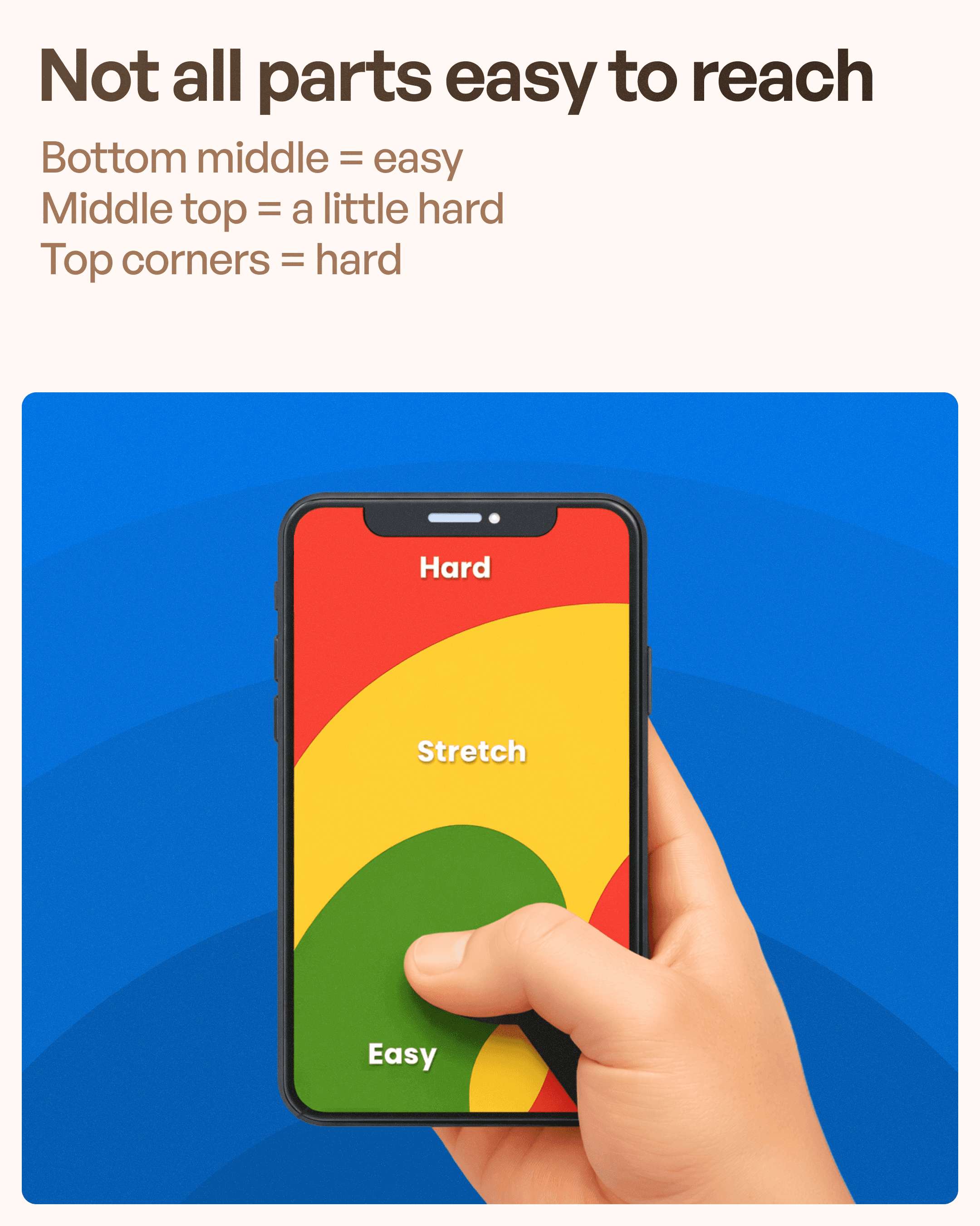
One of the most important concepts in mobile UX design is the Thumb Zone.
Not all areas of a smartphone screen are equally accessible.
Generally, mobile screens can be divided into three zones:
Easy Reach Zone
This area sits near the bottom of the screen and is easily accessible with the thumb.
Users can comfortably interact with controls placed here without changing their grip.
Examples include:
Bottom navigation
Primary action buttons
Frequently used controls
Stretch Zone
The middle section of the screen requires additional thumb movement.
Users can reach these areas, but interactions require more effort.
These areas are acceptable for secondary actions but should not contain critical tasks.
Hard Reach Zone
The top corners of the screen are the most difficult areas to access.
Users often need to:
Adjust their grip
Use a second hand
Stretch uncomfortably
Placing important actions here creates unnecessary usability challenges.
Thumb Size and Touch Targets
Another often overlooked factor is thumb size.
The average thumb contact area is roughly around 1 inch wide, which translates to approximately 72 pixels on many devices.
This means touch targets should be large enough to accommodate natural thumb movement.
When buttons are too small:
Users miss targets
Error rates increase
Frustration grows
Accessibility decreases
This is why modern mobile UX guidelines recommend generous touch areas rather than tiny clickable elements.
A button might look visually clean when reduced in size, but if users struggle to tap it accurately, the design has failed.
Good UI design always prioritizes usability over aesthetics.
People Use Different Hands
A common design mistake is assuming everyone uses their phone the same way.
Some users hold their phone with the right hand.
Others use their left hand.
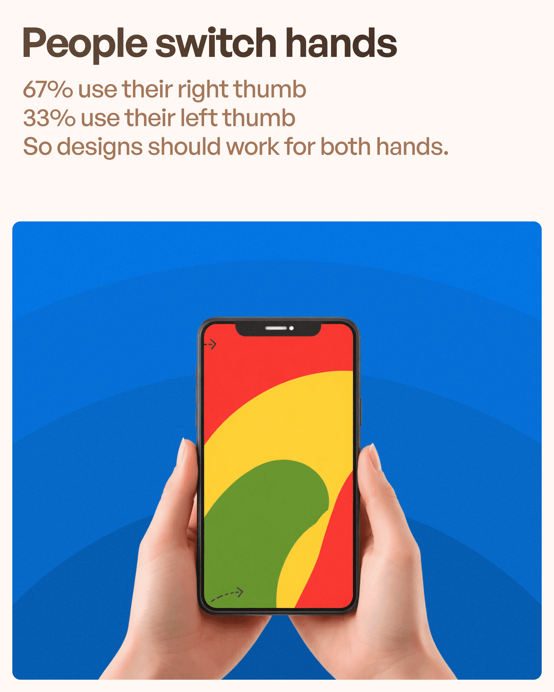
Some switch hands throughout the day depending on the situation.
Designers should therefore avoid creating interfaces that heavily favor only one side of the screen.
Balanced layouts improve usability because they accommodate different usage patterns naturally.
For example:
Important controls should not be clustered exclusively in one corner.
Swipe gestures should consider both left-handed and right-handed interactions.
Frequently used actions should remain accessible regardless of hand preference.
Designing for both hands improves inclusivity and usability simultaneously.
Why Top Navigation Creates Problems
Many older mobile applications inherited navigation patterns from desktop interfaces.
As a result, important actions often ended up at the top of the screen.
Examples include:
Navigation menus
Search functions
Notifications
Profile access
Primary actions
While these placements may work visually, they often create poor ergonomics.
Users repeatedly need to reach into hard-access areas of the screen.
This becomes even more problematic as smartphone screens continue growing larger.
Modern UX design increasingly favors bottom-positioned navigation because it aligns better with natural thumb movement.
This is one reason why many successful mobile applications now place navigation controls at the bottom.
The Rise of Bottom Navigation
Applications such as:
Instagram
Spotify
YouTube
LinkedIn
TikTok
all rely heavily on bottom navigation patterns.
This is not a coincidence.
Bottom navigation provides:
Faster access
Better reachability
Reduced thumb strain
Improved task completion
Users can quickly move between sections without changing their grip.
For frequently used applications, this small improvement significantly enhances the overall experience.
Designing Forms for One-Handed Use
Forms are often one of the most frustrating areas in mobile applications.
Many forms force users to repeatedly move between:
Input fields
Dropdowns
Buttons
Validation messages
Poorly positioned form elements increase cognitive and physical effort.
To improve one-handed usability:
Place important fields lower on the screen.
Keep labels close to inputs.
Minimize unnecessary scrolling.
Use smart defaults and autofill where possible.
Keep action buttons within easy thumb reach.
The goal is to reduce movement and make completion feel effortless.
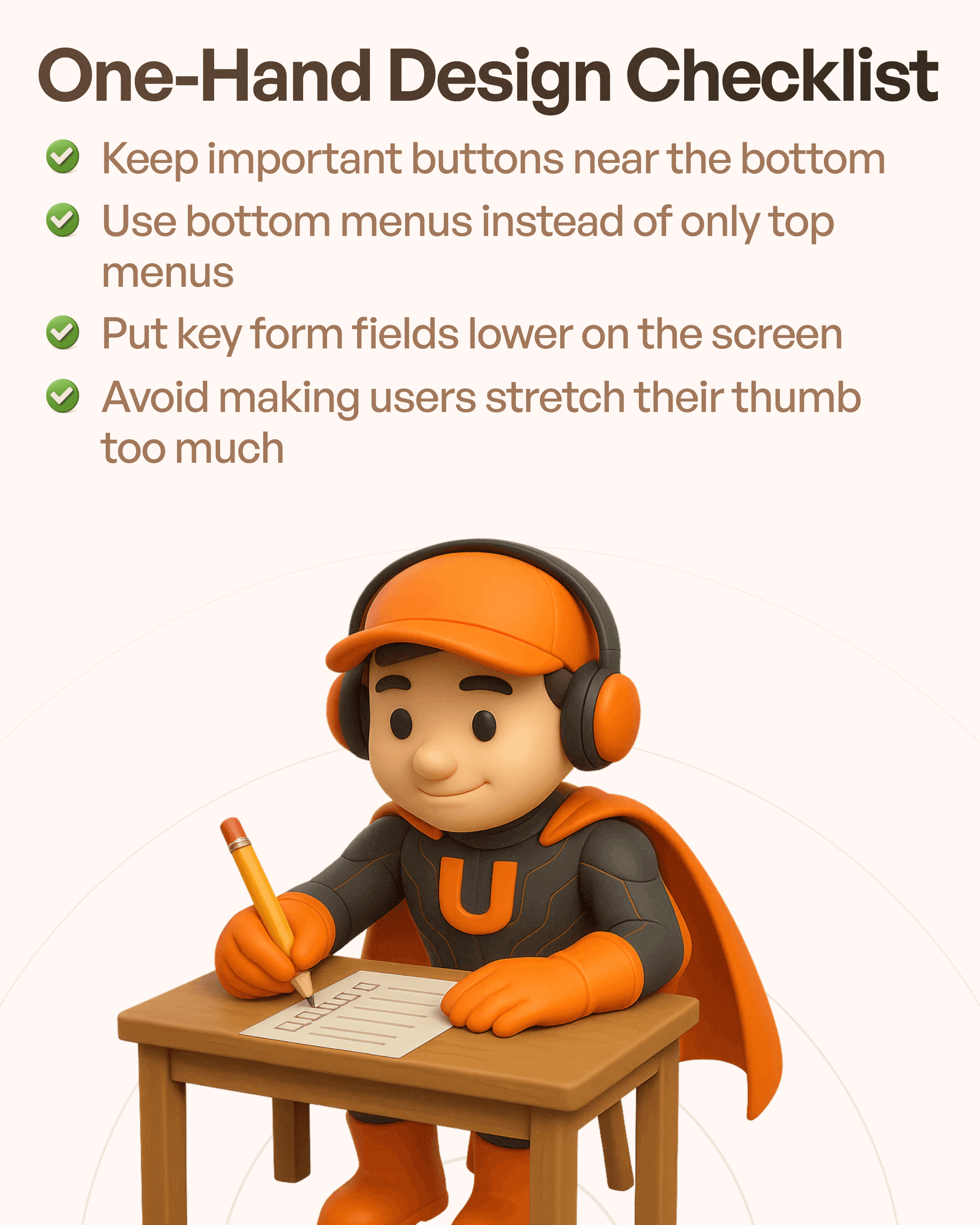
One-Hand Design Checklist
When evaluating a mobile application, designers can use the following checklist:
Keep Important Actions Near the Bottom
Primary actions should remain easily accessible.
Users should not need to stretch their thumb to complete critical tasks.
Use Bottom Navigation
For applications with multiple sections, bottom navigation often provides a better experience than top-only navigation.
Prioritize Reachability
Think about where users naturally hold their devices and place important controls accordingly.
Design Larger Touch Targets
Ensure buttons and interactive elements are large enough for comfortable thumb interactions.
Reduce Unnecessary Movement
Every additional reach, stretch, or grip adjustment increases friction.
How One-Handed UX Improves Business Metrics
One-handed usability is not just a design preference.
It directly impacts business performance.
Improved reachability often leads to:
Higher task completion rates
Faster interactions
Better user satisfaction
Increased engagement
Reduced abandonment
Improved accessibility
When users can complete actions quickly and comfortably, they are more likely to continue using the product.
This is especially important for mobile-first applications where usability directly influences retention and adoption.
Final Thoughts
Mobile UX design is not just about making interfaces look good.
It is about understanding how people physically interact with devices in the real world.
Since a large percentage of mobile interactions happen with one hand, designers must account for thumb reach, touch target sizes, navigation placement, and ergonomic usability.
The most successful mobile applications are not necessarily the most visually impressive.
They are the ones that feel effortless to use.
At Upslide Design Studio, we believe great UX begins by understanding real user behavior. Designing for one-handed usage is one of the simplest yet most impactful ways to create mobile experiences that are faster, more intuitive, and more enjoyable for users.