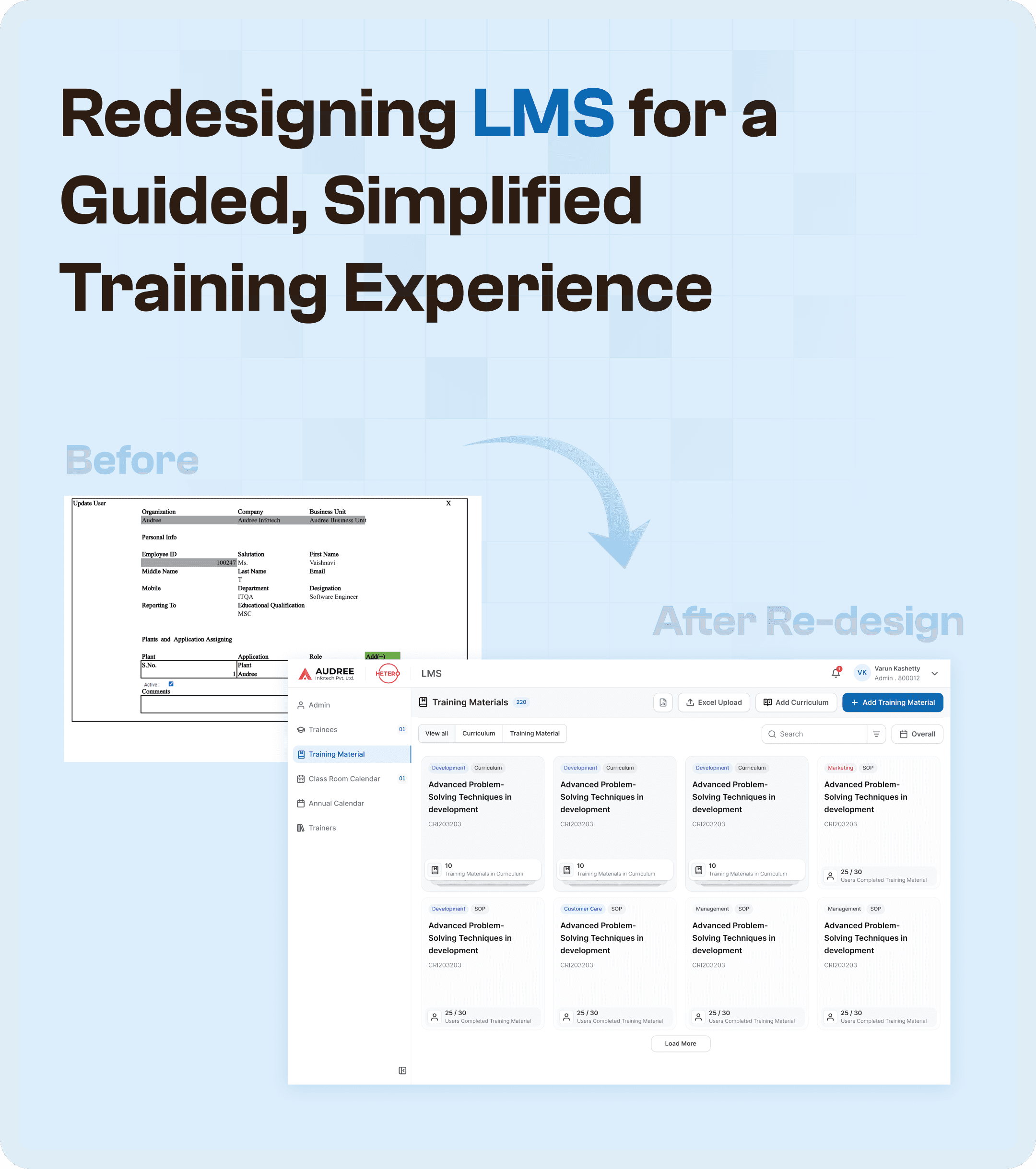

The Challenge: Fragmented LMS Workflows
The original LMS system was heavily fragmented, creating a series of challenges that slowed down the training execution process. These problems became particularly evident when training was passed from one department to another or when reviewers and QA had difficulty tracking progress.
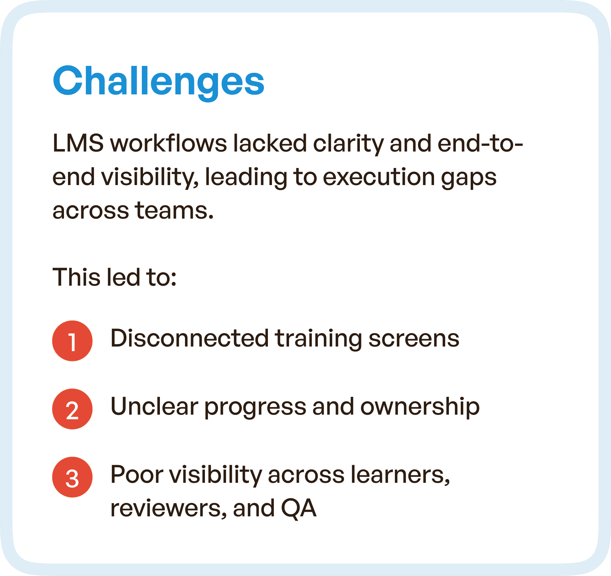
Some core issues included:
Disconnected Training Screens: The interface was cluttered, with screens that didn’t connect logically to one another, causing confusion for learners and instructors alike.
Lack of Clear Ownership: There was no clear ownership of tasks across roles. Managers, learners, and reviewers couldn’t easily track their responsibilities and progress, leading to delays.
Poor Visibility: Teams often lacked insight into the status of each training stage, making it hard to assess completion or identify bottlenecks.
Heavy Manual Coordination: Without clear communication channels, teams often relied on manual coordination to clarify tasks, slowing down the process.
These challenges led to inefficient training cycles and prevented smooth cross-team collaboration.
The Goal: Streamlining LMS for a Seamless Experience
Our goal was to transform the LMS into a guided, simplified training system that increased clarity and reduced manual coordination. The main objectives were:
Simplified Training Execution: Simplify workflows to make training management quicker and more intuitive.
Improved Role-Based Visibility: Ensure that each role could easily track their progress, responsibilities, and next steps.
Reduced Manual Coordination: Minimize the need for emails, follow-ups, and offline communication by improving the system’s automation and transparency.
We envisioned a unified training journey where every action is predictable, and every stage is clear and actionable.

Our Approach: UX Redesign Focused on Simplicity and Clarity
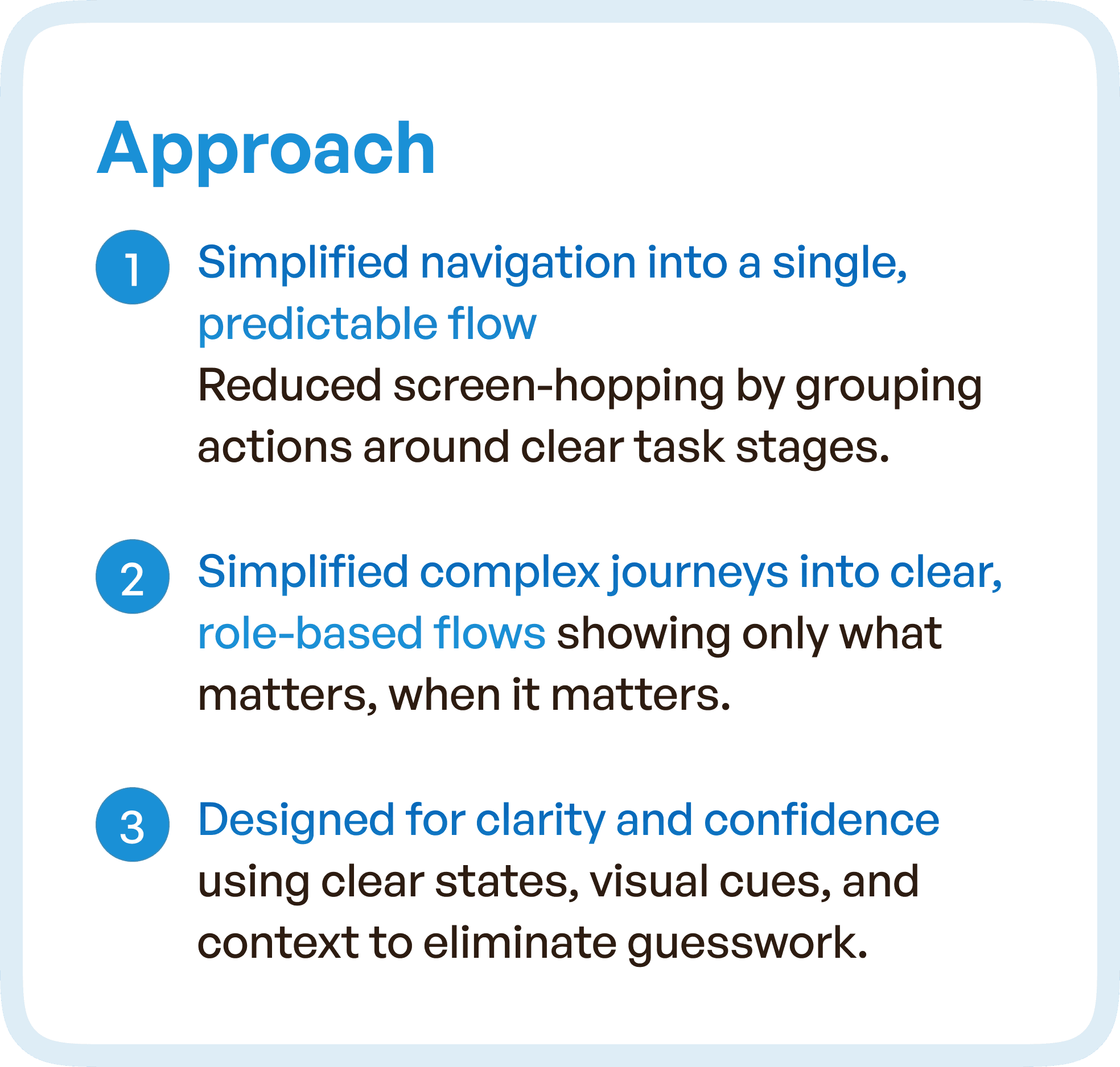
Streamlining the Experience: Simplified Navigation
The first step in our approach was to simplify navigation by consolidating various tasks into clear, role-based flows. This improved the user experience by reducing the complexity of navigating through multiple, unrelated modules. Key elements of this strategy included:
Clear Task Flows: Every screen now led to the next logical step in the training process, making it easy for users to know exactly what to do at each point.
Unified Training Stages: We eliminated scattered training steps, grouping them into clear, defined stages that aligned with the actual training lifecycle.
Clear Ownership of Tasks: Roles and responsibilities were clearly defined on every screen, ensuring that learners, instructors, and reviewers knew what was expected of them at each stage.
These changes allowed teams to follow a more predictable and understandable workflow, improving overall efficiency.
Eliminating Friction Points: User-Centered Design
Our redesign focused on solving the biggest pain points for users, including unclear progress, repetitive actions, and scattered information. We did this by:
Role-Based Task Segmentation: Each user (learners, managers, QA) saw only the information relevant to them at each stage. This helped eliminate unnecessary steps and reduced cognitive load.
Simplified Forms: Training forms were optimized to remove redundant fields and make data entry faster. We included smart fields, auto-fill data, and grouped inputs to minimize errors.
Clarity at Every Step: The redesigned system highlighted the current stage and next steps with visually clear, color-coded indicators. This made tracking progress straightforward for everyone involved.
These changes ensured users could navigate their training paths without confusion, saving time and improving user satisfaction.
Design Highlights: Visual Enhancements for Clarity and Ease of Use
To address the issues of scattered navigation, we implemented visual enhancements that would guide users through their workflows with ease. Notable design improvements included:
Smart Cues: We used visual cues to guide users at each stage, signaling the right actions at the right time. For example, status indicators were prominently displayed so learners and managers knew exactly where they stood.
Simplified Layouts: Each page was redesigned with cleaner layouts to improve focus and reduce distractions. Text and action buttons were carefully placed to guide users through the process with minimal effort.
Clear Progress Tracking: We provided real-time progress tracking that showed how far along the learner was in their training journey, helping everyone stay on the same page.
By improving visual clarity and simplifying the interface, we made the training process less overwhelming and more manageable for everyone.

Impact: Faster, More Transparent Training Cycles
The redesigned LMS now operates as a streamlined, transparent system that speeds up training cycles. Key outcomes included:
Faster Task Completion: With a clearer, more predictable system, learners and managers could complete their tasks more quickly. This reduced the time it took to complete training cycles and boosted productivity across teams.
Less Manual Effort: By automating previously manual tasks and improving visibility into each step, the system minimized the need for follow-up emails and phone calls, saving valuable time for all users.
Clearer Accountability: With defined stages and roles, users could track their responsibilities and progress at any time. This improved accountability and reduced confusion during the training process.
Ultimately, the LMS redesign allowed teams to execute training cycles more efficiently while ensuring compliance and clarity at every step.

Why UX Redesign Matters for LMS Systems
For organizations that rely on training for regulatory compliance or employee development, a streamlined LMS is essential for ensuring consistency, accuracy, and efficiency. The issues of fragmented workflows, manual coordination, and lack of clarity can severely hinder a company's ability to stay on schedule and comply with regulations.
Our case study of the LMS redesign shows how user-centered design principles can make a significant impact on reducing inefficiencies and improving team collaboration. A well-structured UX can create an intuitive environment where each user knows what to do next, without confusion or unnecessary steps.


