

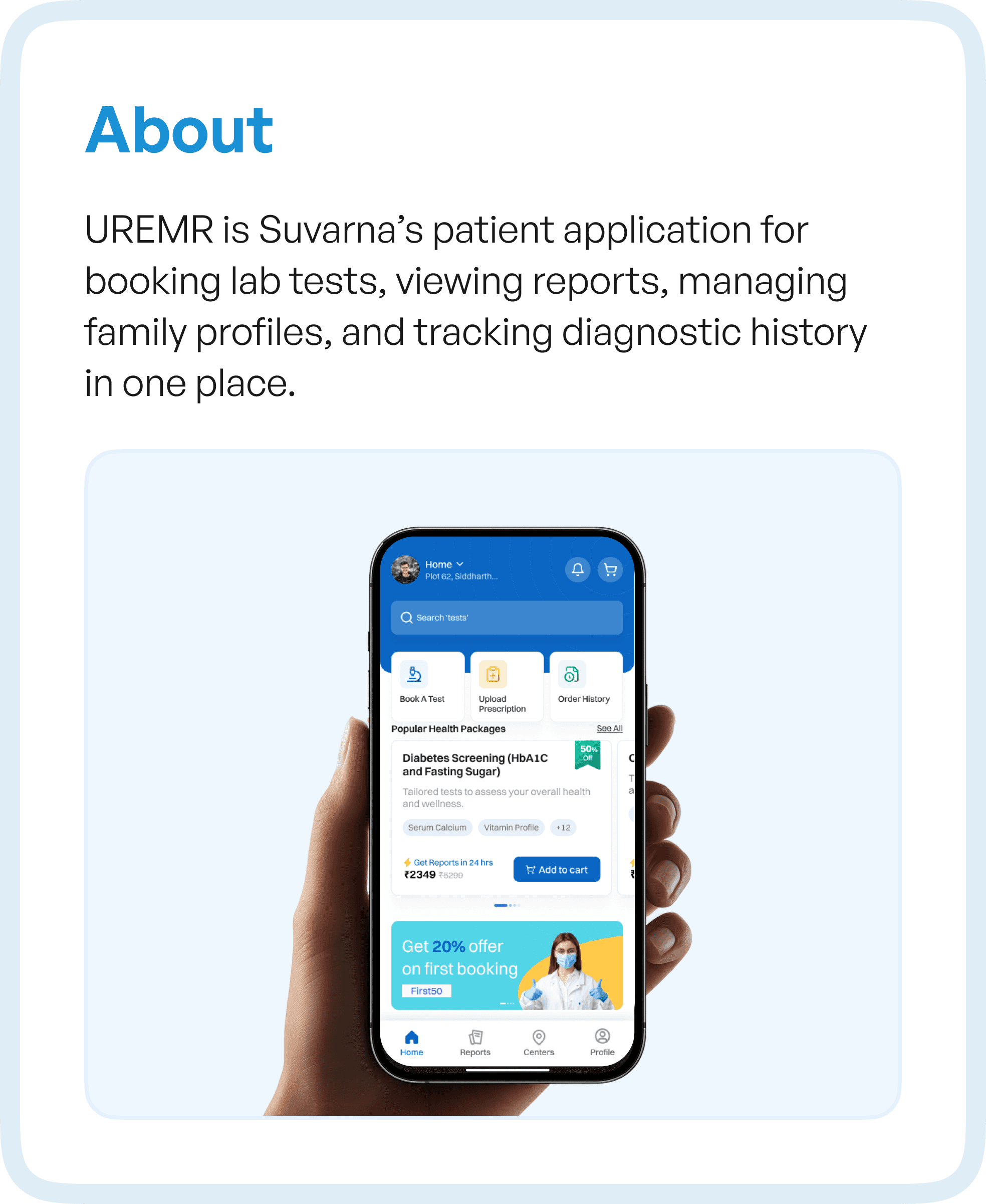
The Real Problem Behind Underused Products
When we started analyzing the UREMR application, it became clear that the issue was not visual design or feature gaps.
It was structural.
Users were:
Taking longer to complete simple tasks
Unsure about what to do next
Relying on guesswork instead of guidance
This is a common pattern in enterprise and healthcare applications. Over time, features get added, but the underlying structure is never re-evaluated.
The result is what we call “workflow decay” - where the system exists, but the experience breaks down.
Why User Flow Analysis Was Critical
Instead of jumping into UI redesign, we focused on user flow analysis.
This meant mapping every step a user takes:
From discovering a test
To booking a slot
To accessing reports
To managing family profiles
By visualizing the complete journey, we could see something that screens alone never reveal — how users actually move through the system.
And more importantly, where they struggle.
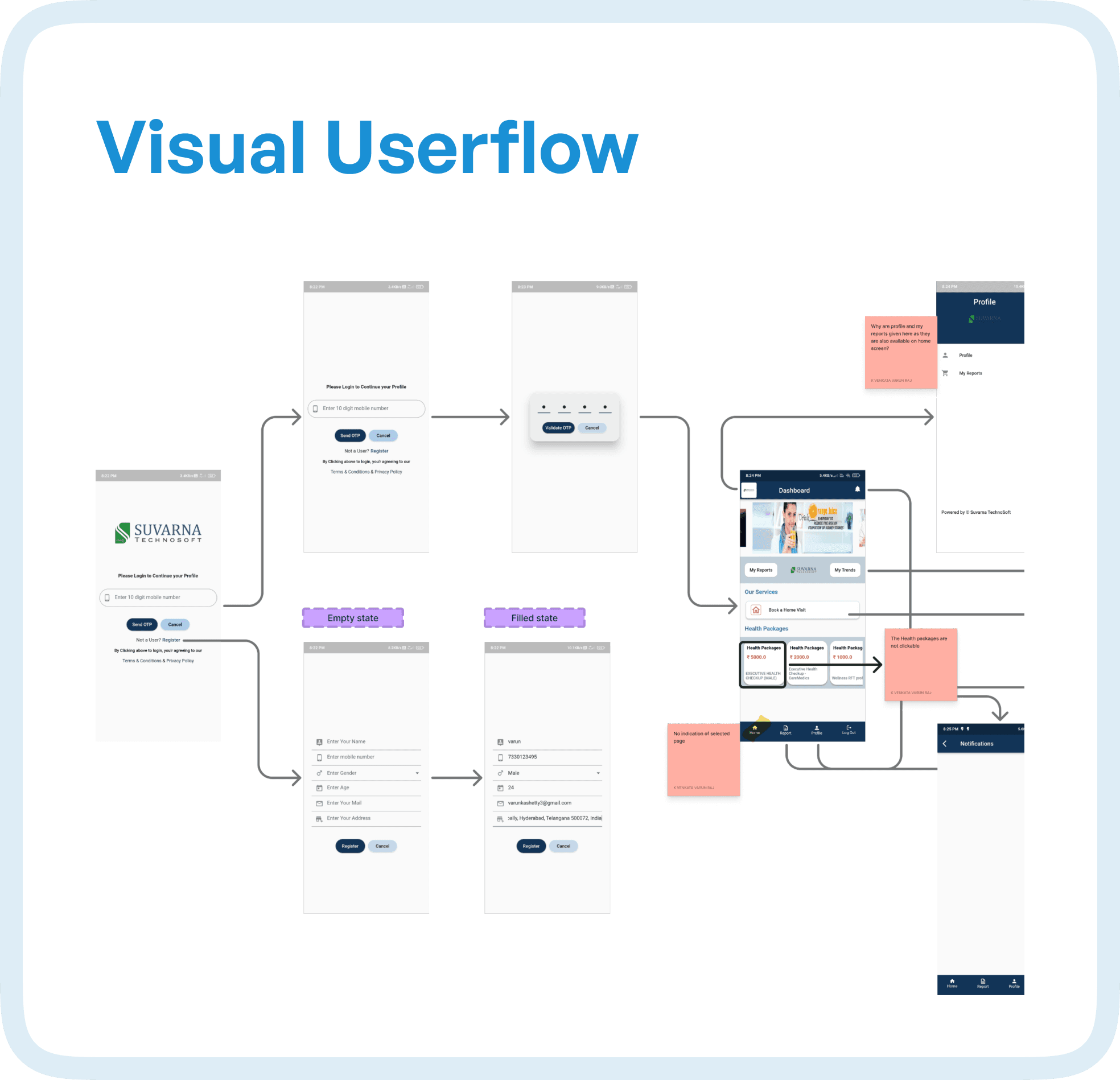
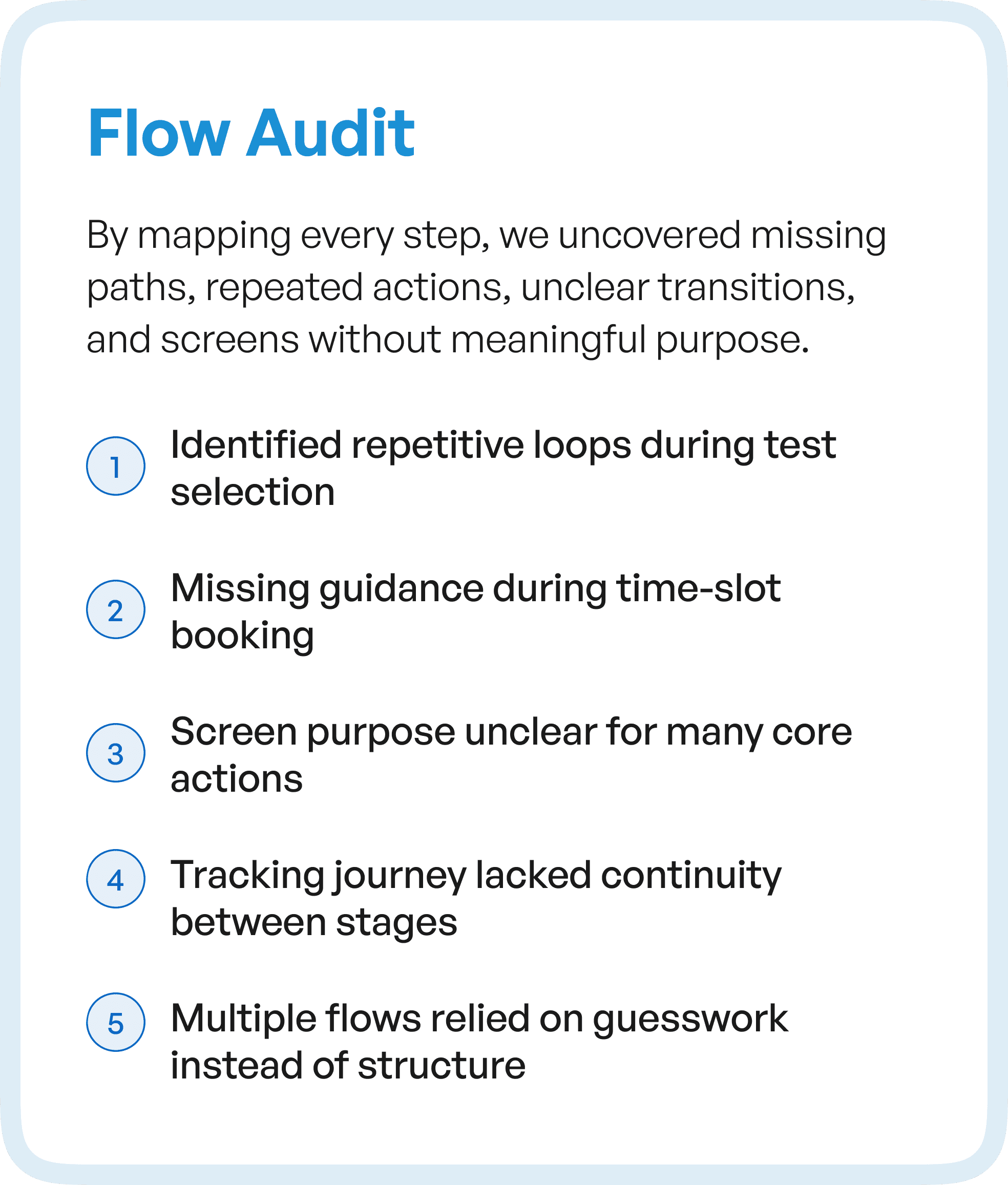
What the Flow Audit Revealed
As we mapped the flows, patterns began to emerge.
There were multiple points where users slowed down, hesitated, or dropped off entirely.
The issues were not isolated — they were systemic.
Repetitive loops during test selection made simple tasks feel longer than necessary. Time-slot booking lacked clear guidance, forcing users to interpret availability instead of being guided through it. Several screens existed without a clearly defined purpose, which made navigation feel inconsistent.
More importantly, the journey itself lacked continuity.
Users would move from one stage to another without a sense of progression. There was no clear indication of where they were or what came next. In many cases, flows relied on user assumptions rather than system guidance.
This created friction at every level.
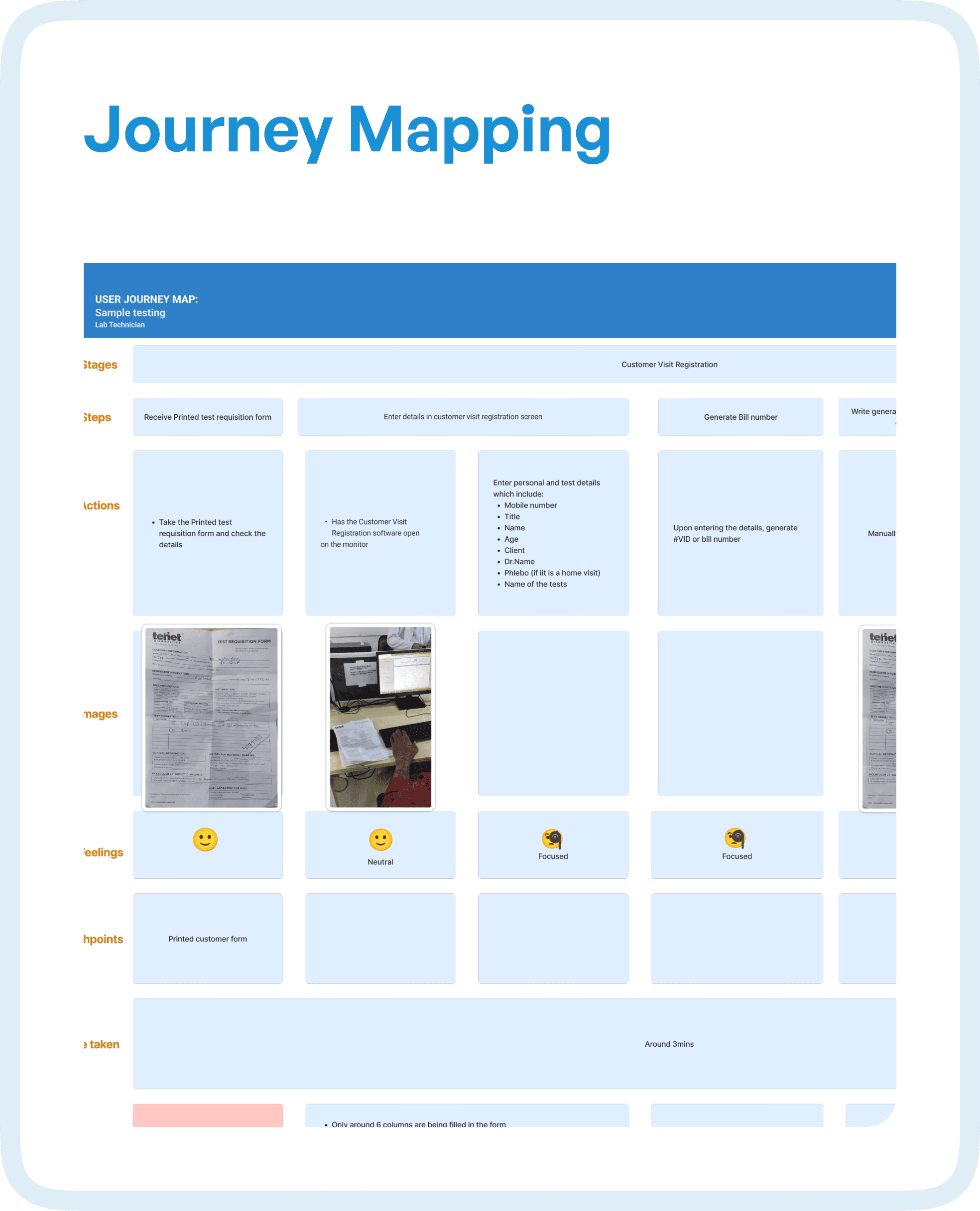
Friction Points Across the Diagnostic Journey
When we extended the analysis into journey mapping, deeper issues surfaced across critical use cases.
Searching for tests required excessive effort, with users needing to explore multiple paths before finding the right option. Booking slots did not clearly communicate availability, leading to hesitation and repeated attempts.
Tracking a phlebotomist felt unpredictable, breaking trust in the system. Accessing reports required unnecessary navigation steps, even though it is one of the most frequent user goals.
Managing family profiles — a core feature — was unintuitive, making a high-value function difficult to use.
Each of these issues may seem small in isolation.
But together, they created a high-friction ecosystem.
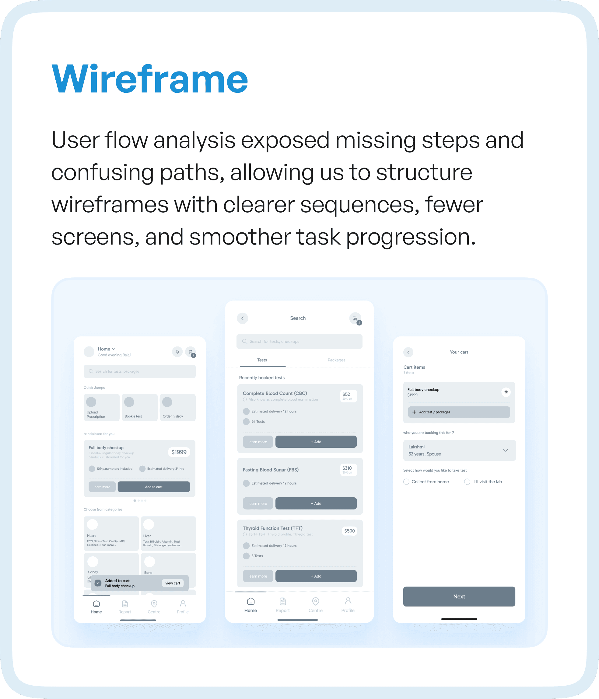
From Flow Problems to Structured Solutions
Once the flow issues were identified, the redesign direction became clear.
We did not start with UI.
We started with structure.
By restructuring the user flows, we focused on:
Creating clear progression between stages
Reducing unnecessary steps
Eliminating loops and dead ends
Guiding users through critical actions
This directly informed the wireframes.
Instead of designing screens independently, we designed them as part of a connected system, where each step logically leads to the next.
The result was fewer screens, clearer actions, and a smoother experience.
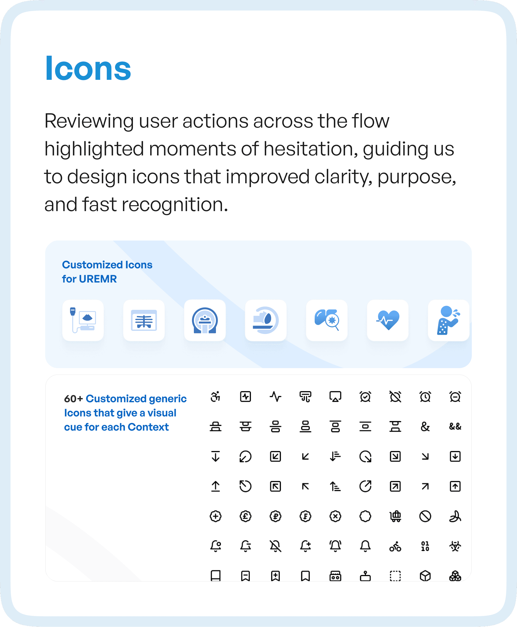
Designing Interfaces Based on User Behavior
One of the key shifts in this project was moving from assumption-based design to behavior-driven design.
By analyzing how users interacted with the system, we identified moments of hesitation — places where users paused, reconsidered, or made errors.
These insights influenced even micro-level decisions.
For example, icon design was not treated as a visual layer, but as a functional one. Icons were created to match user actions and expectations, making them instantly recognizable and reducing cognitive load.
Over 60+ custom icons were designed to create a consistent visual language across the product, ensuring that users could navigate faster without needing to relearn patterns.
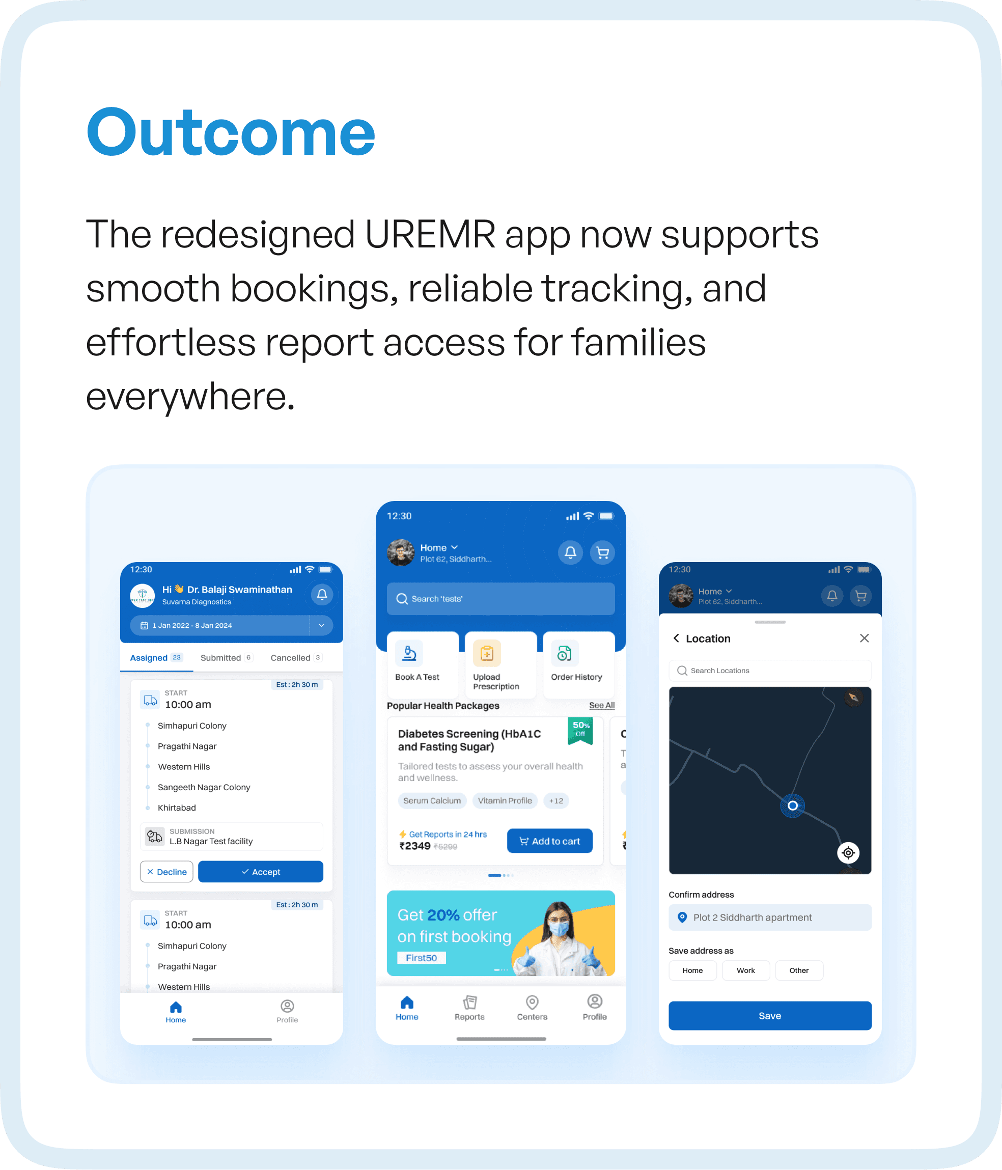
The Outcome: From Confusion to Confidence
The redesigned UREMR experience transformed how users interacted with the system.
What was once a fragmented journey became a guided lifecycle.
Users could now:
Book tests with clarity
Track processes reliably
Access reports without friction
Manage profiles effortlessly
The experience no longer relied on user effort.
It was designed to support users at every step.
This shift reduced confusion, improved task completion, and built trust in the system.
Why This Approach Matters for SaaS and Healthcare Products
UREMR is not an isolated case.
Many SaaS and enterprise products — especially in healthcare — face similar challenges:
Feature-heavy systems with low adoption
Workflows built over time without restructuring
High dependency on training and support
The solution is not adding more features or redesigning visuals.
It is rethinking how the product flows.
Because when workflows are clear:
Users move faster
Errors reduce
Adoption increases
How Upslide Design Studio Approaches UX Transformation
At Upslide Design Studio, we approach redesigns differently.
We don’t start with screens.
We start with how the system works.
Our process focuses on:
Mapping real user behavior
Identifying structural inefficiencies
Simplifying workflows
Designing systems that guide users
This ensures that every redesign is not just visually improved, but functionally optimized for growth, adoption, and scale.
Final Thought
If your product has been in the market for years but still struggles with adoption, the issue may not be visibility or features.
It may be your flows.
Because users don’t experience your product screen by screen.
They experience it step by step.
And if those steps are broken, everything else follows.


