
Redesigning IOT Casa:
Redesigning IOT Casa:
Redesigning IOT Casa:
For a Simpler Home Automation Experience
For a Simpler Home Automation Experience
For a Simpler Home Automation Experience
Client
IoT Casa
IoT Casa
Industry
Home Automation
Home Automation
Duration
4 months
4 months
Services
UI/UX, Icon Design, Micro-copy
UI/UX, Icon Design, Micro-copy
IOT Casa is a smart home app that lets users control devices like lights, fan, AC temp & more. Despite smart home adoption, the app faced low engagement due to a complex interface, confusing onboarding, and poor user experience. The goal was to simplify the experience, make the app intuitive, and boost feature adoption.
IOT Casa is a smart home app that lets users control devices like lights, fan, AC temp & more. Despite smart home adoption, the app faced low engagement due to a complex interface, confusing onboarding, and poor user experience. The goal was to simplify the experience, make the app intuitive, and boost feature adoption.
Challenges Faced
Challenges Faced
The app faced issues such as a complex onboarding process with high drop-off rates, low automation feature adoption due to a lack of clear guidance and easy-to-use templates, and the need for training and continuous help to complete tasks.
The app faced issues such as a complex onboarding process with high drop-off rates, low automation feature adoption due to a lack of clear guidance and easy-to-use templates, and the need for training and continuous help to complete tasks.
Design Process
Design Process

Discover
Discover
In the Discovery phase, we focused on gathering comprehensive insights through Knowledge Transfer (KT), competitive analysis, and user research. This phase laid the foundation for understanding the existing problems and identifying opportunities for improvement.
In the Discovery phase, we focused on gathering comprehensive insights through Knowledge Transfer (KT), competitive analysis, and user research. This phase laid the foundation for understanding the existing problems and identifying opportunities for improvement.
Define
Define
In the Definition phase, we used insights from Discovery to define clear user problems, set specific goals, and outline design requirements. This phase was crucial for narrowing our focus and ensuring the redesign would effectively address the challenges identified.
The audit of the IOT Casa app revealed several key issues:
1) Unclear Navigation: Users struggled with a lack of direction and unclear next steps during key tasks.
2) Inconsistent Design: The icon set was unstandardized, and the outdated design needed modernization.
3) Cluttered Layout: The interface was overcrowded, making it difficult to scan and focus on important information.
4) Disorganized Content: Content lacked clear organization, making it harder for users to find tasks or manage devices.
5) Limited Device Management: The app lacked filtering options, hindering users from effectively tracking and managing devices.
6) Selection Issues: Selection was indicated by coloring individual icons or text, rather than highlighting the entire selection for clarity.
7) Voice Interaction: Generic device names reduced the effectiveness of voice interactions, which could be improved with suggested names.
Ideation
Ideation
After identifying the problems, the team ideated solutions by restructuring task flows, prioritizing actions, simplifying navigation, grouping relevant information, and reducing screens—while ensuring compliance with pharma use cases. These solutions were presented in wireframes, serving as the blueprint for the software.
After identifying the problems, the team ideated solutions by restructuring task flows, prioritizing actions, simplifying navigation, grouping relevant information, and reducing screens—while ensuring compliance with pharma use cases. These solutions were presented in wireframes, serving as the blueprint for the software.
Wireframes
Wireframes
We created wireframes to simplify the dashboard layout, organizing key data more clearly. The chat interface was redesigned for smoother interactions with the database. We added comparison tables and predictive charts to improve data analysis. The design prioritized clarity, making it easier for users to navigate the platform without feeling overwhelmed.
We created wireframes to simplify the dashboard layout, organizing key data more clearly. The chat interface was redesigned for smoother interactions with the database. We added comparison tables and predictive charts to improve data analysis. The design prioritized clarity, making it easier for users to navigate the platform without feeling overwhelmed.

Visual Design
Visual Design
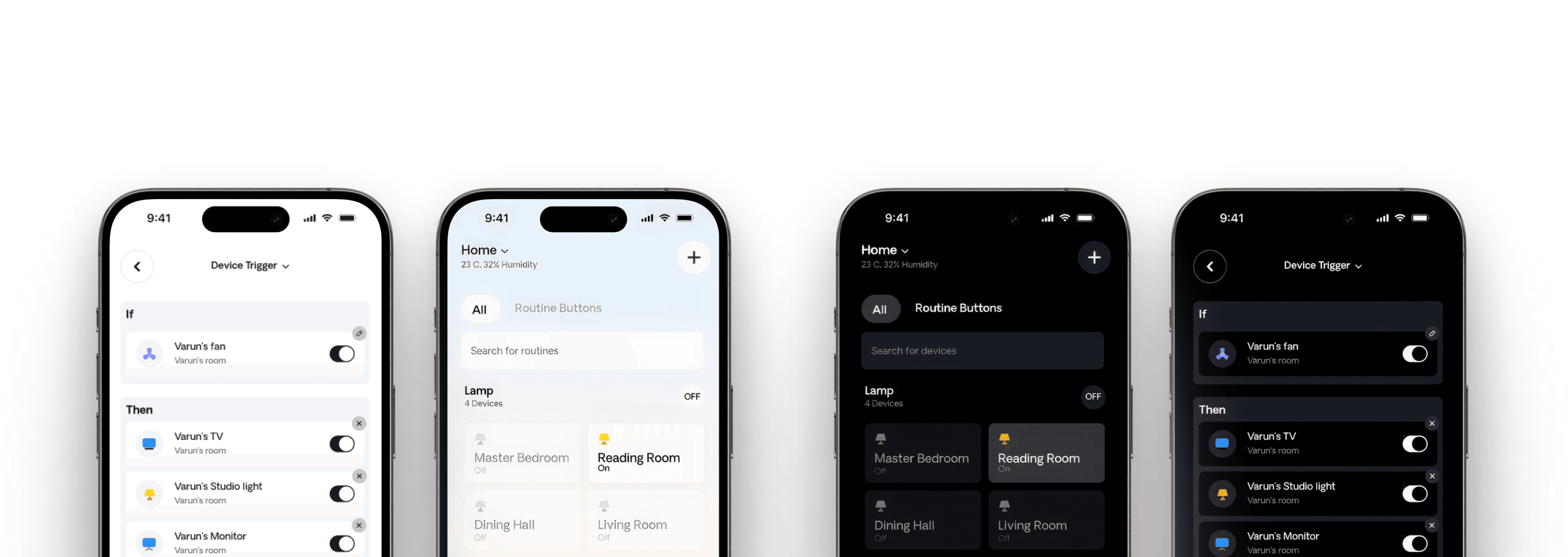
The final UI introduced a task-first, visually consistent experience powered by a centralized design system. We implemented status-driven workflows, reusable components, and prioritized layouts to surface the most relevant information. By reducing number of clicks, consolidating screens, and streamlining task flows, we significantly improved efficiency and helped deliver a faster, more intuitive experience across all their tools.
The final UI introduced a task-first, visually consistent experience powered by a centralized design system. We implemented status-driven workflows, reusable components, and prioritized layouts to surface the most relevant information. By reducing number of clicks, consolidating screens, and streamlining task flows, we significantly improved efficiency and helped deliver a faster, more intuitive experience across all their tools.
Colour Palette
Colour Palette
The interface uses brand colors to ensure a consistent visual identity. Minimal colors are applied for key indications like call-to-action buttons and alerts, enhancing clarity and focus without overwhelming the user. This approach creates a balanced and intuitive experience.
The interface uses brand colors to ensure a consistent visual identity. Minimal colors are applied for key indications like call-to-action buttons and alerts, enhancing clarity and focus without overwhelming the user. This approach creates a balanced and intuitive experience.

Typography
Typography
We chose DM Sans as the primary typeface for the entire website due to its clean, modern, and highly readable form. Its balanced proportions and smooth curves support clarity across various screen sizes, making it ideal for both dense medical content and quick-glance UI elements. The simplicity of DM Sans aligns perfectly with the platform’s goal of delivering trustworthy, user-friendly healthcare information.
We chose DM Sans as the primary typeface for the entire website due to its clean, modern, and highly readable form. Its balanced proportions and smooth curves support clarity across various screen sizes, making it ideal for both dense medical content and quick-glance UI elements. The simplicity of DM Sans aligns perfectly with the platform’s goal of delivering trustworthy, user-friendly healthcare information.


Summary
The IOT Casa redesign aimed to simplify the home automation experience by improving the app's usability for users of all ages. Key updates included a streamlined onboarding process, clearer UI/UX, better device integration, easier room management, and optimized UX copy. These changes made the app more intuitive, reducing complexity and enhancing user engagement with smart home devices.
The IOT Casa redesign aimed to simplify the home automation experience by improving the app's usability for users of all ages. Key updates included a streamlined onboarding process, clearer UI/UX, better device integration, easier room management, and optimized UX copy. These changes made the app more intuitive, reducing complexity and enhancing user engagement with smart home devices.