

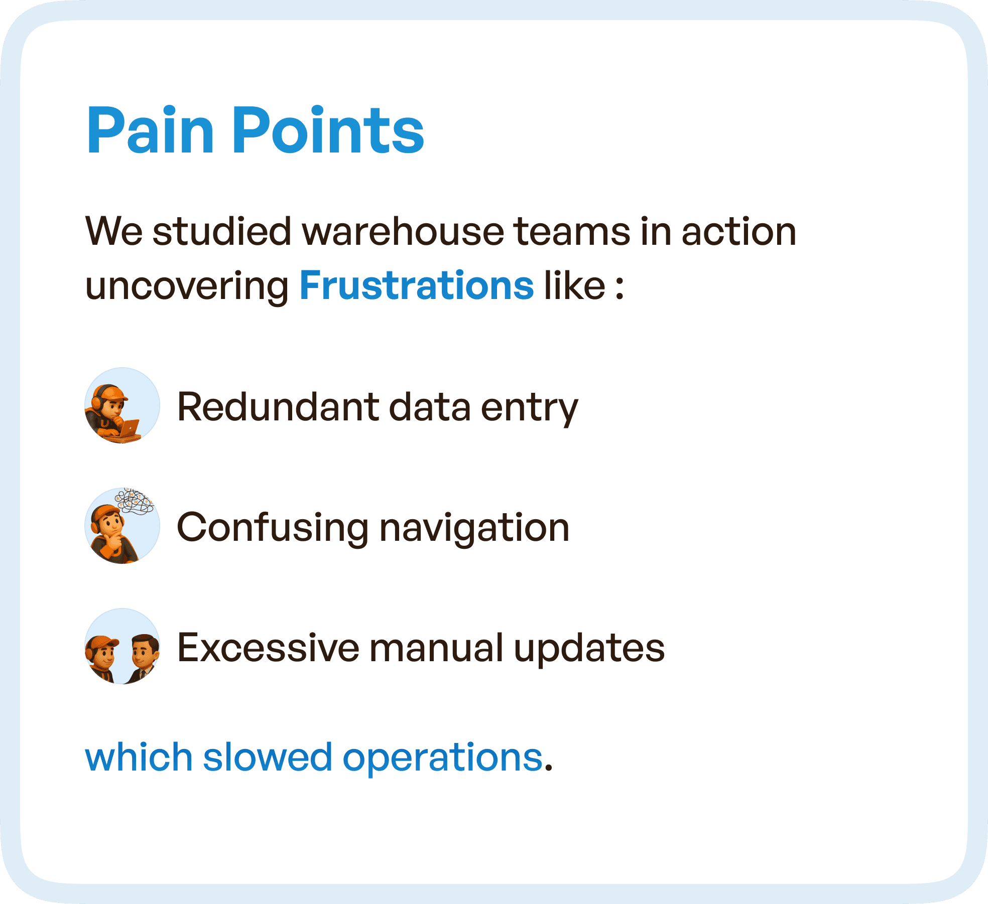
Starting With Real User Pain Points
Instead of beginning with assumptions, we observed warehouse teams in action.
What emerged was not a single issue, but a pattern of friction across everyday tasks.
Users were repeatedly entering the same data across different stages. Navigation was inconsistent, forcing users to spend time figuring out where to go next. Manual updates were frequent, increasing effort and slowing down operations.
These inefficiencies were not isolated.
They were embedded into the system’s workflows.
And over time, they compounded into reduced efficiency, increased errors, and dependency on experience rather than system guidance.
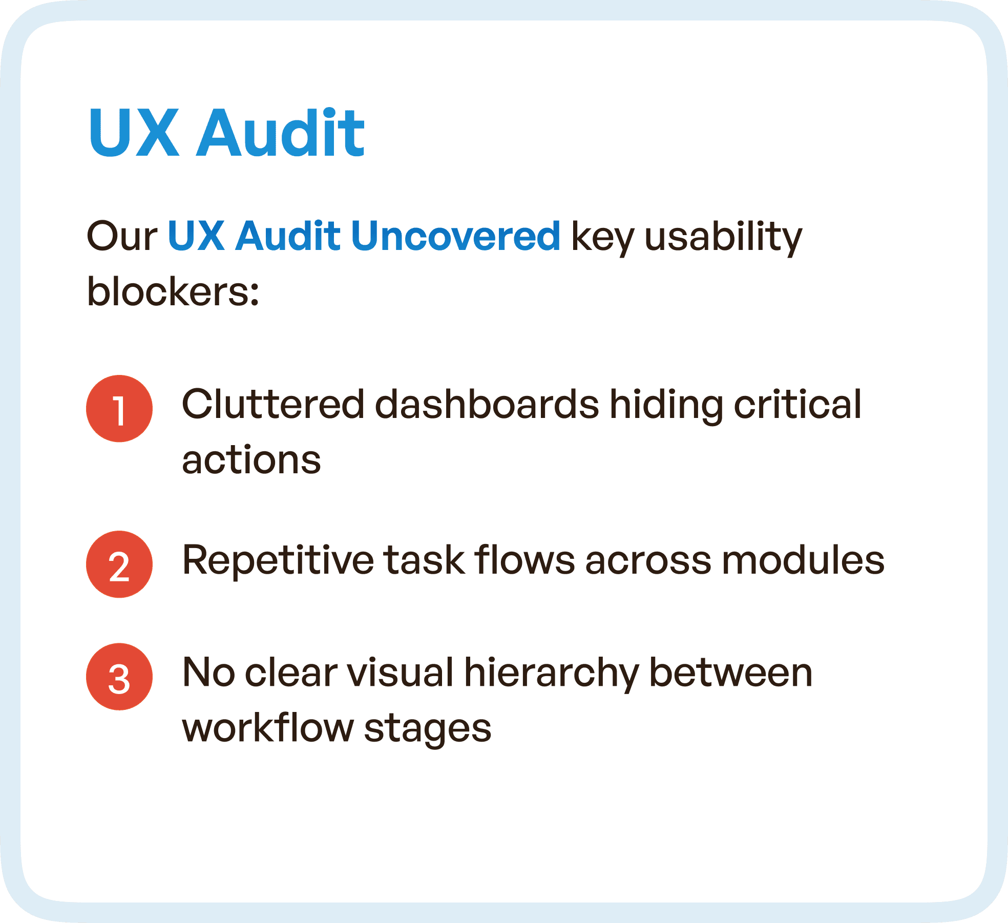
What the UX Audit Uncovered
A detailed UX audit revealed deeper structural problems within the system.
Dashboards were cluttered, making it difficult for users to identify critical actions quickly. Task flows were repetitive across modules, which increased effort without improving outcomes.
More importantly, there was no clear visual hierarchy.
Users could not easily distinguish between stages, priorities, or actions. This forced them to rely on memory and experience instead of the interface itself.
This is a critical failure in enterprise UX — when the system does not guide, users compensate.
Mapping the System Through User Flows
To understand the full scope of the problem, we mapped the entire workflow — from material indent to dispatch.
This allowed us to visualize how different teams interacted with the system and how information moved between stages.
What became clear was the lack of continuity.
Dependencies between teams were not clearly represented. Transitions between stages were not intuitive. Users often had to pause, interpret, and manually connect the dots.
By mapping these flows, we were able to identify where breakdowns occurred and how they impacted overall operations.

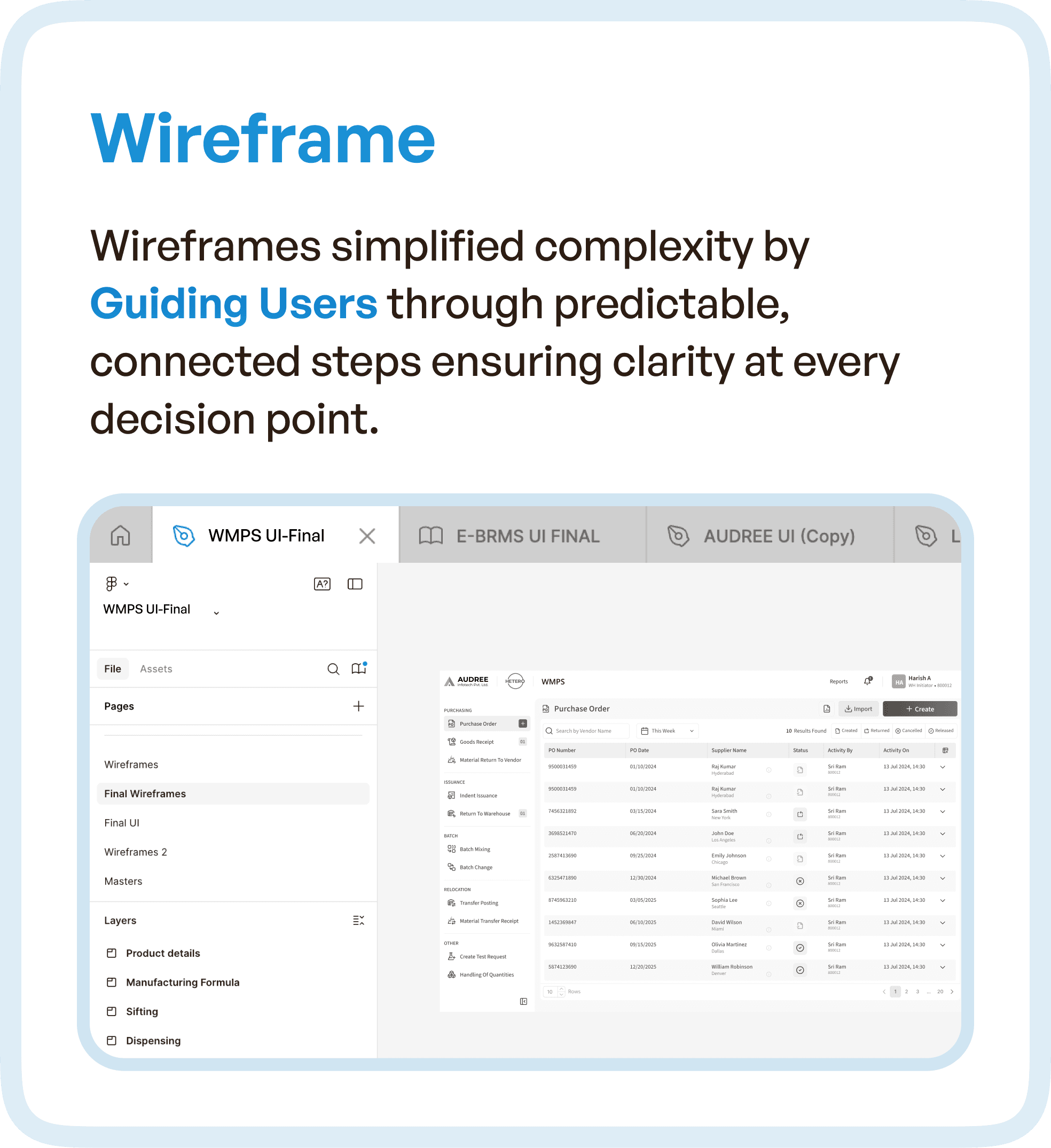
Simplifying Complexity Through Structured Wireframes
Once the flow issues were identified, the focus shifted to restructuring the experience.
Wireframes were designed not as individual screens, but as connected steps within a system.
The goal was to create predictable, guided interactions.
Each stage was clearly defined, and users were led through a logical progression without needing to guess what comes next. This reduced decision fatigue and improved task completion speed.
Instead of overwhelming users with options, the system began to prioritize what matters at each step.
Redefining Data Hierarchy for Better Clarity
One of the biggest improvements came from restructuring how data was presented.
The interface was redesigned to separate:
Core data (critical actions and decisions)
Secondary data (supporting information)
Reference data (contextual details)
This separation reduced visual noise and allowed users to focus on the most important information without distraction.
In high-pressure environments like warehouses, this level of clarity is essential.
Because users don’t have time to scan everything — they need to identify what matters instantly.

Building Consistency Through Reusable Components
Another major issue in the original system was inconsistency across modules.
To solve this, we introduced reusable UI components, standardized status tags, and modular table structures.
This created a unified experience across more than 15 interconnected modules.
Users no longer had to relearn patterns as they moved through the system. Familiar interactions reduced cognitive load and improved speed.
Consistency is often underestimated in UX, but in enterprise systems, it directly impacts efficiency.

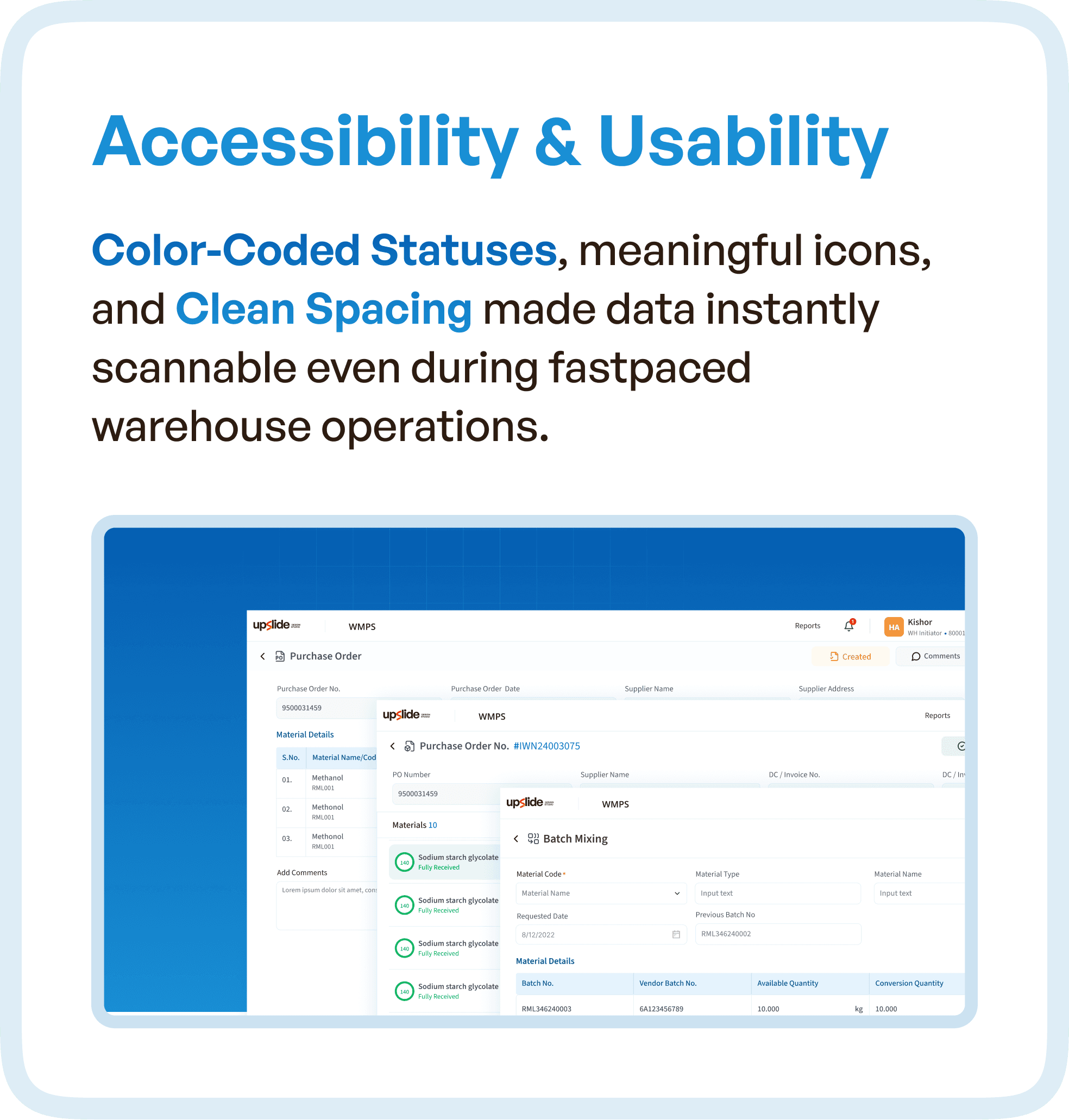
Improving Accessibility and Scannability
Warehouse environments are fast-paced.
Users need to process information quickly, often under time pressure.
To support this, the redesigned system introduced:
Color-coded statuses for quick recognition
Meaningful icons to reduce reliance on text
Clean spacing to improve readability
These changes made the interface more scannable and reduced the effort required to interpret data.
The system began to support users in real time, rather than slowing them down.
The Result: A System That Works With Users
The transformation of WMPS was not about making it look better.
It was about making it work better.
Users could now:
Move through workflows without confusion
Identify priorities instantly
Complete tasks with fewer steps
Rely on the system instead of memory
This shift improved operational efficiency, reduced errors, and increased overall confidence in the system.
Why This Matters for Enterprise and Warehouse Systems
WMPS reflects a common challenge in enterprise software.
As systems evolve, they become feature-rich but experience-poor.
Without restructuring workflows, this leads to:
Fragmented user journeys
Increased manual effort
Dependency on training
Slower operations
The solution is not adding more features or redesigning visuals.
It is rethinking the system as a connected workflow.
Because users don’t experience software as modules.
They experience it as a continuous process.
How Upslide Design Studio Approaches UX Optimization
At Upslide Design Studio, we focus on fixing the structure behind the interface.
Our approach includes:
Observing real user behavior
Mapping complete workflows
Identifying inefficiencies across stages
Restructuring systems into guided flows
Designing interfaces that support clarity and speed
This ensures that enterprise products are not just usable, but efficient, scalable, and aligned with real-world operations.
Final Thought
In systems like WMPS, the challenge is not complexity.
The challenge is how that complexity is organized.
When workflows are fragmented, users struggle.
When workflows are structured, systems scale.
Because great UX is not about simplifying the product.
It’s about simplifying how users move through it.


