
Why Color Matters in UX Design
The human brain processes visual information faster than text.
Before users read:
Your headline
Your navigation
Your features
Your value proposition
They experience your colors.
Colors create immediate emotional reactions that influence:
Trust
Confidence
Excitement
Comfort
Urgency
Perceived quality
This makes color one of the most powerful tools available to designers.
Color Is More Than Aesthetic
Many companies choose colors based on personal preference.
Unfortunately, users don't experience colors the same way designers do.
Color should support:
Brand positioning
User expectations
Product goals
Industry standards
Emotional intent
The right color strengthens a product's message.
The wrong color creates friction and confusion.
Orange: Energy, Speed, and Action
Orange is one of the most action-oriented colors in digital products.
It combines the energy of red with the friendliness of yellow.
Psychological Associations
Orange often feels:
Energetic
Friendly
Fast
Optimistic
Approachable
Why Brands Use Orange
Orange naturally attracts attention without feeling aggressive.
It creates excitement while remaining welcoming.
Example: Swiggy
Food delivery platforms frequently use orange because it reinforces:
Hunger
Speed
Convenience
Instant gratification
The color supports the emotional state users are already experiencing when ordering food.
Best Use Cases
Orange works well for:
Food delivery apps
E-commerce promotions
Call-to-action buttons
Startup brands
Consumer applications

Red: Urgency, Excitement, and Action
Red is one of the strongest emotional colors in design.
It immediately captures attention and encourages action.
Psychological Associations
Red often feels:
Urgent
Powerful
Energetic
Passionate
Attention-grabbing
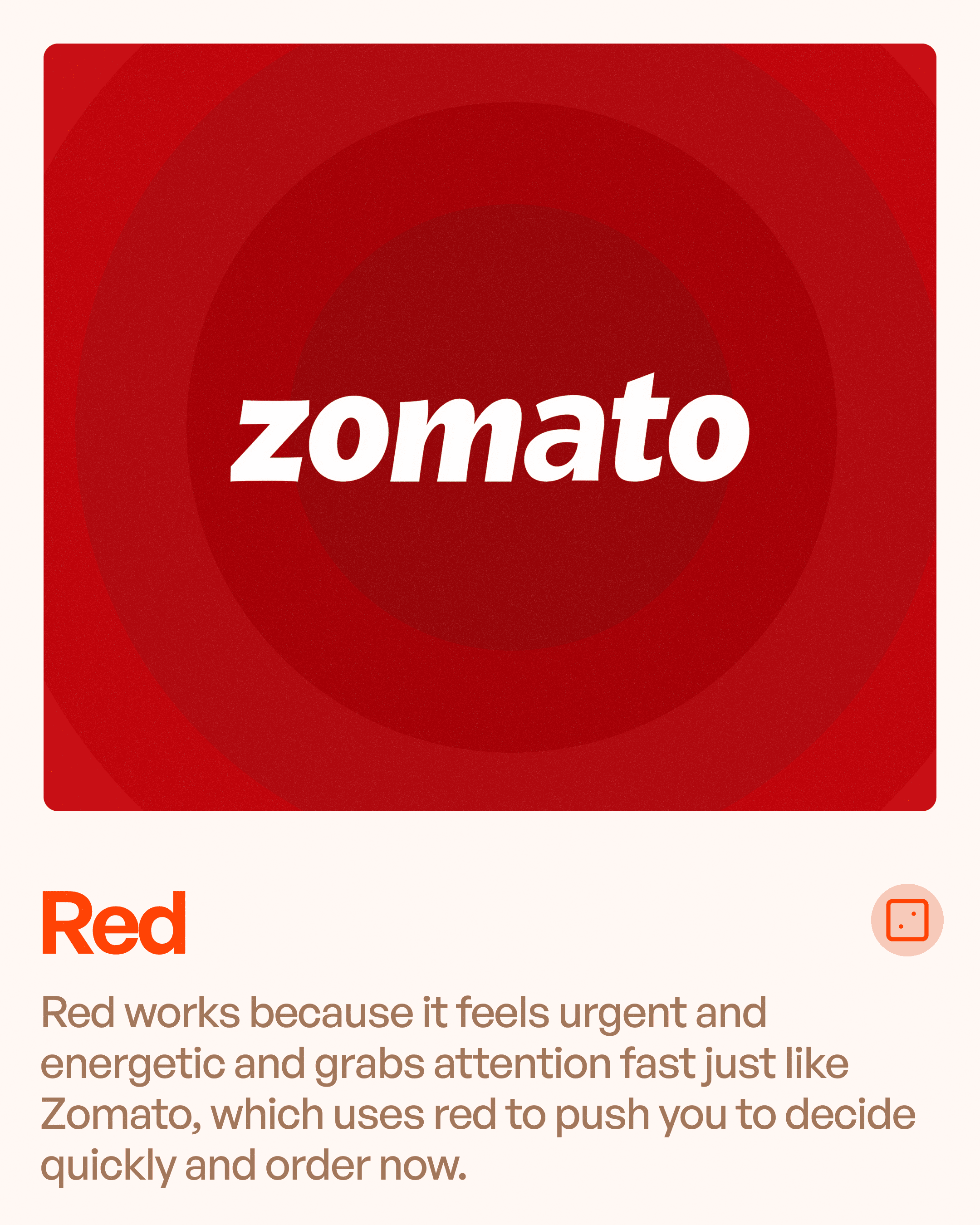
Example: Zomato
Zomato uses red to create urgency and stimulate quick decisions.
The color naturally aligns with food-related behaviors and fast ordering experiences.
Best Use Cases
Red is commonly used for:
Promotions
Sales
Alerts
Food brands
High-energy products
Important Consideration
Because red attracts significant attention, overusing it can overwhelm users.
Strategic use is critical.
Blue: Trust, Stability, and Professionalism
Blue is the most widely used color in digital products.
And for good reason.
Psychological Associations
Blue often communicates:
Trust
Reliability
Security
Professionalism
Calmness
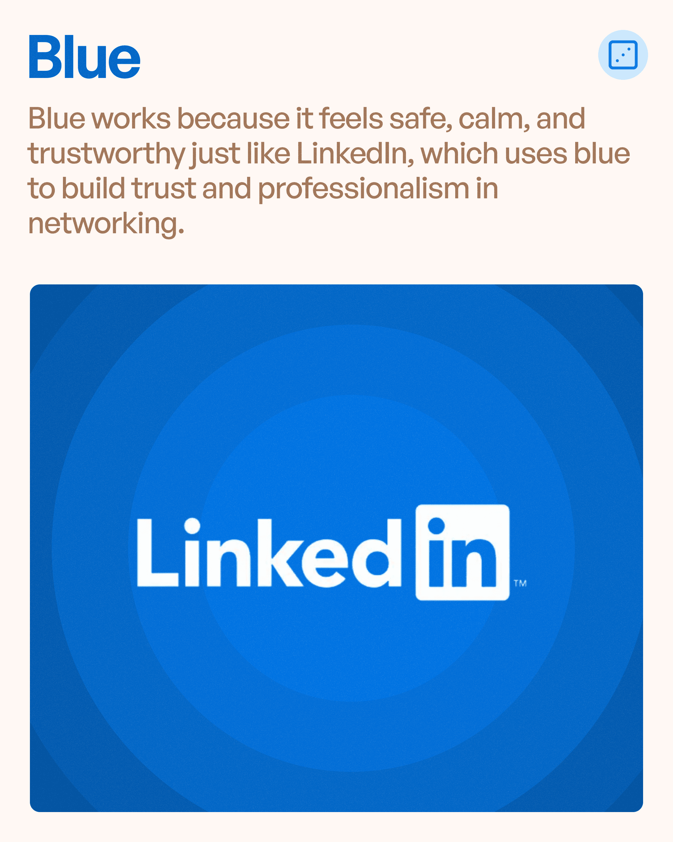
Example: LinkedIn
LinkedIn's blue branding reinforces professional networking and credibility.
Users are more likely to trust platforms that appear stable and dependable.
Why SaaS Products Use Blue
Many SaaS and enterprise platforms choose blue because users associate it with:
Data security
Professional expertise
Reliability
Reduced risk
Best Use Cases
Blue works particularly well for:
Enterprise software
SaaS platforms
Financial products
Healthcare applications
Professional services
Green: Safety, Growth, and Reassurance
Green is strongly connected to positive emotional experiences.
It often signals safety and success.
Psychological Associations
Green feels:
Safe
Positive
Healthy
Reassuring
Balanced
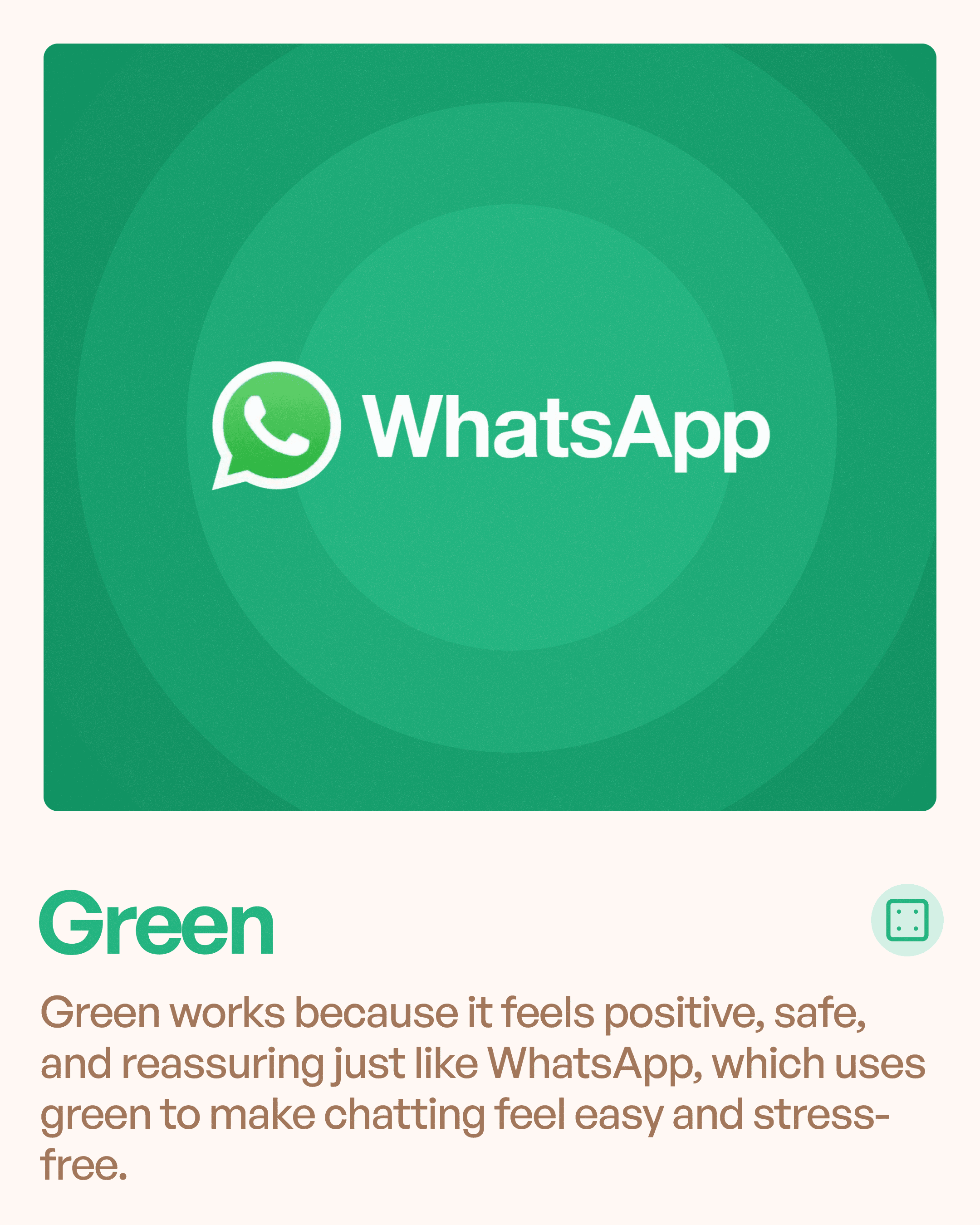
Example: WhatsApp
WhatsApp uses green to create a relaxed and welcoming communication experience.
The color reduces tension and supports effortless interaction.
Why Green Works
Green is naturally associated with:
Progress
Success
Completion
Growth
This makes it effective for confirmation states and positive feedback.
Best Use Cases
Green works well for:
Messaging platforms
Wellness products
Sustainability brands
Success notifications
Financial growth tools
Yellow: Happiness, Optimism, and Attention
Yellow is one of the most visually noticeable colors.
It attracts attention quickly and creates positive emotional responses.
Psychological Associations
Yellow often feels:
Happy
Playful
Optimistic
Youthful
Energetic
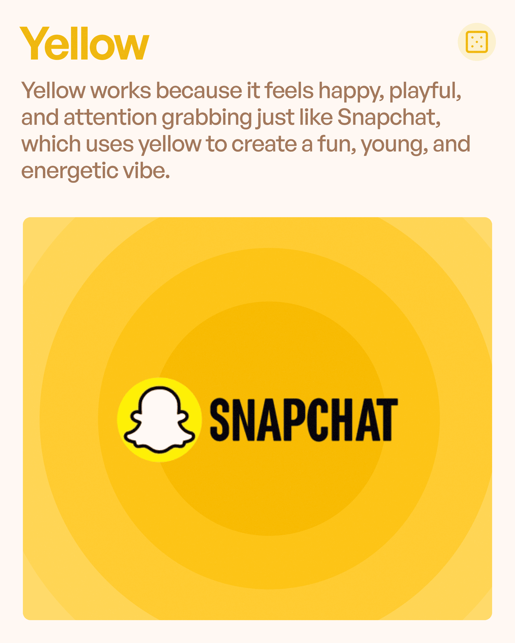
Example: Snapchat
Snapchat's yellow branding reflects the playful and spontaneous nature of the platform.
It immediately differentiates the brand from competitors.
Why Designers Use Yellow
Yellow creates excitement and visibility without the intensity of red.
Best Use Cases
Yellow is effective for:
Youth-focused products
Social applications
Entertainment platforms
Attention-grabbing highlights
Pink: Emotion, Warmth, and Personality
Pink has evolved significantly in modern branding.
It is no longer limited to traditional associations.
Psychological Associations
Pink often communicates:
Warmth
Creativity
Playfulness
Emotional connection
Individuality
Example: Barbie
Barbie's iconic pink branding creates instant recognition and emotional association.
The color reinforces the brand's personality and identity.
Modern Use Cases
Many modern products use pink to create:
Distinctiveness
Emotional appeal
Brand memorability
Best Use Cases
Pink works well for:
Lifestyle brands
Creative products
Beauty applications
Community-focused platforms
The Real Secret: Context Matters More Than Color
A common misconception is that colors have universal meanings.
In reality, context matters.
For example:
Blue Can Mean
Trust (LinkedIn)
Innovation (Stripe)
Enterprise (Salesforce)
Green Can Mean
Messaging (WhatsApp)
Finance (Mint)
Sustainability (environmental brands)
Red Can Mean
Urgency
Food
Luxury
Entertainment
The same color creates different perceptions depending on:
Industry
Product type
Brand positioning
User expectations
This is why color selection should always align with business strategy.
How Color Impacts User Experience
Color influences UX in several ways:
Creates First Impressions
Users form opinions within seconds.
Color heavily contributes to these judgments.
Guides Attention
Colors help users identify:
Primary actions
Secondary actions
Warnings
Success states
Improves Recognition
Consistent color usage strengthens brand recall.
Supports Emotional Design
Colors help products feel:
Friendly
Professional
Premium
Innovative
Common Color Psychology Mistakes
Many products make avoidable mistakes:
Choosing Colors Based on Personal Preference
User perception matters more than designer preference.
Ignoring Industry Expectations
Users bring existing mental models from other products.
Using Too Many Colors
Too many colors weaken hierarchy and create confusion.
Lack of Consistency
Inconsistent color systems reduce trust and professionalism.
Final Thoughts
Colors are not just visual elements.
They are communication tools.
Every color tells users something about your product before they interact with it.
Whether you're designing a SaaS platform, mobile application, enterprise system, or consumer product, understanding color psychology can help you create stronger user experiences.
Remember:
Orange drives action.
Red creates urgency.
Blue builds trust.
Green provides reassurance.
Yellow creates excitement.
Pink adds personality.
The best products don't choose colors because they look good.
They choose colors because they support how users should feel.
And great UX starts with understanding those emotions.


