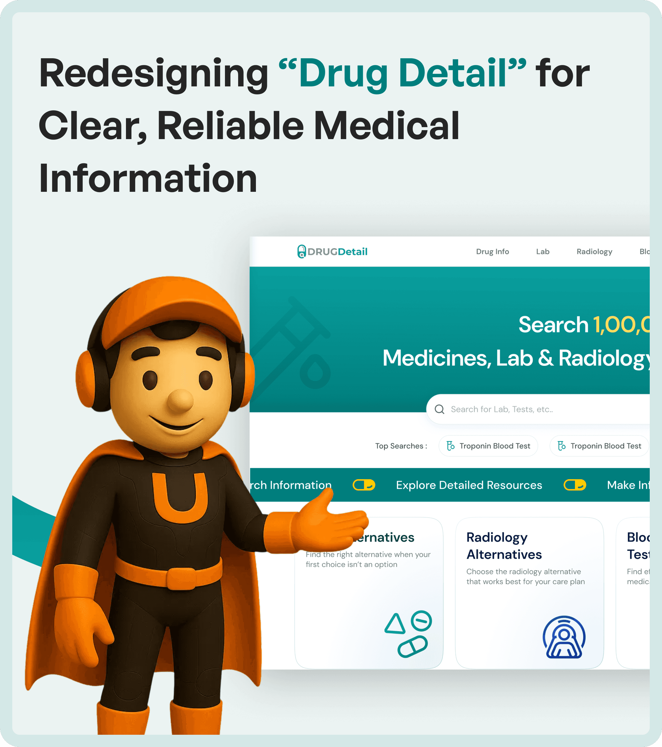

The Core Problem in Medical Information Platforms
Drug Detail contained extensive pharmaceutical data, but users struggled with:
Disorganized layouts
Dense information presentation
Unclear visual hierarchy
This made it difficult to:
Find relevant drug details
Understand relationships between information
Make quick and confident decisions
The issue was not data availability - it was data usability.
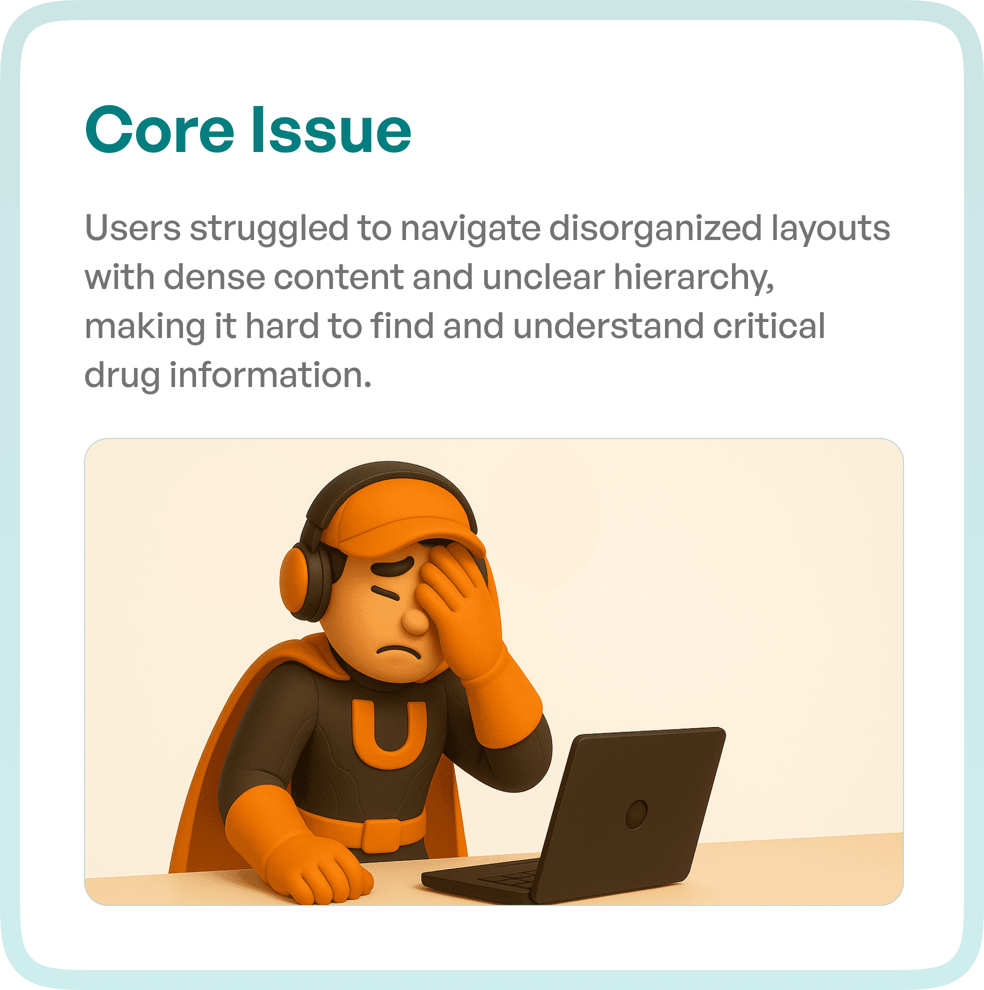
Understanding User Pain Points
To redesign the experience, we studied how users interacted with the platform.
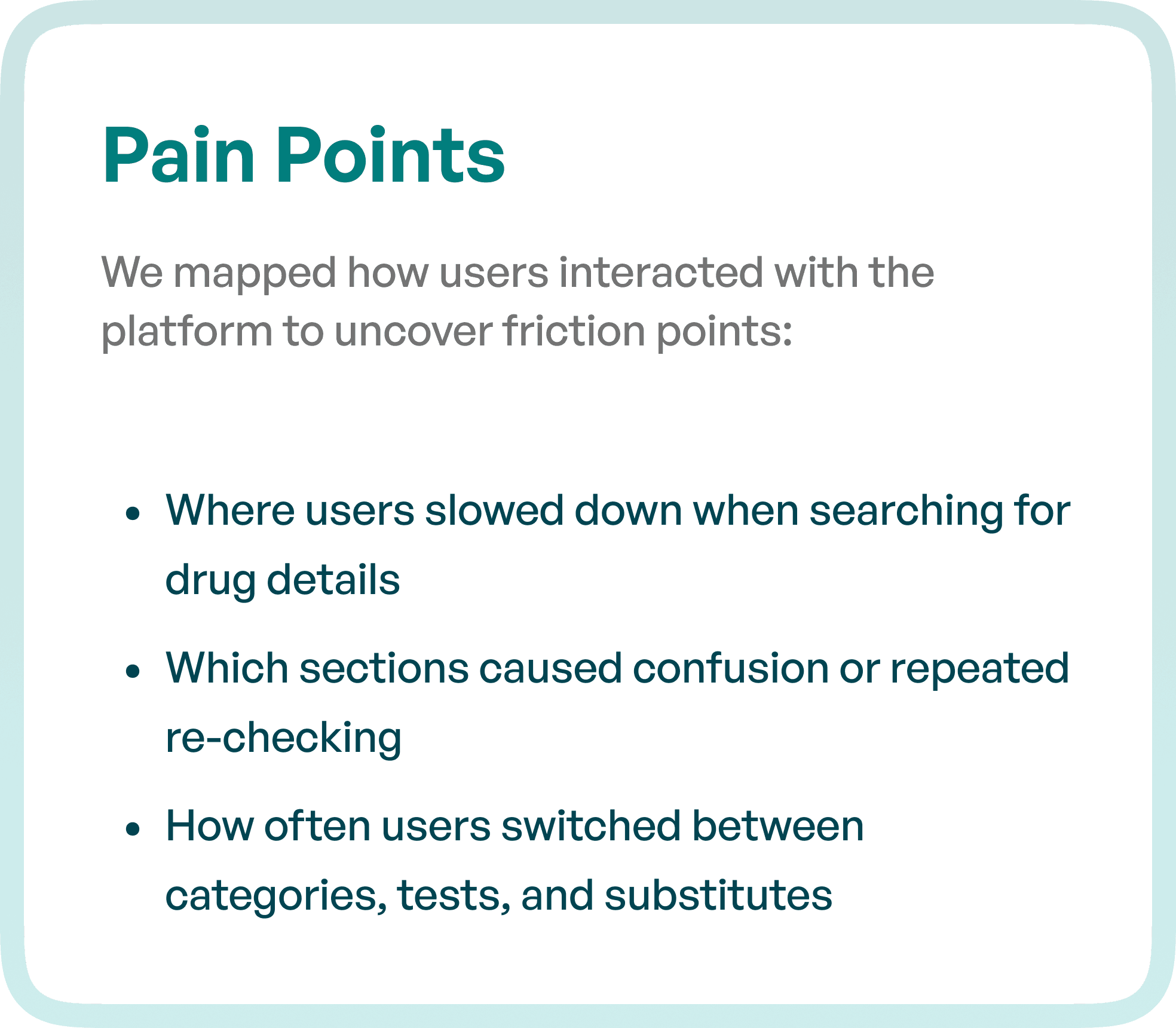
Key friction points identified:
Users slowing down while searching for drug information
Confusion caused by poorly structured sections
Repeated re-checking of information due to lack of clarity
Frequent switching between categories, tests, and substitutes
These issues increased cognitive load and reduced efficiency.
The UX Goal: Clear and Reliable Medical Information
The redesign objective was to create a system where users can:
Easily find critical drug information
Understand it without confusion
Make decisions quickly and confidently
The focus was on transforming Drug Detail into a structured and readable information platform.
UX Approach: Structuring Information for Clarity
Rather than redesigning visuals alone, we focused on improving information architecture and readability.
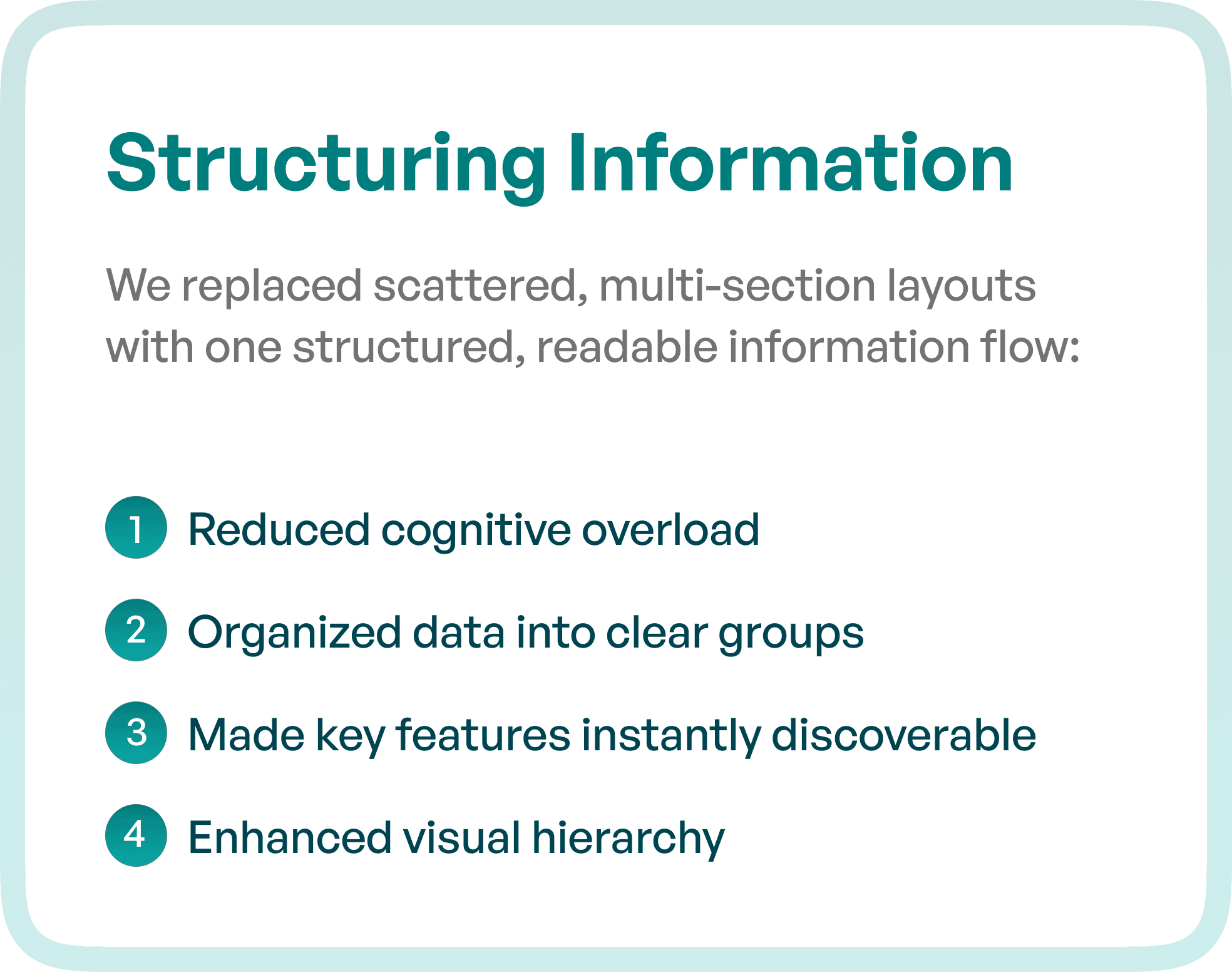
1. Structuring Information into a Clear Flow
We replaced scattered, multi-section layouts with a unified structure.
Key improvements:
Reduced cognitive overload
Organized data into logical groups
Made important features easily discoverable
Improved visual hierarchy
This allowed users to scan information quickly.
2. Reducing Cognitive Load
Medical platforms often overwhelm users with dense data.
We addressed this by:
Prioritizing essential information
Simplifying layouts
Removing unnecessary complexity
This improved comprehension and usability.
3. Enhancing Visual Hierarchy
Users need to understand:
What is important
What to read first
What actions to take
We introduced:
Clear typography hierarchy
Structured content sections
Consistent layout patterns
This made information easier to interpret.
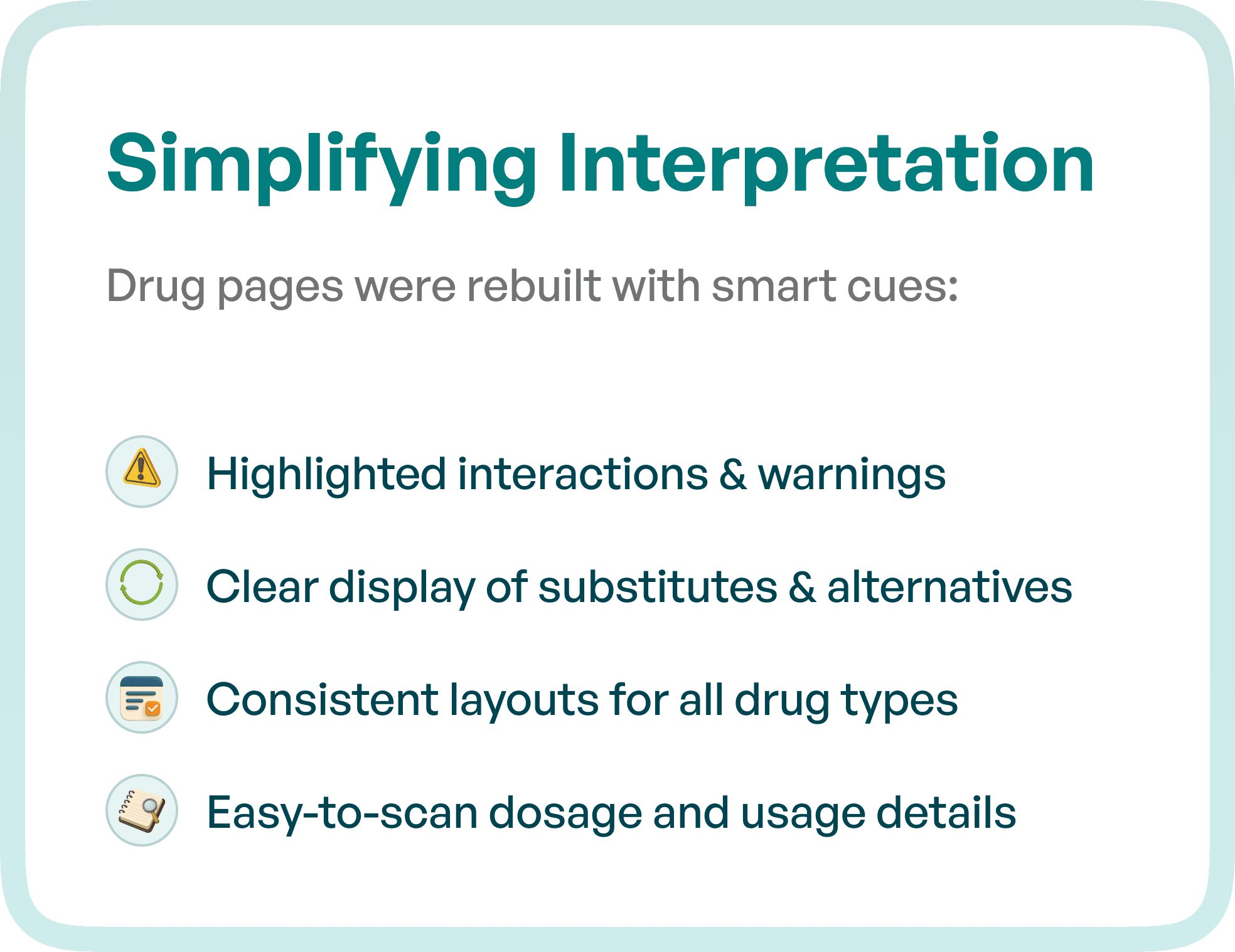
Simplifying Interpretation of Drug Data
To make complex medical data easier to understand, we redesigned drug pages with smart visual cues.
Key improvements:
Highlighted interactions and warnings
Clear display of substitutes and alternatives
Consistent layouts across all drug types
Easy-to-scan dosage and usage details
This reduced confusion and improved decision-making.
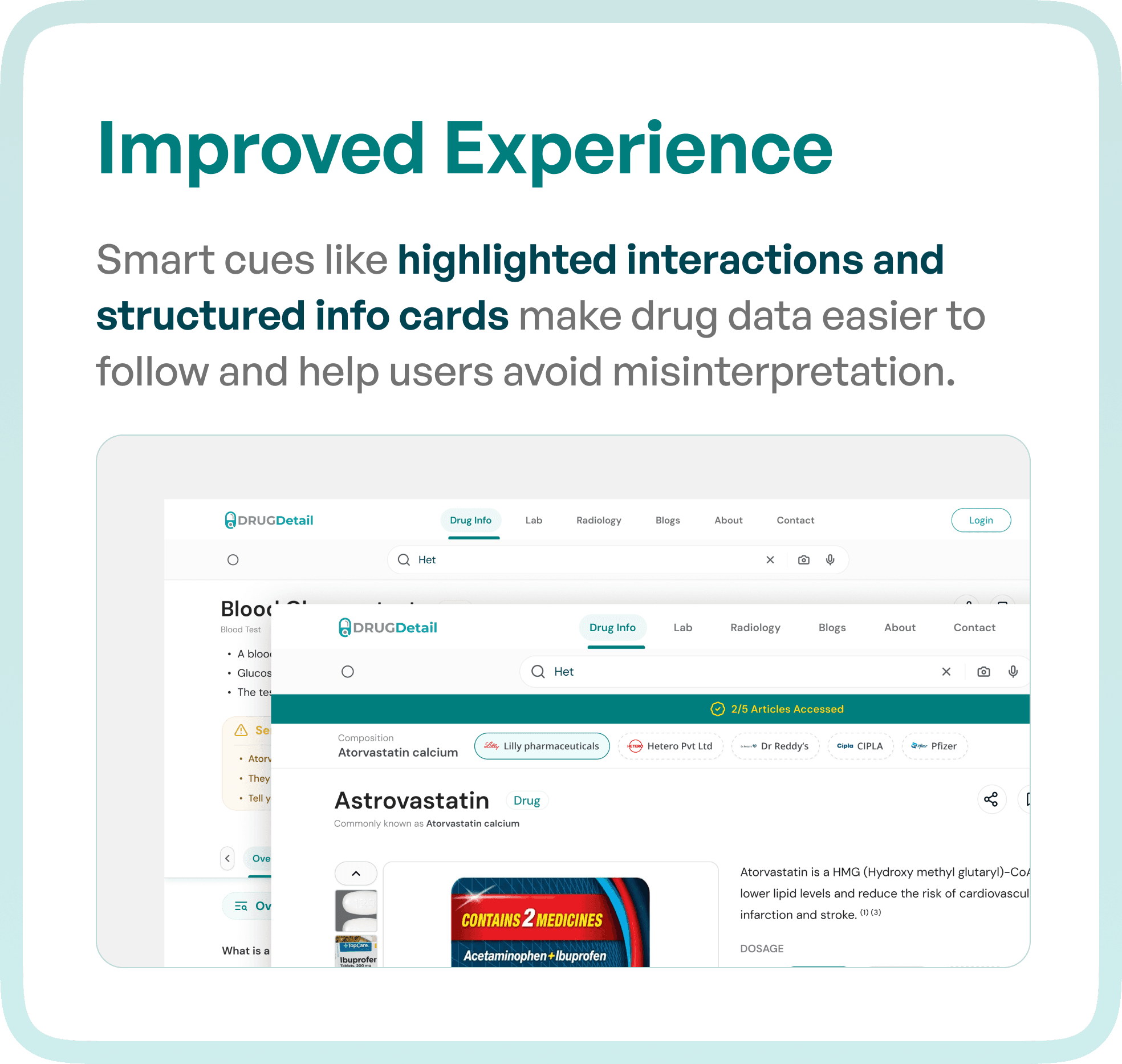
Improving Experience with Structured Information Cards
We introduced structured information components to make data more usable.
Enhancements included:
Highlighted key insights
Structured information cards
Improved readability of content
This helped users:
Follow information easily
Avoid misinterpretation
Make informed decisions faster
The Result: A Clear and Efficient Medical Platform
After the redesign, Drug Detail became a more intuitive and reliable platform.
Key outcomes:
Clearer drug information
Improved feature visibility
Faster decision-making
Smoother overall user experience
Users could now:
Find information quickly
Understand it with confidence
Act without hesitation
Why UX Design is Critical in Healthcare Platforms
Healthcare systems deal with:
High-stakes decisions
Complex data
Multiple user types
Without strong UX:
Errors increase
Trust decreases
Efficiency drops
With structured UX:
Clarity improves
Decisions become faster
User confidence increases
Final Thoughts
The challenge in medical platforms is not collecting data.
It is presenting that data in a way that users can understand, trust, and act on.
By focusing on structure, clarity, and usability, platforms can deliver real value.