Radiology Management Software
Radiology Management Software
Product Design
Product Design
Redesigning a Global RIS-PACS Software to Improve Efficiency and Reduce Errors in Radiology
Redesigning a Global RIS-PACS Software to Improve Efficiency and Reduce Errors in Radiology
Redesigning a Global RIS-PACS Software to Improve Efficiency and Reduce Errors in Radiology
Transformed a complex radiology software into a streamlined experience reducing friction, minimizing errors, and enabling faster decisions.
Transformed a complex radiology software into a streamlined experience reducing friction, minimizing errors, and enabling faster decisions.
Transformed a complex radiology software into a streamlined experience reducing friction, minimizing errors, and enabling faster decisions.
About Project
About Project
About Project
In a typical hospital, a patient is prescribed a radiology test like an X-ray, CT scan, or MRI. The test is scheduled, performed, and reviewed all managed through a RIS-PACS software.
The platform is used by radiologists, technicians, reception staff, and doctors to handle the complete radiology workflow from billing and scheduling to scan execution and report approval.
Over time, however, the software became complex and cluttered. Routine tasks required too many clicks, multiple screens, and constant interpretation of dense information.
This slowed down workflows, increased the chances of human error, and made the software heavily dependent on training making a redesign necessary.
Industry
Industry
Industry
Healthcare Industry
Healthcare Industry
Team
Team
Team
Varun,Madhumala
Varun,Madhumala
Subscription Category
Subscription Category
Subscription Category
Quick Win
Quick Win
Project Start Year
Project Start Year
Project Start Year
Febraury 2026
Febraury 2026

Business Challenges
Business Challenges
Business Challenges

Increased Risk of
Human Error
Increased Risk of
Human Error
Increased Risk of
Human Error
The interface was cluttered with too many actions and dense information, forcing users to interpret next steps and increasing the risk of errors.
The interface was cluttered with too many actions and dense information, forcing users to interpret next steps and increasing the risk of errors.
The interface was cluttered with too many actions and dense information, forcing users to interpret next steps and increasing the risk of errors.

High Dependency on Training
High Dependency on Training
High Dependency on Training
The system relied heavily on training and was difficult for new users to understand, leading to slower onboarding and inconsistent usage.
The system relied heavily on training and was difficult for new users to understand, leading to slower onboarding and inconsistent usage.
The system relied heavily on training and was difficult for new users to understand, leading to slower onboarding and inconsistent usage.


Fragmented user experience
Fragmented user experience
Fragmented user experience
Workflows were spread across multiple screens with no clear flow, forcing context switching and slowing down task completion.
Workflows were spread across multiple screens with no clear flow, forcing context switching and slowing down task completion.
Workflows were spread across multiple screens with no clear flow, forcing context switching and slowing down task completion.
Our Approach
Our Approach
Our Approach
We analyzed how users interacted with the existing RIS-PACS system and identified gaps in workflow clarity and efficiency, where tasks required navigating multiple screens with excessive actions. We addressed this by restructuring workflows into a unified interface, simplifying interactions, and introducing AI-assisted features for faster reporting and decision-making.
We analyzed how users interacted with the existing RIS-PACS system and identified gaps in workflow clarity and efficiency, where tasks required navigating multiple screens with excessive actions. We addressed this by restructuring workflows into a unified interface, simplifying interactions, and introducing AI-assisted features for faster reporting and decision-making.
We analyzed how users interacted with the existing RIS-PACS system and identified gaps in workflow clarity and efficiency, where tasks required navigating multiple screens with excessive actions. We addressed this by restructuring workflows into a unified interface, simplifying interactions, and introducing AI-assisted features for faster reporting and decision-making.
Visual Userflow
Audit
Ui Concepts
Design System
Wireframes
Ui
Visual Userflow
Audit
Ui Concepts
Design System
Wireframes
Ui
Visual Userflow
Audit
Ui Concepts
Design System
Wireframes
Ui
Problems in the Existing Software
Problems in the Existing Software
Problems in the Existing Software
We identified key issues that created friction in daily tasks, increasing effort and slowing down workflows.
We identified key issues that created friction in daily tasks, increasing effort and slowing down workflows.
We identified key issues that created friction in daily tasks, increasing effort and slowing down workflows.
Problem - 1
Too Many Actions with No Clear Priority
Each screen was filled with multiple actions, with no clear priority or structure. Users had to pause, scan through options, and interpret what each action meant before moving forward.
What should have been a quick decision became a moment of hesitation, slowing down even simple tasks.


Problem - 2
Lack of Context While Working
Switching between multiple screens caused users to lose track of their current task and progress. Each action required moving to a different view, breaking the natural flow of work.
With no single place to view and act on everything together, users had to mentally piece together information and remember where they were in the process.
This constant context switching increased effort, slowed down task completion, and made workflows feel disconnected and harder to manage.
Problem - 3
No Clear Way to Add Patients and See Reports
Adding new patients was not straightforward, as there was no clear or visible entry point in the interface. Users often had to search through multiple options to find where to perform this action.
This lack of clarity made a basic task feel confusing and inconsistent, especially for new users who were unfamiliar with the system.
As a result, a routine process took longer than expected, slowing down workflows and interrupting the overall experience.
Problem - 1
Problem - 1
Too Many Actions with No Clear Priority
Too Many Actions with No Clear Priority
Each screen was filled with multiple actions, with no clear priority or structure. Users had to pause, scan through options, and interpret what each action meant before moving forward.
What should have been a quick decision became a moment of hesitation, slowing down even simple tasks.
Each screen was filled with multiple actions, with no clear priority or structure. Users had to pause, scan through options, and interpret what each action meant before moving forward.
What should have been a quick decision became a moment of hesitation, slowing down even simple tasks.

Problem - 2
Problem - 2
Lack of Context While Working
Lack of Context While Working
Switching between multiple screens caused users to lose track of their current task and progress. Each action required moving to a different view, breaking the natural flow of work.
With no single place to view and act on everything together, users had to mentally piece together information and remember where they were in the process.
This constant context switching increased effort, slowed down task completion, and made workflows feel disconnected and harder to manage.

Problem - 3
Problem - 3
No Clear Way to Add Patients and See Reports
No Clear Way to Add Patients and See Reports
Adding new patients was not straightforward, as there was no clear or visible entry point in the interface. Users often had to search through multiple options to find where to perform this action.
This lack of clarity made a basic task feel confusing and inconsistent, especially for new users who were unfamiliar with the system.
As a result, a routine process took longer than expected, slowing down workflows and interrupting the overall experience.

The Solutions We Crafted
The Solutions We Crafted
The Solutions We Crafted
We designed focused solutions to simplify workflows, reduce complexity, and help users complete tasks faster and with more clarity.
We designed focused solutions to simplify workflows, reduce complexity, and help users complete tasks faster and with more clarity.
We designed focused solutions to simplify workflows, reduce complexity, and help users complete tasks faster and with more clarity.
Solution - 1
Solution - 1
Clear Action Hierarchy and Simplified Interface
Clear Action Hierarchy and Simplified Interface
We redesigned the interface to bring clarity to how actions are presented. Instead of showing everything at once, actions are now structured based on priority, helping users quickly understand what to do next.
Primary actions are more visible, while secondary actions are grouped to reduce clutter.
This removes the need to pause and interpret multiple options, making actions more immediate and tasks faster to complete.


Solution - 2
Solution - 2
Unified Workspace for Better Context
Unified Workspace for Better Context
We brought key information, actions, and workflows into a single, structured view, aligning the interface with how users naturally work.
Instead of switching between multiple screens, users can now access everything they need in one place, reducing interruptions and maintaining context.
This helps users stay focused, understand their progress, and complete tasks more smoothly.

Solution - 3
Solution - 3
Dedicated Entry Point for Adding Study Details
Dedicated Entry Point for Adding Study Details
We introduced a clear and accessible “Add Study Details” button as a primary action, making it immediately visible within the interface.
Instead of searching through multiple options, users can now quickly identify where to begin and add study details without confusion.
This simplifies a common task, making the process more direct, consistent, and easier to learn, especially for new users.

Solution - 1
Clear Action Hierarchy and Simplified Interface
We redesigned the interface to bring clarity to how actions are presented. Instead of showing everything at once, actions are now structured based on priority, helping users quickly understand what to do next.
Primary actions are more visible, while secondary actions are grouped to reduce clutter.
This removes the need to pause and interpret multiple options, making actions more immediate and tasks faster to complete.
Solution - 2
Unified Workspace for Better Context
We brought key information, actions, and workflows into a single, structured view, aligning the interface with how users naturally work.
Instead of switching between multiple screens, users can now access everything they need in one place, reducing interruptions and maintaining context.
This helps users stay focused, understand their progress, and complete tasks more smoothly.
Solution - 3
Dedicated Entry Point for Adding Study Details
We introduced a clear and accessible “Add Study Details” button as a primary action, making it immediately visible within the interface.
Instead of searching through multiple options, users can now quickly identify where to begin and add study details without confusion.
This simplifies a common task, making the process more direct, consistent, and easier to learn, especially for new users.

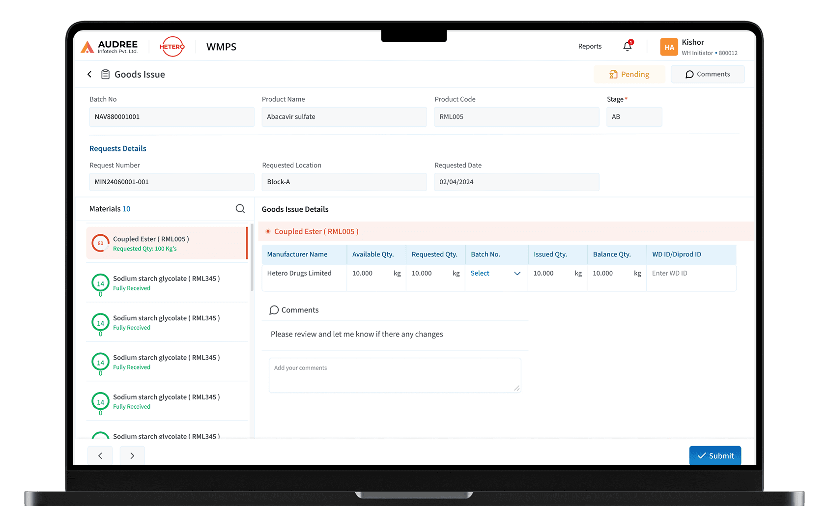
Base of Final UI Design with UX Explanation
Base of Final UI Design with UX Explanation
We restructured the RIS-PACS experience to align with real radiology workflows, simplifying interactions and bringing key actions, data, and insights into a single, intuitive interface.
We restructured the RIS-PACS experience to align with real radiology workflows, simplifying interactions and bringing key actions, data, and insights into a single, intuitive interface.


AI-Driven Support for
Radiology Reporting
AI-Driven Support for
Radiology Reporting
AI-Driven Support for Radiology Reporting
The assistant helps users explore features, perform actions, and understand data through simple, conversational interactions making the software easier to use and learn.
The assistant helps users explore features, perform actions, and understand data through simple, conversational interactions making the software easier to use and learn.
The assistant helps users explore features, perform actions, and understand data through simple, conversational interactions making the software easier to use and learn.


Features Enhancing Radiology Workflows
Features Enhancing Radiology Workflows
Features Enhancing Radiology Workflows
A set of streamlined features designed to reduce complexity, improve usability, and enable more efficient radiology operations.
A set of streamlined features designed to reduce complexity, improve usability, and enable more efficient radiology operations.
A set of streamlined features designed to reduce complexity, improve usability, and enable more efficient radiology operations.


In-Built DICOM Viewer
View and analyze DICOM images directly within the system.
In-Built DICOM Viewer
View and analyze DICOM images directly within the system.
In-Built DICOM Viewer
View and analyze DICOM images directly within the system.
Smart Test Scheduling
Easily schedule and assign radiology tests with clear status.
Smart Test Scheduling
Easily schedule and assign radiology tests with clear status.
Smart Test Scheduling
Easily schedule and assign radiology tests with clear status.
Predefined Report Templates
Create faster, consistent reports using templates.
Predefined Report Templates
Create faster, consistent reports using templates.
Predefined Report Templates
Create faster, consistent reports using templates.
AI-Assisted Analysis
Generate quick insights and support diagnosis with AI.
AI-Assisted Analysis
Generate quick insights and support diagnosis with AI.
AI-Assisted Analysis
Generate quick insights and support diagnosis with AI.
Redesigned RIS-PACS
Interface
Redesigned RIS-PACS Interface
Redesigned RIS-PACS Interface
A unified and streamlined interface designed to simplify workflows, reduce complexity, and bring key actions and information into one place, enabling faster and more accurate task completion.
A unified and streamlined interface designed to simplify workflows, reduce complexity, and bring key actions and information into one place, enabling faster and more accurate task completion.
A unified and streamlined interface designed to simplify workflows, reduce complexity, and bring key actions and information into one place, enabling faster and more accurate task completion.


Visual Foundations &
Components
Visual Foundations & Components
Visual Foundations &
Components
The visual direction was designed to prioritize clarity, accessibility, and ease of use. Every element was kept purposeful to help users quickly understand information and take action without confusion.
The visual direction was designed to prioritize clarity, accessibility, and ease of use. Every element was kept purposeful to help users quickly understand information and take action without confusion.


Typography
Typography
SANS
SANS
SANS
General Sans Variable
General Sans Variable
12
12
14
14
16
16
20
20
24
24
28
28
32
32
12
14
16
20
24
28
32

How the Redesign Transformed the System
Visual Foundations & Components
How the Redesign Transformed the System
We simplified complex workflows, brought everything into one place, and made the system easier to use helping teams work faster and with more clarity.
We simplified complex workflows, brought everything into one place, and made the system easier to use helping teams work faster and with more clarity.
Reduced Clicks
From
0
1
2
3
4
5
0
1
2
3
4
5
6
7
8
9
Reduced Clicks
From
0
1
2
3
4
5
0
1
2
3
4
5
6
7
8
9
Reduced Clicks
From
0
1
2
3
4
5
0
1
2
3
4
5
6
7
8
9
AI-Supported Reports
AI-Supported Reports
AI-Supported Reports

Patient Details
Scheduling
Reporting
Collaboration
DICOM Viewer
Multiple screens
One unified workspace
No more switching everything you need is in one unified system.
Patient Details
Scheduling
Reporting
Collaboration
DICOM Viewer
Multiple screens
One unified workspace
No more switching everything you need is in one unified system.
Patient Details
Scheduling
Reporting
Collaboration
DICOM Viewer
Multiple screens
One unified workspace
No more switching everything you need is in one unified system.
Easier to learn. Faster to use
Easier to learn. Faster to use
Easier to learn. Faster to use
Seamless Collaboration
Seamless Collaboration
Seamless Collaboration

Impact Created
Impact Created
By reducing complexity and bringing everything into one place, the software helps users work faster, make better decisions, and deliver outcomes with confidence.
By reducing complexity and bringing everything into one place, the software helps users work faster, make better decisions, and deliver outcomes with confidence.

More efficient workflows
Simplified scheduling, reporting, and navigation reduce manual effort and operational delays.


Faster diagnosis and reporting
Integrated DICOM viewer and AI assistance help doctors analyze and complete reports quicker.

Improved clarity and collaboration
Structured interfaces and in-software communication reduce confusion and improve team coordination.
More efficient workflows
Simplified scheduling, reporting, and navigation reduce manual effort and operational delays.
Faster diagnosis and reporting
Integrated DICOM viewer and AI assistance help doctors analyze and complete reports quicker.
Improved clarity and collaboration
Structured interfaces and in-software communication reduce confusion and improve team coordination.
Want results like these for your Product ?
Talk to us or see how our process works before you decide.
Want results like these for your Product ?
Talk to us or see how our process works before you decide.
Want results like these for your Product ?
Talk to us or see how our process works before you decide.
Case Studies


Impact Created
By reducing complexity and bringing everything into one place, the software helps users work faster, make better decisions, and deliver outcomes with confidence.
More efficient workflows
Simplified scheduling, reporting, and navigation reduce manual effort and operational delays.
Faster diagnosis and reporting
Integrated DICOM viewer and AI assistance help doctors analyze and complete reports quicker.
Improved clarity and collaboration
Structured interfaces and in-software communication reduce confusion and improve team coordination.