


Mark the current flow with issues and evidence
Current step / issue | Evidence needed | Proposed response |
|---|---|---|
Administrator opens settings repeatedly to find invitations. | Observed task route plus reliable navigation events. | Provide a stable invitation route where the task context warrants it. |
A blocked invitation returns to an unexplained form. | Error state, permission rule and a session showing interpretation. | Explain the policy and legitimate responsible role. |
A failed send looks complete. | Delivery response and UI state comparison. | Separate pending, failed and confirmed delivery states. |
Resend creates repeated attempts. | Invitation identity and event deduplication checks. | Retain one record and explain whether retry is still pending. |
Compare the revised flow on the same goal
Current illustrative flow: open settings → enter details → send → ambiguous state → return to settings → resend. Revised proposal: open invitations → enter details → validate access → send → show confirmed or failed state; failure preserves the record and provides one retry route.
Prioritize a blocked authorized outcome above a merely longer visual route.
Separate policy denial from a usability defect.
Inspect tracking completeness before interpreting drop-offs.
Observe the revised failure path with the same task and content.
Measure correct completion, repeated attempts and recovery without coaching.
Analytics can locate a suspicious transition but cannot alone explain the person’s understanding. A qualitative session can reveal a cause but cannot establish its population frequency without a suitable quantitative basis.
A revised flow is an improvement only when its task evidence supports the change.
Most UX problems don’t come from visuals.
They come from broken flows.
Users don’t struggle because buttons look bad.
They struggle because:
Steps are unclear
Decisions are confusing
Paths don’t lead to completion
This is where user flows in UX design become one of the most powerful diagnostic tools.
Identify where the current experience breaks down with a UX audit.
What Are User Flows (From a Problem-Solving Perspective)?
User flows are not just journey maps.
They are a way to visualize how users actually move through your product.
Every Click, Decision & Transition becomes visible.
And when you see the flow clearly, you start seeing what’s not working.
Why User Flows Help Identify UX Problems
User flows expose friction.
They make problems visible that are otherwise hidden inside screens.
Common issues revealed through flows:
Unnecessary steps
Confusing decision points
Broken navigation paths
Incomplete journeys
Every extra click or hesitation becomes obvious when mapped.
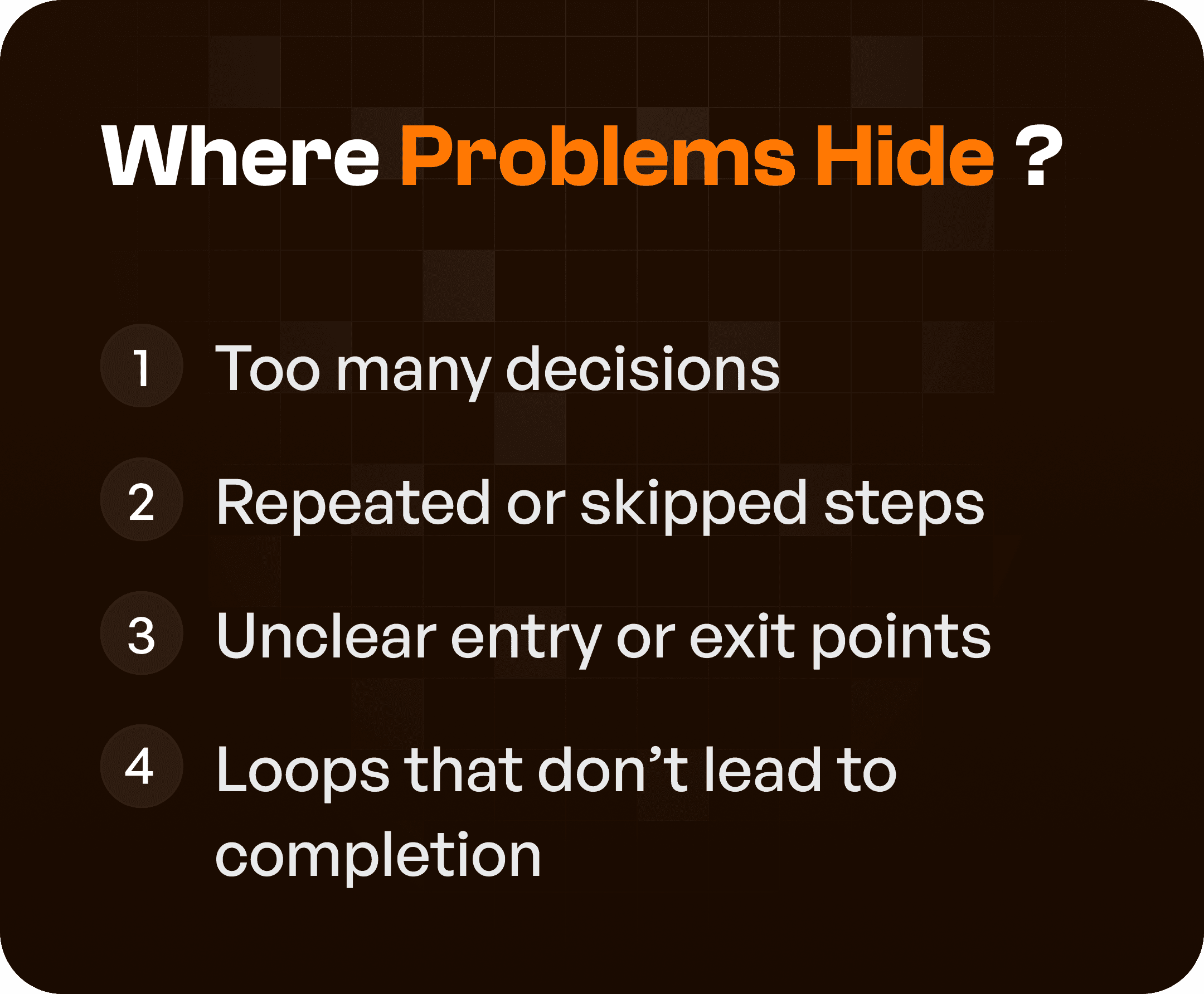
Where UX Problems Usually Hide
When analyzing user flows, look for these patterns:
1. Too Many Decisions
Users are forced to think too much at each step.
2. Repeated or Skipped Steps
Users go back and forth or miss important actions.
3. Unclear Entry or Exit Points
Users don’t know where to start or how to finish.
4. Loops Without Completion
Users get stuck in cycles without reaching their goal.
These are strong indicators of poor UX structure.
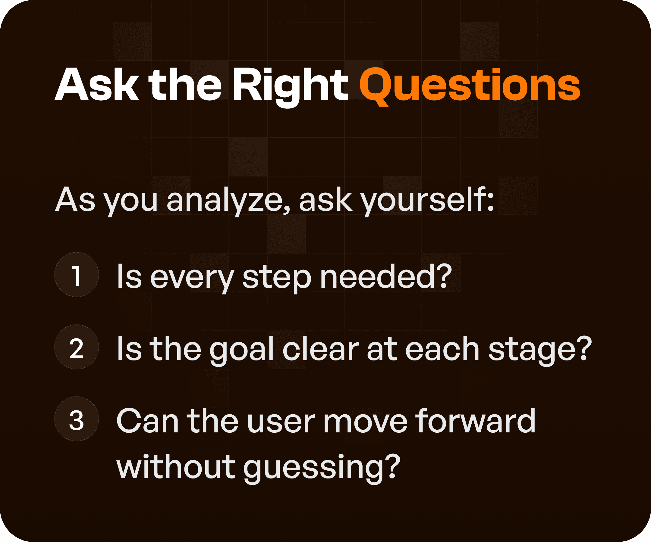
Step 1: Ask the Right Questions
While reviewing user flows, ask:
Is every step necessary?
Is the goal clear at each stage?
Can the user move forward without guessing?
If the answer is no, there is a UX problem.
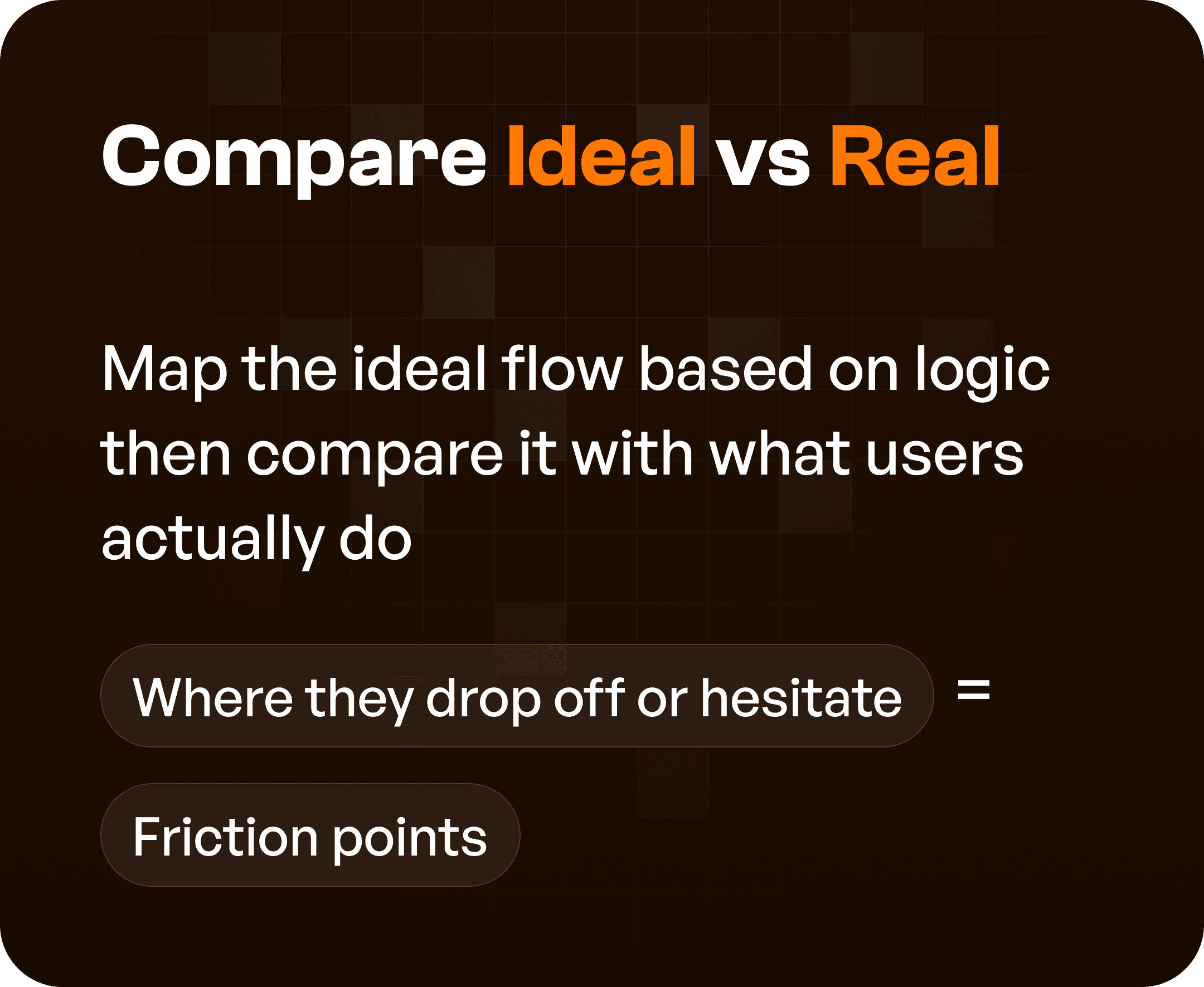
Step 2: Compare Ideal vs Real User Behavior
There is always a gap between:
how the product is designed
how users actually behave
Approach:
Map the ideal flow (based on logic)
Compare it with real user behavior
Where users:
Drop off
Hesitate
Take detours
Those are friction points.
Step 3: Identify Friction Points
Friction appears as:
Delays
Confusion
Unnecessary effort
Common friction indicators:
Long paths to complete tasks
Multiple clicks for simple actions
Unclear navigation
These are opportunities for improvement.
Step 4: Simplify and Refine the Flow
Once problems are identified, simplify the experience.
Key actions:
Remove dead ends
Shorten long workflows
Reduce decision complexity
Highlight critical actions
The goal is to create clear and direct paths.
The Outcome: Clean Flows = Confident Users
When flows are optimized:
Users move faster
Users make fewer mistakes
Users feel confident using the product
This leads to:
Better adoption
Higher task completion rates
Reduced support dependency
Why This Matters for SaaS and Enterprise UX
In complex systems:
Workflows are multi-step
Users have different roles
Tasks are interconnected
Without flow optimization:
Systems become inefficient
Users rely on training
Processes slow down
With optimized flows:
Systems guide users
Workflows become intuitive
Efficiency improves
Final Thoughts
User flows are more than design artifacts.
They are problem-detection tools.
If you want to improve your product:
Don’t start with UI.
Start with flows.
Because when flows are clear, everything else becomes easier.
Frequently asked questions
Can a user-flow diagram prove why users abandon a task?
No. A diagram can expose extra steps, dead ends or unclear decision points, but it does not prove why users leave. Combine the flow with analytics, usability observation and relevant support evidence before treating a suspected problem as the cause of abandonment.
How should flow problems be prioritized?
Prioritize blocked tasks, consequential mistakes and frequent rework. Consider how many roles are affected and whether recovery is possible. Avoid removing a step simply to shorten the diagram when it communicates a necessary decision, approval or safety check.

