

Follow one material through the warehouse
Upslide’s published case describes material movement, storage and inventory workflows, with receipt, storage and dispatch mapped together: Audree WMPS case study
Illustrative task stage | Information and responsibility | Exception to design |
|---|---|---|
Receipt | Material identity, expected versus received quantity, receiver and receipt state. | A mismatch remains visible with an owner; do not silently treat it as complete. |
Storage / locating | Material location, available context and the person responsible for the move. | Explain a missing location or unavailable destination. |
Issue / dispatch | Requested, received and pending quantities presented with the relevant material. | Preserve a partial issue and explain the remaining quantity. |
Review | Current state, earlier actions and what the reviewer may do. | Returned work identifies the specific correction and responsible operator. |
Read the interface decision, not only the screen style
The public project describes side-by-side receipt and issue information with material cards. The transferable decision is to keep related quantities and the material identity in the same task context. That reduces the need to remember a value from a disconnected view; the actual effect still needs task evidence.
For a proposed partial-issue test, give an operator a synthetic material with an outstanding quantity and ask what remains to dispatch. Observe whether the person identifies the correct material, quantity and next owner without opening unrelated records.
State whether quantities refer to requested, received, issued or remaining material.
Use text as well as color for status.
Keep a returned action associated with its reason.
Measure task correctness and recovery before claiming efficiency gains.
The key warehouse question is what can happen to this material next, and why.
Pharmaceutical warehouse operations are inherently complex.
They involve:
material management
inventory tracking
batch processing
quality checks
dispatch workflows
But in many systems, inefficiency doesn’t come from operations.
It comes from poor UX design and unstructured workflows.
At Upslide Design Studio, we redesigned a pharmaceutical Warehouse Management System (WMPS) to improve clarity, reduce manual effort, and streamline operations.
For a closer look at review ownership and returned work, read BMR workflow UX decisions.
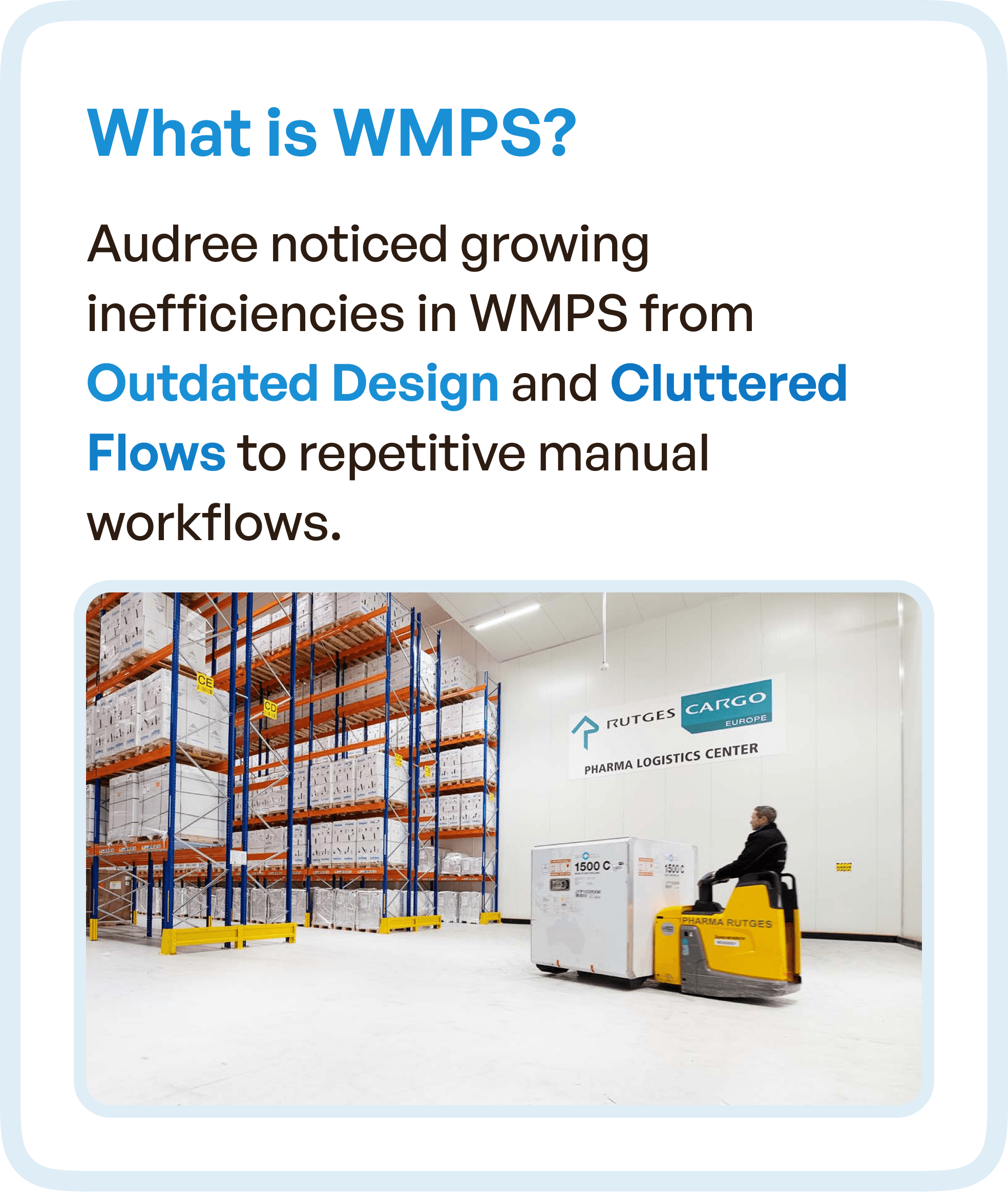
What is a Pharma Warehouse Management System (WMPS)?
A Warehouse Management System (WMS) in pharma is used to manage:
Material storage
Inventory movement
Batch lifecycle
Compliance processes
Unlike standard WMS platforms, pharma systems must also handle:
Regulatory workflows
Traceability
Quality assurance steps
This makes UX design critical.
The Core Problem: Outdated Design and Fragmented Workflows
Audree’s WMPS faced increasing inefficiencies due to:
Outdated UI design
Cluttered and disconnected workflows
Heavy reliance on manual coordination
This resulted in:
Repetitive tasks
Process delays
Operational confusion
The system was functional, but not efficient.
Key Business Challenges
1. Stuck in Process Loops
Users repeated steps due to unclear workflows.
2. Outdated UX
Interfaces did not reflect modern usability standards.
3. Heavy Manual Dependency
Teams relied on communication instead of system guidance.
These issues reduced productivity and increased error risk.
UX Goal: Simplify End-to-End Warehouse Operations
The objective was to redesign the system to:
Simplify warehouse workflows
Less manual coordination
Improve visibility across processes
From material indent to dispatch, every step needed clarity.
UX Approach: Restructuring Warehouse Flows
Instead of focusing only on UI improvements, we restructured the entire workflow logic.
1. Merging Redundant Steps
We identified and eliminated unnecessary actions.
Result:
Fewer steps
Faster task completion
Reduced user effort
2. Standardizing Key Screens
Different modules had inconsistent layouts.
We introduced:
Consistent design patterns
Predictable navigation
Uniform interaction behavior
This improved usability across the system.
3. Making Actions Traceable
Users struggled to track progress across workflows.
We redesigned flows to ensure:
Clear action states
Visibility of progress
Easy completion of tasks
This improved accountability and control.
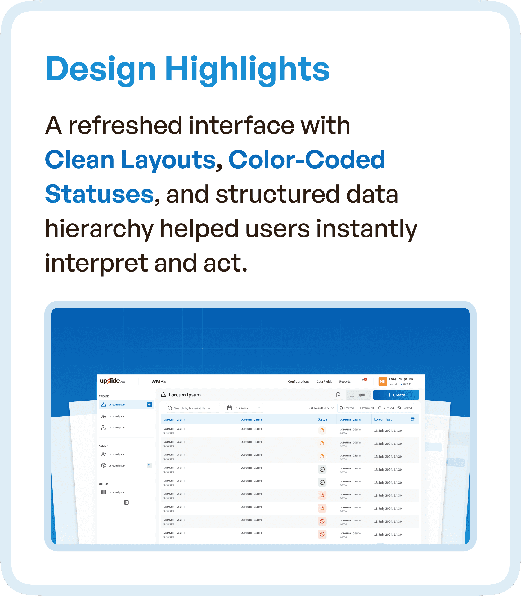
Design Highlights: Creating Clarity Through Interface
We redesigned the interface with a focus on readability and instant comprehension.
Key improvements:
Clean and structured layouts
Color-coded status indicators
Clear data hierarchy
This helped users:
Interpret information quickly
Take action without confusion
Simplifying Warehouse Operations
The redesigned system enabled:
Clear visibility of inventory and processes
Seamless navigation between workflows
Reduced reliance on manual coordination
This transformed complex operations into manageable workflows.
Outcomes to validate in the warehouse task
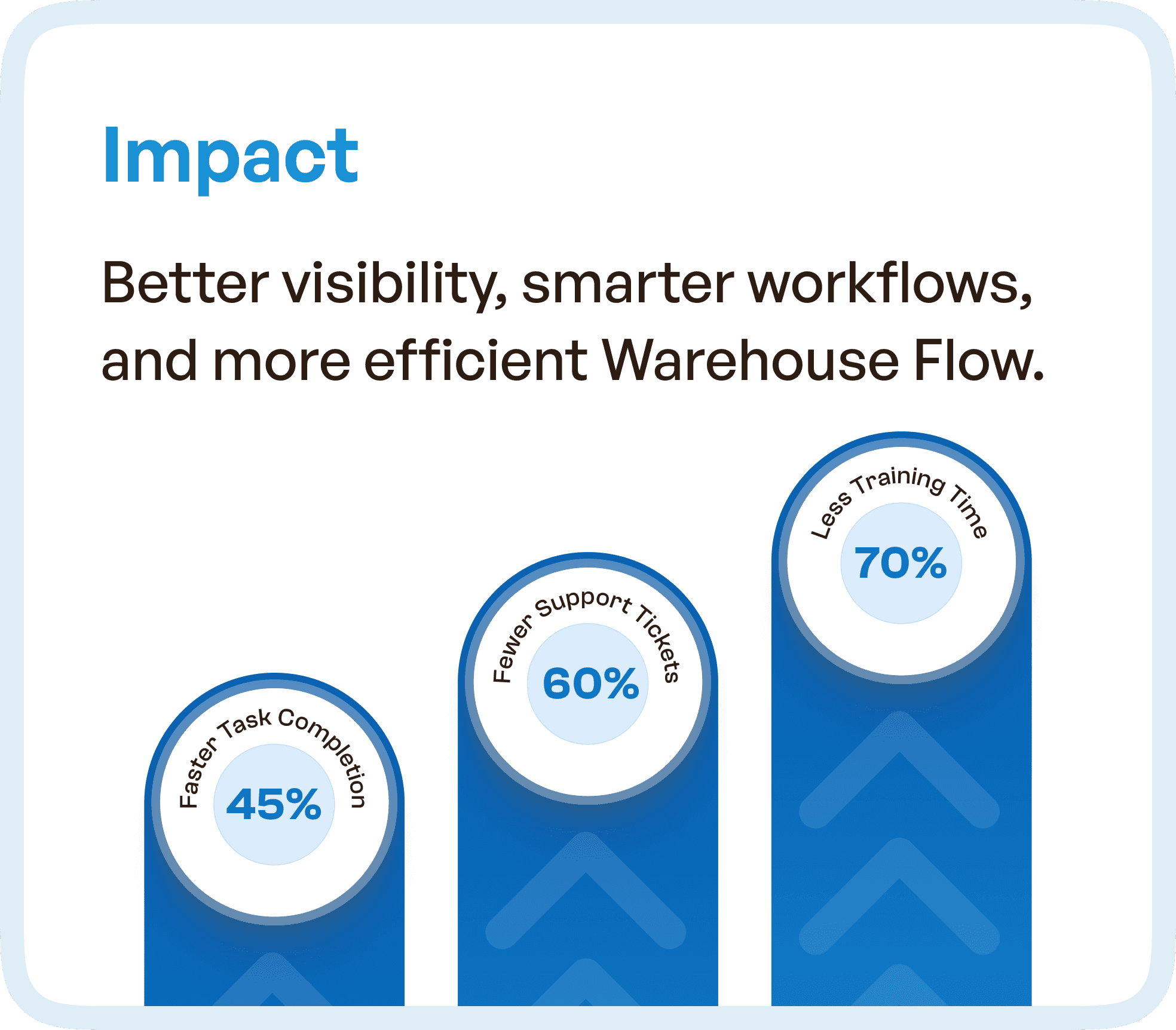
The redesign aims to make material status, outstanding quantities and responsibility easier to understand. Evaluate correct task completion, handoff comprehension and assistance required with a documented baseline. Numerical improvement claims are not asserted here without the underlying measurement records.
Why UX Design is Critical in Pharma Systems
Pharmaceutical systems are:
Process-heavy
Compliance-driven
Data-intensive
Without strong UX:
Errors increase
Workflows slow down
Training becomes mandatory
With structured UX:
Processes become intuitive
Systems guide users
Efficiency improves significantly
For mapping responsibility and handoffs, use enterprise user-flow guidance.
Final Thoughts
Warehouse operations don’t need more features.
They need better structure and usability.
By redesigning workflows and simplifying interactions, complex enterprise systems can become:
Faster
More efficient
Easier to use
Frequently asked questions
What is different about UX for pharma warehouse software?
Warehouse software must make material identity, location, status and responsibility clear during operational handoffs. UX should help staff distinguish what can happen next and what is blocked. Interface clarity supports the workflow; it does not by itself establish regulatory compliance.
How can an interface make material status and handoffs clearer?
Show status in plain language, the responsible role, the last relevant update and the permitted next action together. Keep blocked items distinguishable from items ready for processing, and explain what information or approval is needed to continue.

